Analysis in R: Examine all the characteristics of your data! The “tabplot” package
Introducing the “tabplot” package, which provides a graphical representation of the data in its entirety. It supports both qualitative and quantitative data. The number of data and labels are also displayed on the output graph. It is a very useful package.
Graphing data is a labor-intensive task. However, it is an important task because it can reveal characteristics of the data that are often overlooked in descriptive statistics. Descriptive statistics and graphical validation are the first steps in data analysis.。
Package version is 1.4.1. Checked with R version 4.2.2.
<おすすめのRに関する書籍です>

Install Package
Run the following command.
#Install Package
if(!require("devtools", quietly = TRUE)){
  install.packages("devtools");require("devtools")
}
install_github("mtennekes/tabplot")Example
See the command and package help for details.
#Loading the library
library("tabplot")
#Install the tidyverse package if it is not already there
if(!require("tidyverse", quietly = TRUE)){
install.packages("tidyverse");require("tidyverse")
}
###Creating Data#####
set.seed(1234)
n <- 10000
TestData1 <- tibble(Data1 = sample(1:5, n, replace = TRUE),
Group = sample(c(paste0("Group", 1:5), NA), n, replace = TRUE),
Text = sample(c(LETTERS[10:24], NA), n, replace = TRUE),
Data2 = runif(n), Data3 = 1:n, Data4 = rnorm(n))
TestData2 <- tibble(Data1 = sample(1:5, n, replace = TRUE),
Group = sample(c(paste0("Group", 1:5), NA), n, replace = TRUE),
Text = sample(c(LETTERS[10:24], NA), n, replace = TRUE),
Data2 = runif(n), Data3 = 1:n, Data4 = rnorm(n))
########
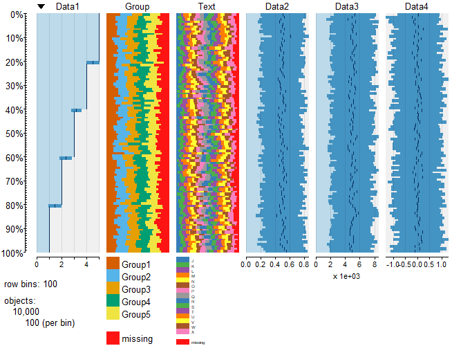
#Displaying data: tableplot command
tableplot(TestData1)
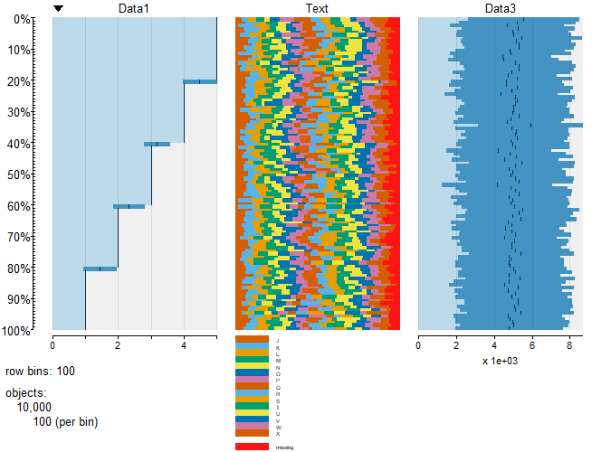
#Select data to display: select option
tableplot(TestData1, select = c(Data1, Text, Data3))
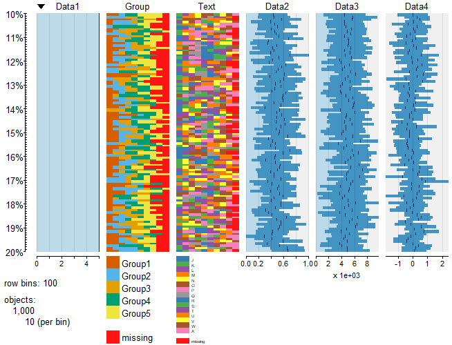
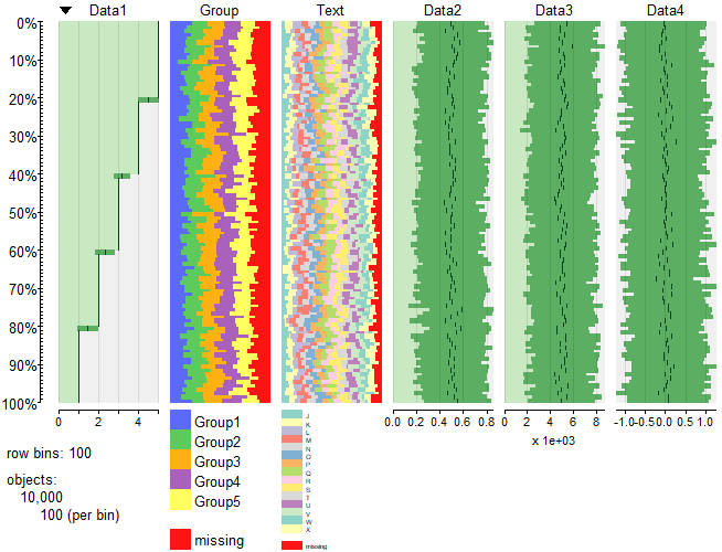
#Specify data to be displayed in percentage of composition: from, to options
tableplot(TestData1, from = 10, to = 20)
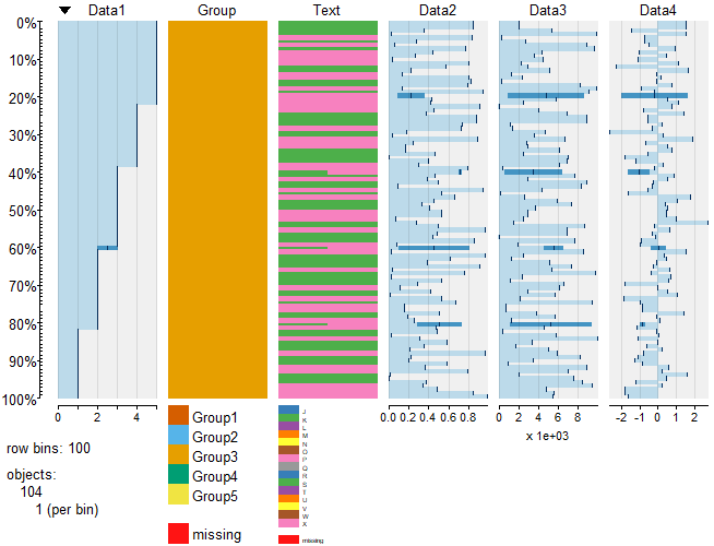
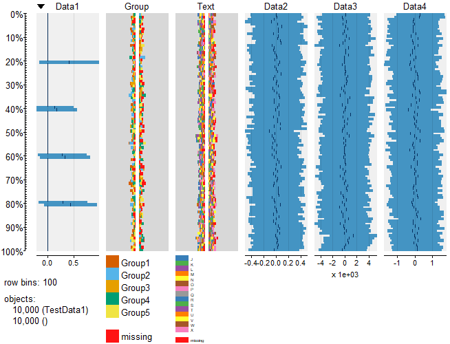
#Conditional selection of data to display: subset option
#or is specified by "|",and is specified by "&"
tableplot(TestData1, subset = Text == c("K", "P") & Group == "Group3")
#Compare the differences between the two data sets
Tp1 <- tableplot(TestData1, plot = FALSE)
Tp2 <- tableplot(TestData2, plot = FALSE)
plot(Tp1 - Tp2)
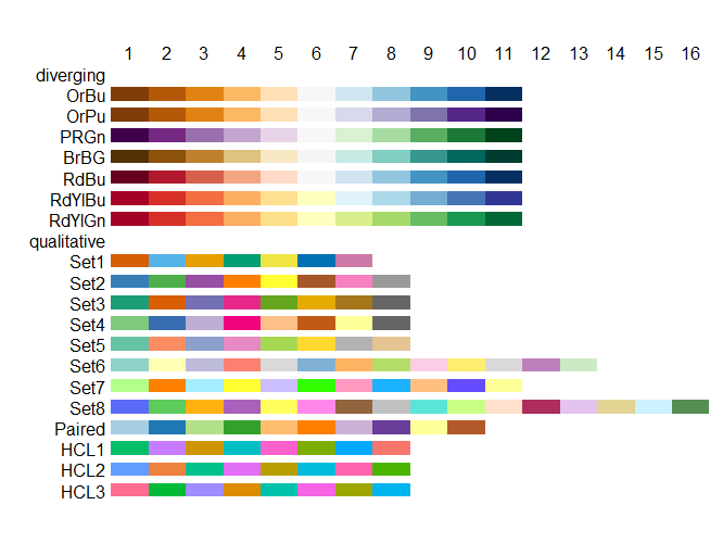
#Change plot color: numPals, pals option
#Use the color palette included in the package
#numPals:color of quantitative data
#palse:Specify by color, list of qualitative data
tableplot(TestData1, numPals = "PRGn", pals = list(Group = "Set8", Text = "Set6"))
#Color palette included in the package
tablePalettes()Output Example
・tableplot command
・select option
・from,to option
・subset option
・Compare the differences between the two data sets
・numPals、pals option
・Color palette included in the package
I hope this makes your analysis a little easier !!