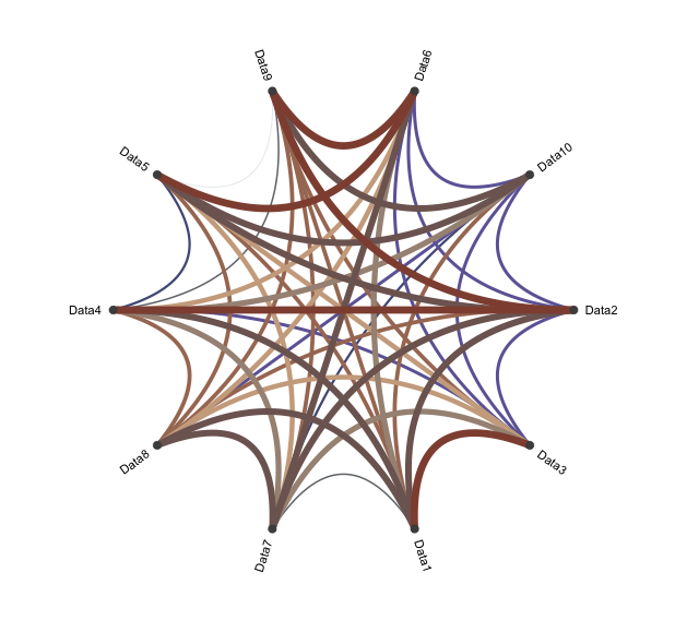
While heat maps and scatter plots are commonly used to express relationships, pie charts are also recommended. A pie chart is a method of expressing relationships between variables by arranging the variables around a circle and using line thickness and color.
Package version is 0.4.1. Checked with R version 4.2.2.
<おすすめのRに関する書籍です>

心理学・教育学研究のための効果量入門: Rを用いた実践的理解 | 中村 大輝
Amazonで中村 大輝の心理学・教育学研究のための効果量入門: Rを用いた実践的理解。アマゾンならポイント還元本が多数。中村 大輝作品ほか、お急ぎ便対象商品は当日お届けも可能。
Install Package
Run the following command.
#Install Package
install.packages("devtools")
devtools::install_github("mjwestgate/circleplot")

##Add
install.packages("amap")
install.packages("scales")
Example
See the command and package help for details.
#Loading the library
library("circleplot")
library("amap")

###Creating Data#####
n <- 10
TestData <- data.frame(Data1 = sample(1:100, n, replace = TRUE),
                       Data2 = sample(1:100, n, replace = TRUE),
                       Data3 = sample(1:100, n, replace = TRUE),
                       Data4 = sample(1:100, n, replace = TRUE),
                       Data5 = sample(1:100, n, replace = TRUE),
                       Data6 = sample(300:400, n, replace = TRUE),
                       Data7 = sample(1:100, n, replace = TRUE),
                       Data8 = sample(1:100, n, replace = TRUE),
                       Data9 = sample(300:400, n, replace = TRUE),
                       Data10 = sample(1:100, n, replace = TRUE))
########

#Calculating similarity using the "Dist" command of the "amap" package
DistResult <- Dist(TestData, method = "spearman")

#Assign data for graph labels
attr(DistResult, "Labels") <- colnames(TestData)

#Set colors in the "sales" package
library("scales")
x <- seq(0, 1, length = 9)
ColPal <- seq_gradient_pal(c("#e1e6ea", "#505457", "#4b61ba", "#a87963",
                                      "#d9bb9c", "#756c6d"))(x)

#Describing the Circle Plot:circleplot command
#Display Style Settings:style option;"classic","pie","clock"
#Adjustment of plot presentation:plot.control option
#Contents are specified by list
#plot.rotation,plot,par,point,point.labels,line.gradient,line.breaks
#line.cols,line.widths,arrows,na.control are possible
circleplot(DistResult, style = "classic",
           plot.control = list(line.cols = ColPal,
                               line.widths = seq(1, 10, by = 1)[1:9]))
Output Example
I hope this makes your analysis a little easier !!