This package can output charts that can be edited in Word and PowerPoint. You can create bar, line, scatter and area charts.
Package version is 0.3.1. Checked with R version 4.1.2. Checked with Office 365.
Install Package
Run the following command.
#Install Package
install.packages("mschart")
Example
See the command and package help for details.
#Loading the library
library("mschart")
###Creating Data#####
n <- 30
TestData <- data.frame("ID" = rep(c("KA", "RA", "DA"), each = 3, length = n),
"Group" = rep_len(c("Group1", "Group2", "Group3"), n),
"Point" = rep(1:10, length = n),
"Value" = rnorm(n))
########
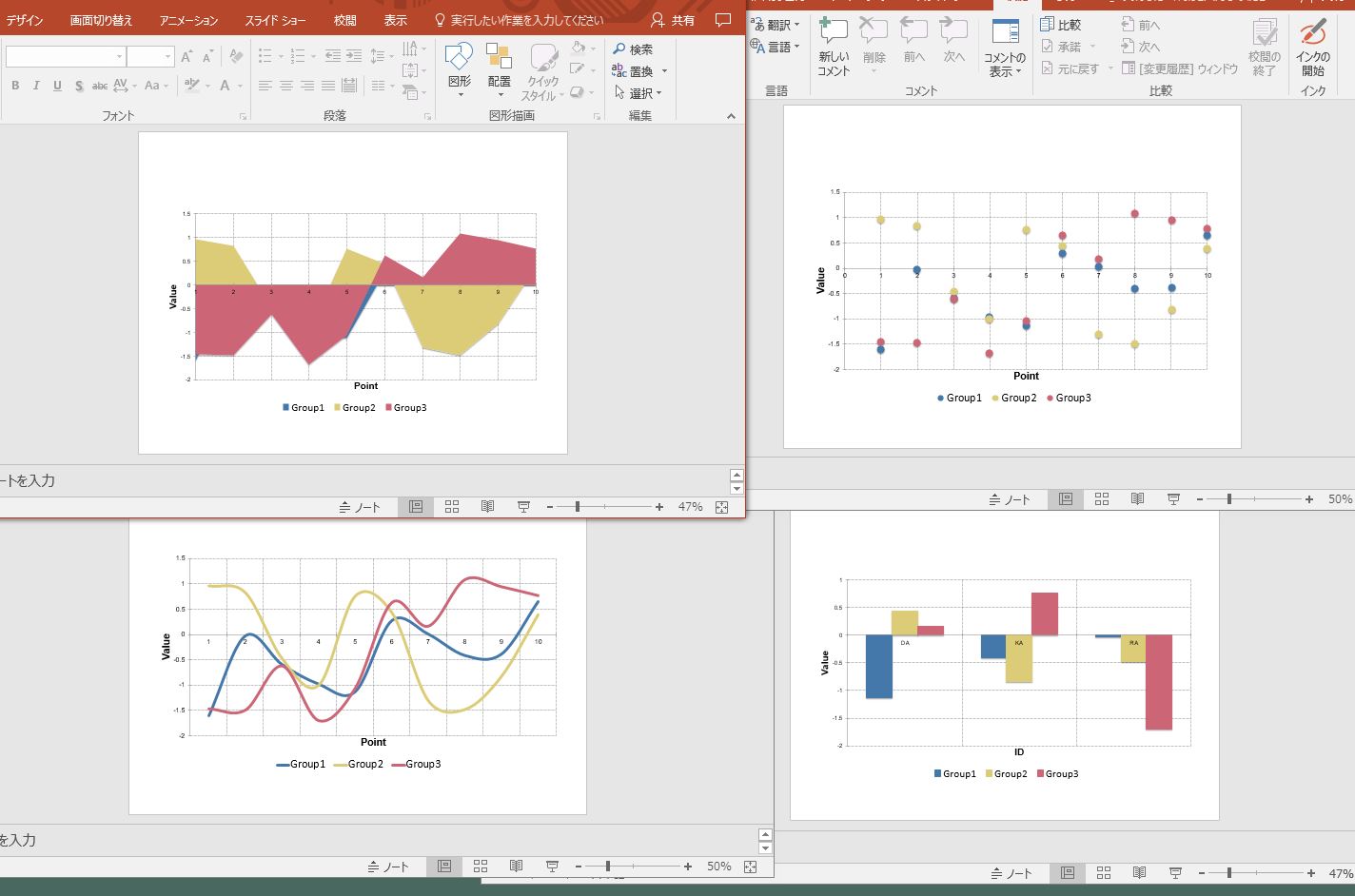
#Four types of graphs that can be created: ms_XXXX command
#The created graph is displayed with the print command, preview = TRUE
#Group split: group option: no split with NULL
#Bar chart: ms_barchart command
TestBar <- ms_barchart(data = TestData, x = "ID", y = "Value", group = "Group")
print(TestBar, preview = TRUE)
#NoGTestBar <- ms_barchart(data = TestData, x = "ID", y = "Value", group = NULL)
#print(NoGTestBar, preview = TRUE)
#Line chart: ms_linechart command
TestLine <- ms_linechart(data = TestData, x = "Point", y = "Value", group = "Group")
print(TestLine, preview = TRUE)
#Scatter plot: ms_scatterchart command
TestScatter <- ms_scatterchart(data = TestData, x = "Point", y = "Value", group = "Group")
print(TestScatter, preview = TRUE)
#Area graph: ms_areachart command
TestAreachart <- ms_areachart(data = TestData, x = "Point", y = "Value", group = "Group")
print(TestAreachart, preview = TRUE)
#Set graph type: chart_settings command
#SetType: Grouping option; stacked: Stacked, percentStacked: 100% Stacked,
#Clustered :Clustered; Bar and scatter plots, standard: Standard can be specified.
#Overlap: Overlap command; -100 to 100 can be specified
SetTestBar1 <- chart_settings(TestBar, grouping = "stacked", overlap = 50)
print(SetTestBar1, preview = TRUE)
#Formatting of X and Y axes: chart_ax_x,chart_ax_y command
#Both of these command options are the same
#Specify label position: crosses option; min, max, autoZero
#Specify the position of tick marks and auxiliary tick marks:
#major_tick_mark and minor_tick_mark options; cross,in,none,out
#Label rotation: rotation option; -360 to 360 can be specified
#Numeric formatting: num_fmt option
SetTestBar2 <- chart_ax_x(SetTestBar1, crosses = "min", minor_tick_mark = "cross",
rotation = -45)
SetTestBar3 <- chart_ax_y(SetTestBar2, crosses = "min", minor_tick_mark = "cross",
num_fmt = "0.0", rotation = -45)
print(SetTestBar3, preview = TRUE)
#Set titles for graphs, X and Y axes: chart_labels command
SetTestBar3$theme$main_title$font.family <- "Arial"
SetTestBar3$theme$axis_title_x$font.family <- "Arial"
SetTestBar3$theme$axis_title_y$font.family <- "Arial"
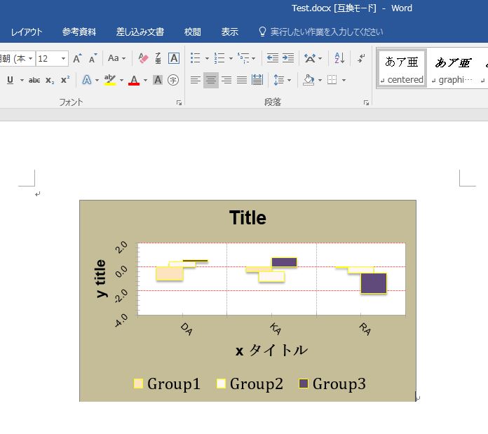
SetTestBar4 <- chart_labels(SetTestBar3, title = "Title",
xlab = "x title", ylab = "y title")
print(SetTestBar4, preview = TRUE)
#Specify fill color: chart_data_fill command
#Set colors: value option
SetTestBar5 <- chart_data_fill(SetTestBar4,
values = c(Group1 = "#FDE4C0",
Group2 = "#FFF7F3",
Group3 = "red"))
print(SetTestBar5, preview = TRUE)
#Specify border colors: chart_data_stroke command
#Options are common to chart_data_fill command
SetTestBar6 <- chart_data_stroke(SetTestBar5, values = "yellow")
print(SetTestBar6, preview = TRUE)
#Example: Embedding and saving charts in a Word or PowerPoint file
#install.packages("officer")
library("officer")
#Word:body_add_chart command
doc <- read_docx()
doc <- body_add_chart(doc, chart = SetTestBar6, style = "centered")
print(doc, target = "Test.docx")
#PowerPoint:ph_with_chartcommand
doc <- read_pptx()
doc <- add_slide(doc, layout = "Title and Content", master = "Office Theme")
doc <- ph_with_chart(doc, chart = SetTestBar6)
print(doc, target = "Test.pptx")Output Example
・ms_XXXX command
・Adaptation of the whole formatting command to the ms_barchart command
『SetTestBar6』
・Exsample: Editing after output to Word
I hope this makes your analysis a little easier !!