This is an introduction to a package that creates scatter plots of pie charts. It is a very interesting display. Used with the ggplot2 package.
Package version is 0.1.7. Checked with R version 4.2.2.
Install Package
Run the following command.
#Install Package
install.packages("scatterpie")
Example
See the command and package help for details.
###Create Data####
#Install the tidyverse package if it is not already there
if(!require("tidyverse", quietly = TRUE)){
install.packages("tidyverse");require("tidyverse")
}
set.seed(1234)
n <- 10
TestData <- tibble(Group = sample(paste0("Group", 1:4), n,
replace = TRUE),
#x-axis coordinates
X_Point_Data = sample(c(1:30),
n, replace = TRUE),
#y-axis coordinates
Y_Point_Data = sample(c(51:100), n, replace = TRUE),
#Pie chart data_1
YES_Value_Data = sample(c(1:5), n, replace = TRUE),
#Pie chart data_2
NO_Value_Data = sample(c(1:5), n, replace = TRUE),
#Circle Size
Radius = sample(c(5:100), n, replace = TRUE)/30)
########
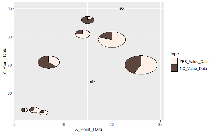
#Draw scatter plot symbols as a pie chart: geom_scatterpie command
#Set the size of the pie chart: set by aes(r = "number")
#Specify the data: cols option; specify by column name
#Use the scale_fill_manual command to change the chart fill color
ggplot() +
geom_scatterpie(data = TestData,
aes(x = X_Point_Data, y = Y_Point_Data, r = Radius),
cols = c("YES_Value_Data", "NO_Value_Data"),
alpha = 1.0) +
scale_fill_manual(values = c("#fef0e7", "#5c463e"))
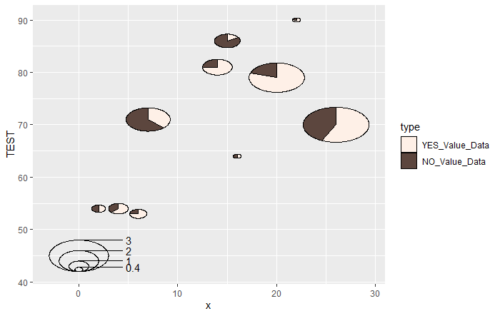
#Add a legend to the graph: geom_scatterpie_legend command
#Specify the size of the legend for pie charts: radius option
#Specify the number of divisions: n option
#y-axis labels are [label name + r], can be changed with labs command
ggplot() +
geom_scatterpie(data = TestData,
aes(x = X_Point_Data, y = Y_Point_Data, r = Radius),
cols = c("YES_Value_Data", "NO_Value_Data"),
alpha = 1.0) +
scale_fill_manual(values = c("#fef0e7", "#5c463e")) +
#geom_scatterpie_legend command
geom_scatterpie_legend(radius = TestData$Radius, x = 0, y = 45, n = 5) +
#Change y-axis label
labs(y = "TEST")Output Example
・geom_scatterpie command
・geom_scatterpie_legend command
I hope this makes your analysis a little easier !!