This is an introduction to a package that is useful for adding plots, text, and other information to ggplot2. Many commands are included. The command examples introduce commands for text, table, reference line, plot, centroid, and number of occurrences quartered by reference to the plot.
Package version is 0.4.4. R version 4.2.2 is confirmed.
Install Package
Run the following command.
#Install Package
install.packages("ggpp")
Execute command
See the command and package help for details.
#Loading the library
library("ggpp")
#Install the tidyverse package if it is not already there
if(!require("tidyverse", quietly = TRUE)){
install.packages("tidyverse");require("tidyverse")
}
###Creating Data Examples#####
set.seed(1234)
n <- 50
TestData <- tibble(Group = factor(sample(paste0("Group", 1:4), n,
replace = TRUE)),
X_Data = sample(c(1:50), n, replace = TRUE),
Y_Data = sample(c(51:100), n, replace = TRUE))
########
###Create basic scatter plots#####
PointPlot <- ggplot(TestData, aes(x = X_Data, y = Y_Data,
col = Group)) +
geom_point() +
scale_color_manual(values = c("red", "#505457",
"#4b61ba", "#a87963")) +
theme_bw()
#Confirmation
PointPlot
########
#Add text to the plot:geom_text_npc command
##Normal geom_text_npc command
##Plot position is specified in data.frame format##
#X axis position;"left","right","center"
#Y axis position;"bottom","top","middle"
TexiPoint <- tibble(X_Position = c("left", "left", "right", "right", "center"),
Y_Position = c("bottom", "top", "bottom", "top", "middle"),
text = c("からだに", "いいもの", "KARADA", "GOOD", ".net"))
#Set to plot
PointPlot + geom_text_npc(data = TexiPoint,
aes(npcx = X_Position,
npcy = Y_Position,
label = text),
col = c("red", "blue", "yellow", "green", "black"),
size = c(3, 5, 7, 9, 11))
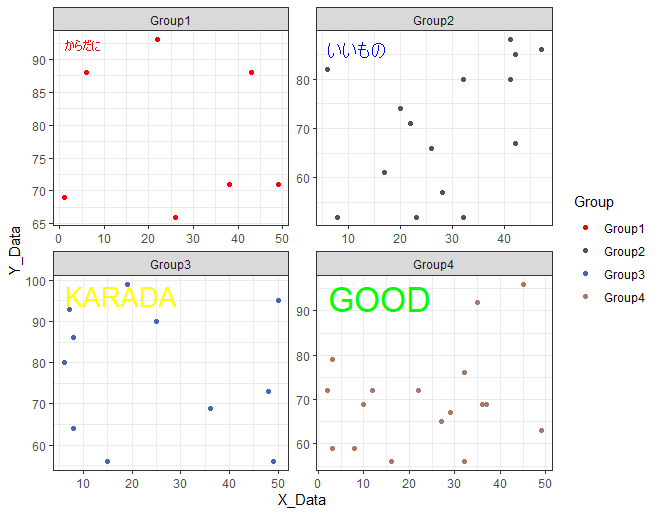
##For example, adjust facet_wrap with the geom_text_npc command
#The point is to use facet_wrap group variables as variable names
FacetPoint <- tibble(Group = levels(TestData$Group),
X_Position = "left",
Y_Position = "top",
text = c("からだに", "いいもの", "KARADA", "GOOD"))
#Set to plot
PointPlot + geom_text_npc(data = FacetPoint,
aes(npcx = X_Position,
npcy = Y_Position,
label = text),
col = c("red", "blue", "yellow", "green"),
size =c(3, 5, 7, 9)) +
facet_wrap(~Group, scales = "free")
#############
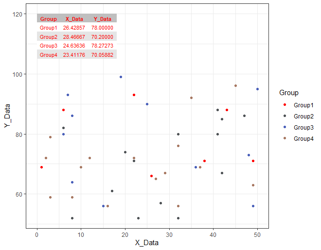
#Adding a table to a plot:geom_table command
#Prepare the data to be added
InsertTable <- tibble(X = 0, Y = 120) %>%
mutate(Table = TestData %>%
group_by(Group) %>%
summarise(X_Data = mean(X_Data), Y_Data = mean(Y_Data)) %>%
list())
#Confirmation
InsertTable
# A tibble: 1 x 3
# X Y Table
# <dbl> <dbl> <list>
#1 0 120 <tibble [4 x 3]>
#Set to plot
#Customize design:table.theme option;
#ttheme_gtdefault,ttheme_gtminimal,ttheme_gtbw,ttheme_gtplain
#ttheme_gtdark,ttheme_gtlight,ttheme_gtsimple,ttheme_gtstripes
PointPlot +
geom_table(data = InsertTable,
aes(x = X, y = Y, label = Table),
table.theme = ttheme_gtstripes,
color = "red", size = 3,
angle = 0, vjust = 1)
#############
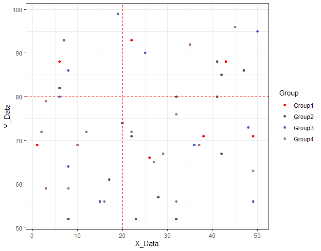
#Add a reference line to the plot:geom_vhlines command
#X axis position:xintercept option
#Y axis position:yintercept option
PointPlot +
geom_vhlines(xintercept = 20, yintercept = 80,
linetype = "dashed", color = "red")
#############
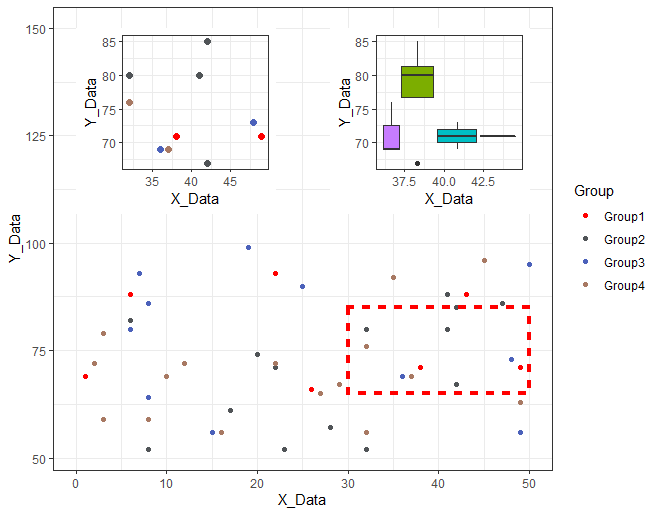
#Add Plot to Plot:geom_plot command
#Add decorative plots to plots:annotate command
#Prepare plot to be added to the plot
#Create scatter plot
InsertPlot <- tibble(X = 0, Y = 150) %>%
mutate(Plot = list(TestData %>%
filter(dplyr::between(X_Data, 30, 50) &
dplyr::between(Y_Data, 65, 85)) %>%
ggplot(aes(x = X_Data, y = Y_Data, col = Group)) +
geom_point(show.legend = FALSE, size = 2) +
scale_color_manual(values = c("red", "#505457",
"#4b61ba", "#a87963")) +
theme_bw()))
#Create boxplot plot
InsertBoxPlot <- tibble(X = 50, Y = 150) %>%
mutate(Plot = list(TestData %>%
filter(dplyr::between(X_Data, 30, 50) &
dplyr::between(Y_Data, 65, 85)) %>%
ggplot(aes(x = X_Data, y = Y_Data,
group = Group, fill = Group)) +
geom_boxplot(show.legend = FALSE) +
scale_color_manual(values = c("red", "#505457",
"#4b61ba", "#a87963")) +
theme_bw()))
#Set to plot
PointPlot +
#Add Scatter plot
geom_plot(data = InsertPlot, aes(x = X, y = Y, label = Plot)) +
#Add BoxPlot
geom_plot(data = InsertBoxPlot, aes(x = X, y = Y, label = Plot)) +
#Add a frame with the annotate command
annotate(geom = "rect",
xmin = 30, xmax = 50, ymin = 65, ymax = 85,
linetype = "dotted", fill = NA, colour = "red",
size = 1.5)
#############
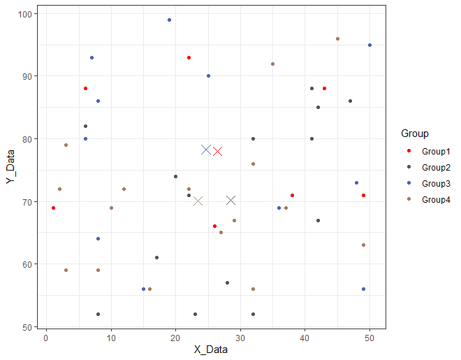
#Add centroid per group to plot: stat_centroid command
PointPlot +
stat_centroid(shape = "cross", size = 4)
#############
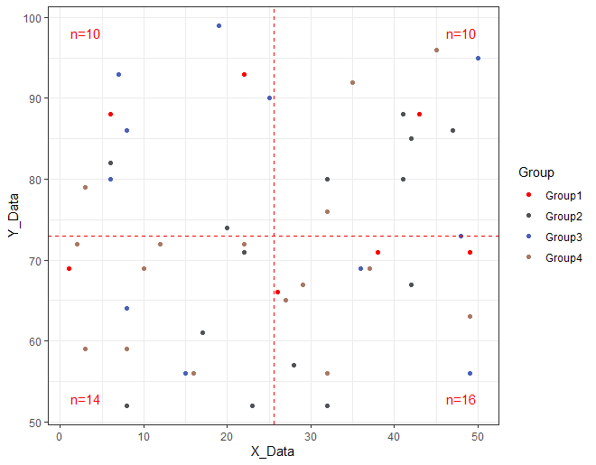
#Show the number of occurrences divided by criteria: stat_quadrant_counts command
#Create criteria on average
MeanData <- TestData %>%
summarise(X_Data = mean(X_Data), Y_Data = mean(Y_Data))
#Set to plot
#X axis position:xintercept option
#Y axis position:yintercept option
PointPlot +
stat_quadrant_counts(colour = "red",
xintercept = MeanData$X_Data,
yintercept = MeanData$Y_Data) +
geom_vhlines(xintercept = MeanData$X_Data,
yintercept = MeanData$Y_Data,
linetype = "dashed", color = "red")
#############
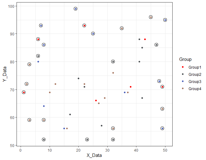
#Highlight by specified criteria starting from the lowest density: stat_dens2d_filter command
#See "?stat_dens2d_filter" for more information
PointPlot +
stat_dens2d_filter(keep.fraction = 1/2, #keep.number = 50,
colour = "black", size = 4, shape = 1)
########Output Examples
・For example, the geom_text_npc command adjusts facet_wrap.
・Adding a table to a plot: geom_table command
・Add reference lines to a plot: geom_vhlines command.
・Add plot to plot: geom_plot command.
・Add centroid per group to plot: stat_centroid command.
・Show the number of occurrences quartered by criterion: stat_quadrant_counts command.
・Highlight by specified criteria from lowest density: stat_dens2d_filter command.
I hope this makes your analysis a little easier !!