Analysis in R: “ggrepel” package useful for adding text and labels to geom_point
The ggplot2 package has a geom_point command that is useful for creating scatter plots, but it was very cumbersome to adjust the position of the plot symbols when trying to add text or label information to them. This is an introduction to a package that can solve such a problem.
Here is an example of running “geom_text_repel, geom_label_repel” from the “ggrepel” package, which adds text and labels to geom_points.
For reference, the ggiraph package includes the “ggeom_text_repel_interactive” and “ggeom_label_repel_interactive” commands for interactive display. An example of using the “geom_label_repel_interactive” command is shown at the end of the “Running commands” section.
Package version is 0.9.1. R version 4.2.2 is confirmed.
Install Package
Run the following command.
#Install Package
install.packages("ggrepel")Execute command
See the command and package help for details.
#Loading the library
library("ggrepel")
###Creating Data Examples#####
n <- 30
TestData <- data.frame(Group = sample(paste0("Group", 1:5), n, replace = TRUE),
Data1 = rnorm(n), Data2 = rnorm(n) + rnorm(n) + rnorm(n))
###Create a simple scatterplot with ggplot2#####
PointPlot <- ggplot(TestData, aes(x = Data1, y = Data2,
label = Group, color = Group,
fill = Group)) + geom_point()
#Plot
PointPlot
###Add text to plots#####
#Package ggplot2:geom_text command
#PointPlot + geom_text()
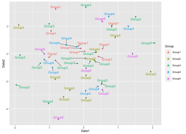
#Package ggrepel: geom_text_repel command
PointPlot + geom_text_repel()
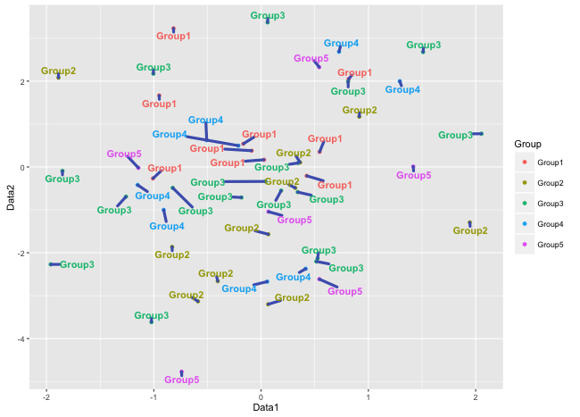
#Plotting with a different look
#ggplot2 graph elements can be used
PointPlot + geom_text_repel(
#Text appearance
fontface = "bold",
#Line color
segment.color = "#4b61ba",
#Line width
segment.size = 1.5,
#Distance to label
min.segment.length = 0.1,
#Exclude missing values
na.rm = TRUE,
#Hide legend
show.legend = FALSE)
########
###Labeling on plots#####
#Package ggplot2:geom_label command
#Text color is changed to white
#PointPlot + geom_label(color = "white")
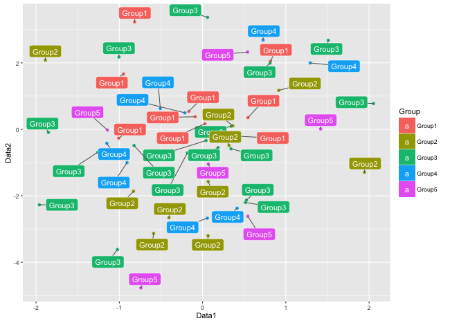
#Package ggrepel: geom_label_repel command
PointPlot + geom_label_repel(color = "white")
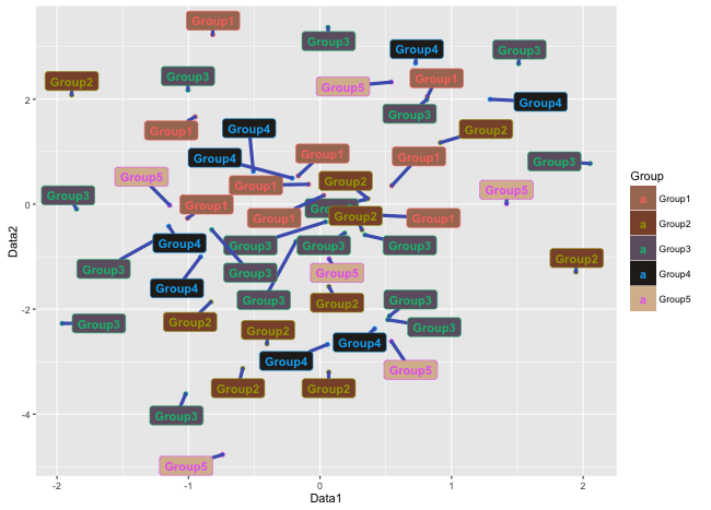
#Plotting with a different look
PointPlot + geom_label_repel(
fontface = "bold",
segment.color = "#4b61ba",
segment.size = 1,
min.segment.length = 0.1,
na.rm = TRUE,
show.legend = TRUE) +
scale_fill_manual(values = c("#a87963", "#8a5136",
"#6e5f72", "#28231e", "#d9bb9c"))
########
###Extra:Interactive graphs using the ggiraph package#####
#See the package
#https://www.karada-good.net/analyticsr/r-376/
#Loading the library
#Install the ggiraph package if it is not already there
if(!require("ggiraph", quietly = TRUE)){
install.packages("ggiraph");require("ggiraph")
}
###Add data for interactive use#####
#Creation of tooltip data:tooltip
TestData$tooltip <- paste0( "グループ名 <br/>", TestData[, 1])
#Create content to be displayed with icon clicks:clickjs
TestData$click <- sprintf("alert(\"%s%s%s%s\")",
"X:", round(TestData[, 2], 2),
", Y:", round(TestData[, 3], 2))
#geom_label_repel_interactive command
PointPlot <- ggplot(TestData, aes(x = Data1, y = Data2,
tooltip = tooltip, onclick = click,
label = Group, color = Group, fill = Group)) +
geom_point() +
geom_label_repel_interactive(
fontface = "bold",
segment.color = "#4b61ba",
segment.size = 1,
min.segment.length = 0.1,
na.rm = TRUE,
show.legend = TRUE) +
scale_fill_manual(values = c("#a87963", "#8a5136", "#6e5f72",
"#28231e", "#d9bb9c"))
#Plot
girafe(ggobj = PointPlot)Output Examples
・geom_text_repel command:base
・geom_text_repel command:change
・geom_label_repel command:base
・geom_label_repel command:change
・Interactive graphs using the ggiraph package
I hope this makes your analysis a little easier !!