The ‘squash’ package allows you to colourise and create quirky heatmaps for data visualisation; by creating and assigning colour information from frequency of occurrence, mean values, etc. to 2D plot symbols, you can create pseudo 3D plots.
Presenting data in a package can lead to new discoveries.
Package version is 1.0.9. Checked with R version 4.2.2.
Install Package
Run the following command.
#Install Package
install.packages("squash")
Example
See the command and package help for details.
#Loading the library
library("squash")
#Creating Data
TestData <- data.frame(Group = sample(paste0("グループ", 1:10), 100, replace = TRUE),
Data1 = sample(0:5, 100, replace = TRUE),
Data2 = sample(5:10, 100, replace = TRUE))
##############################
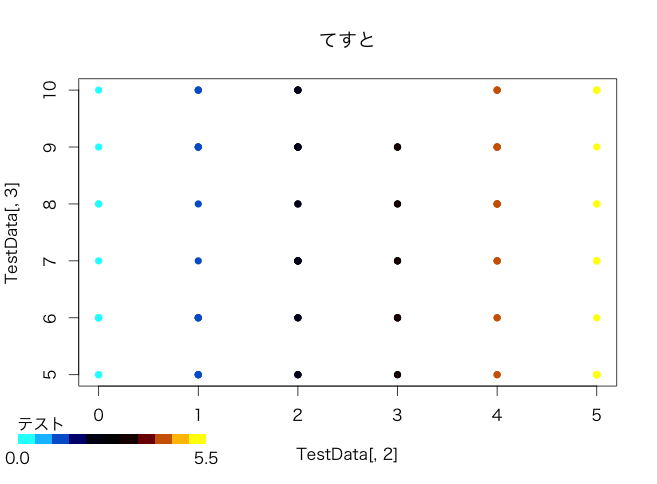
#Colour map from numerical values:makecamp command
#colFnオプション:rainbow2,jet,heat,coolheat,blueorange,
#bluered,darkbluered,greyscaleの設定が可能
MapData <- makecmap(TestData[, 2], colFn = coolheat)
#Create a colour palette from a colour map:cmap command
ColorMap <- cmap(TestData[, 2], map = MapData)
#Plot
plot(TestData[, 2], TestData[, 3], col = ColorMap, pch = 16, main = "てすと")
#Plot of colour key
hkey(MapData, "テスト")
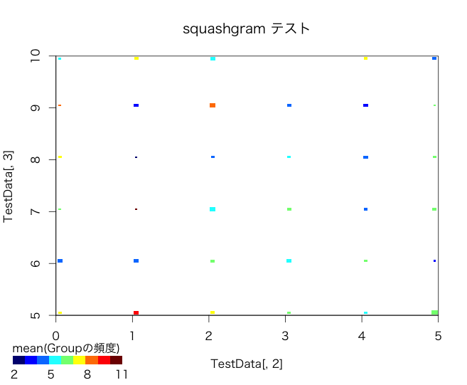
#Bin Plot:squashgram command
#Information such as frequency of symbols at z option
#shrink option:Specify cut-off value
squashgram(x = TestData[, 2], y = TestData[, 3], z = TestData[, 1], FUN = mean,
shrink = 10, main = "squashgram", zlab = "Group frequency")
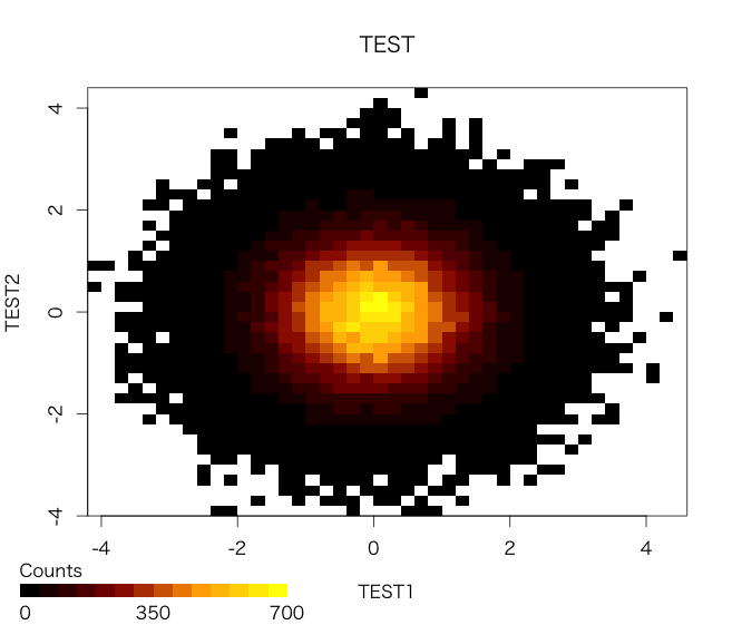
#Creation of scatter plots:hist2 command
hist2(rnorm(100000), rnorm(100000), main = "TEST",
xlab = "TEST1", ylab = "TEST2", zlab = "Counts")
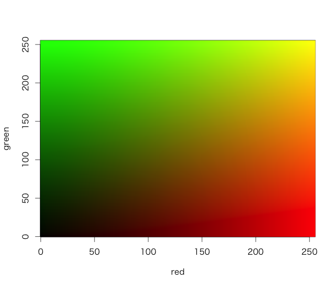
#Creating a colour map from the matrix:cimage command
#Creating Data
red <- green <- 0:255
rg <- outer(red, green, rgb, blue = 1, maxColorValue = 255)
#Plot
cimage(red, green, zcol = rg)
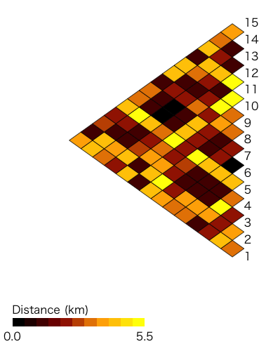
#Creating colour maps from distance data:distogram command
#Calculate the distance with the "dist" command
DiData <- dist(head(TestData[, 2:3], 15), method = "euclidean")
#Plot
distogram(DiData, title = "Distance (km)", n = 15) Output Example
・makecamp command
・squashgram command
・hist2 command
・cimage command
・distogram command
I hope this makes your analysis a little easier !!