The ggplot2 package is a very powerful plotting package. We have compiled a list of uses and commands as a reminder.
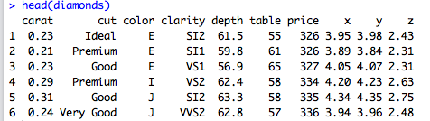
The data used in the introduction is converted to data frames from the diamonds included in the package.
tidyverse version is 1.3.1. R version 4.2.2 is confirmed.
Overview of ggplot2
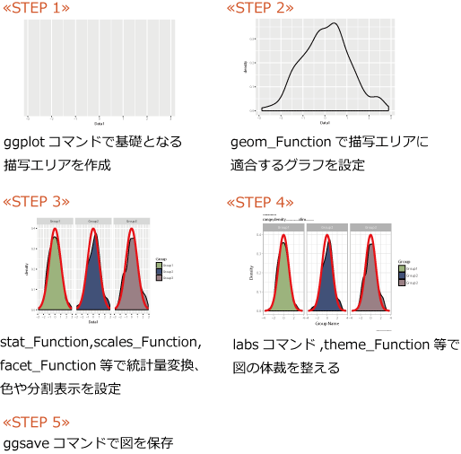
One of the features of ggplot2 is that the commands for “reading” data, “plotting” figures from the data, and “decorating” figures are clearly separated.
It may take some getting used to, but it is a reasonable package because the commands have clear modification points, so the effort is low. Specifically, the “ggplot” command reads data, creates an object, plots, and then decorates the object.
Installing ggplot2
Run the following command. This tutorial uses the tidyverse package, which includes the ggplot2 package.
#install.packages("ggplot2")
install.packages("tidyverse")
Loading the ggplot2 library
Run the following command.
#Loading the library
#library("ggplot2")
library("tidyverse")
Data Read Command
There are two ways to read data with ggplot2: the “qplot” command, which specifies everything together from reading to plotting, and the “ggplot” command, which specializes in reading data.
Although “qplot” can be used as a precursor, we recommend using the “ggplot” command to take full advantage of ggplot2’s features: “read data” command, “plot figure from data” command, and “decorate figure” command.
Note that the x-axis, y-axis, groups, symbol colors, etc. must be specified with the aes command when loading data or within the plot command. The x- and y-axes must be specified according to the figure to be plotted.
#Data Read Command
Testdata <- diamonds
List of “aes options” that specify graph elements
List of aes options. Multiple options can be set.
| 表現内容 | オプション | 例 |
|---|---|---|
| 軸データを指定 | x, y, z | aes(x = 1, y = 2) |
| 塗りつぶしの色 | fill | aes(fill = "red") |
| 線の色、囲み線の色 | colour | aes(colour = "red") |
| 色の透過度 | alpha | aes(alpha = 0.5) |
| シンボルの形 | shape | aes(shape = 3) |
| シンボルのサイズ | size | aes(size = 4) |
| 線の種類 | linetype | aes(linetype = 1) |
| グループの指定 | group | aes(group = "読み込んだデータの列 or 行名") |
| 並び替え | order | aes(order = "読み込んだデータの列 or 行名") |
| x or yの最小値 | xmin or ymin | aes(xmin = 1) |
| x or yの最大値 | xmax or ymax | aes(xmax = 1) |
| 矢印の記入 | xend, yend, arrow | geom_segment(aes(x = 4, y = 25, xend = 3.5, yend = 20), arrow = arrow(length = unit(0.5, "cm"))) |
Example of plotting read data
The elements are specified by aes from the geom_point command to plot the read data in a scatterplot. See the command comments for details.
#You can plot by specifying elements with aes
PlotData <- ggplot(Testdata)
PlotData +
  geom_point(aes(x = carat, y = price, color = color))

#To decorate a figure, you can plot it with the print command if you store an object in the argument
PointPlot <- PlotData + geom_point(aes(x = carat, y = price, color = color))
print(PointPlot)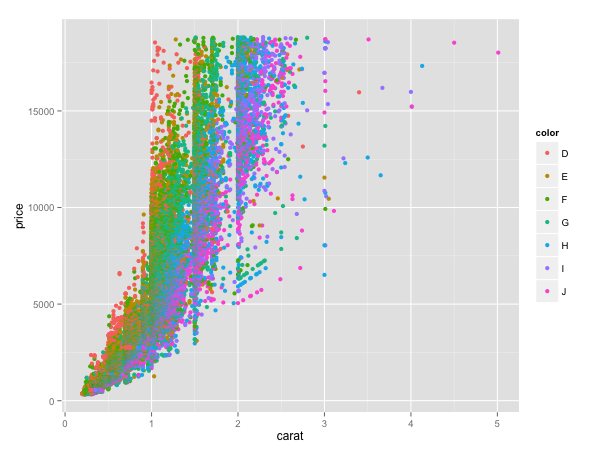
Scatter plots to be plotted.
To save the file, use the ggsave command. The save in the working directory.
ggsave("Test.png", PointPlot)Introduction to articles that may be helpful for graphing
Split plot “facet command”
How to place a graph from the right. facet_grid(. ~”name or number of the row to split”)
PlotData +
  geom_point(aes(x = carat, y = price, color = color)) +
  facet_grid(.~color) +
  labs(x = "carat", y = "price", colour = "Colour")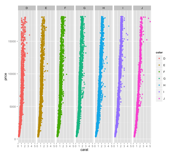
How to place the graph from the top. facet_grid(“name of the column or column number you want to split”~.)
PlotData +
  geom_point(aes(x = carat, y = price, color = color)) +
  facet_grid(color~.) +
  labs(x = "carat", y = "price", colour = "Colour")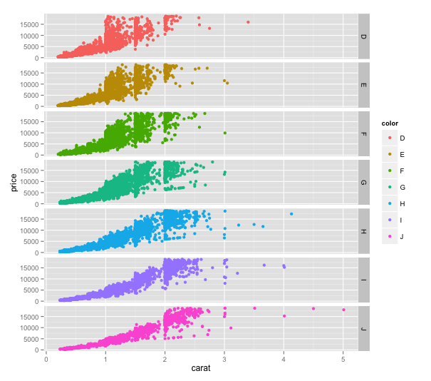
Adjust Legend and Axis Labels
First, the plot is normal. The legend and axis labels are not the row names of the data.
PlotData <- ggplot(Testdata, aes(x = Testdata[, 1],
                                 y = Testdata[, 7],
                                 color = Testdata[, 3],
                                 size = Testdata[, 1])) +
  geom_point()
print(PlotData)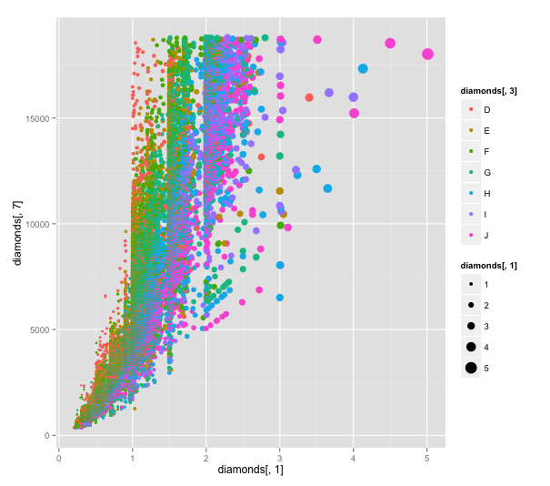
The legend and axis names can be customized using the labs command, which also allows you to set titles.
PlotData2 <- PlotData +
  labs(x = "Calat", y = "Price", title = "TEST PLOT",
       color = "Color", size = "SIZE")
print(PlotData2)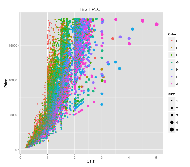
Customize plot symbols
PlotData2 is used to change the transparency and color of the plot. The alpha option is added to the transparency with the aes command. If it is not set, the alpha legend will be displayed, so the guide command is used to prevent it from being displayed. The scale_colour_brewer command is used for color. For continuous data, it is better to use scale_colour_continuous, etc.
PlotData3 <- PlotData2 +
  aes(alpha = 0.01) +
  guides(alpha = "none") +
  scale_colour_brewer(palette = "Set1")
print(PlotData3)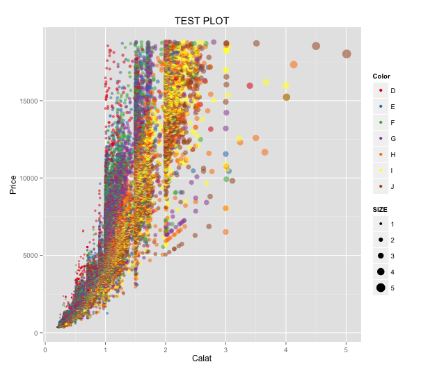
Figure plotting commands commonly used with ggplot2
| 表現内容 | コマンド | 注意するオプション |
|---|---|---|
| 切片と傾きを指定した直線 | geom_abline() | intercept = 0, slope = 1 |
| 積み上げ折れ線グラフ | geom_area() | |
| 棒グラフ | geom_bar() | stat = "bin or identity", position = "stack or dodge" |
| タイル状に表現 | geom_bin2d() | |
| 箱ヒゲ図 | geom_boxplot() | outlier.colour = "black", outlier.shape = 16, outlier.size = 2, notch = FALSE, notchwidth = 0.5 *外れ値は箱の長さの1.5倍です。 |
| ドットプロット | geom_dotplot() | binaxis = "x", method = "dotdensity", binpositions = "bygroup", stackdir = "up", stackratio = 1, dotsize = 1, stackgroups = FALSE |
| エラーバー | geom_errorbar() | 水平方向のエラーバーにgeom_errorbarh()があります。 |
| 要素数を折れ線で表現 | geom_freqpoly() | |
| ヒストグラム | geom_histogram() | |
| 水平方向の線 | geom_hline() | 切片はyinterceptで指定します。垂直方向はgeom_vline()です。切片はxinterceptで指定します。 |
| ジッタープロット | geom_jitter(position = position_jitter()) | position_jitter()は横の振れ幅:width = 0.5と縦の振れ幅:height = 0.5があります。 |
| 折れ線グラフ | geom_line() | x軸は数字の小さい順からプロットされます。 |
| 要素の出現順に線で結ぶ | geom_path() | |
| 散布図 | geom_point() | |
| 指定した範囲を枠で囲む | geom_rect() | |
| 指定した範囲の線分を描写 | geom_segment() | |
| 文字列の描写 | geom_text() | |
| バイオリンプロット | geom_violin() |
Commands for arranging the appearance of the entire figure
The character style is achieved using the theme command. The easiest way is to customize the provided theme_classic(), theme_minimal(), etc.
PlotData3 + theme_minimal()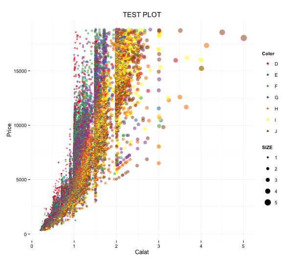
List options for theme command
The usage is theme(element = corresponding element(option)).
Ex: theme(axis.title = element_text(face = “bold.italic”, colour = “red”))
| 設定箇所 | 要素 | 対応エレメント | オプション |
|---|---|---|---|
| 文字全体 | text | element_text() | family = NULL, face = "plain or italic or bold or bold.italic", colour = NULL, size = NULL, hjust = NULL, vjust = NULL, angle = NULL, lineheight = NULL |
| 表、凡例タイトル全体 | title | element_text() | family = NULL, face = "plain or italic or bold or bold.italic", colour = NULL, size = NULL, hjust = NULL, vjust = NULL, angle = NULL, lineheight = NULL |
| 軸ラベル | axis.title | element_text() | family = NULL, face = "plain or italic or bold or bold.italic", colour = NULL, size = NULL, hjust = NULL, vjust = NULL, angle = NULL, lineheight = NULL |
| X軸ラベル | axis.title.x | element_text() | family = NULL, face = "plain or italic or bold or bold.italic", colour = NULL, size = NULL, hjust = NULL, vjust = NULL, angle = NULL, lineheight = NULL |
| Y軸ラベル | axis.title.y | element_text() | family = NULL, face = "plain or italic or bold or bold.italic", colour = NULL, size = NULL, hjust = NULL, vjust = NULL, angle = NULL, lineheight = NULL |
| 目盛りラベル | axis.text | element_text() | family = NULL, face = "plain or italic or bold or bold.italic", colour = NULL, size = NULL, hjust = NULL, vjust = NULL, angle = NULL, lineheight = NULL |
| X軸目盛りラベル | axis.text.x | element_text() | family = NULL, face = "plain or italic or bold or bold.italic", colour = NULL, size = NULL, hjust = NULL, vjust = NULL, angle = NULL, lineheight = NULL |
| Y軸目盛りラベル | axis.text.y | element_text() | family = NULL, face = "plain or italic or bold or bold.italic", colour = NULL, size = NULL, hjust = NULL, vjust = NULL, angle = NULL, lineheight = NULL |
| 凡例要素ラベル | legend.text | element_text() | family = NULL, face = "plain or italic or bold or bold.italic", colour = NULL, size = NULL, hjust = NULL, vjust = NULL, angle = NULL, lineheight = NULL |
| 凡例タイトル | legend.title | element_text() | family = NULL, face = "plain or italic or bold or bold.italic", colour = NULL, size = NULL, hjust = NULL, vjust = NULL, angle = NULL, lineheight = NULL |
| 図タイトル | plot.title | element_text() | family = NULL, face = "plain or italic or bold or bold.italic", colour = NULL, size = NULL, hjust = NULL, vjust = NULL, angle = NULL, lineheight = NULL |
| facetコマンド使用時要素ラベル | strip.text | element_text() | family = NULL, face = "plain or italic or bold or bold.italic", colour = NULL, size = NULL, hjust = NULL, vjust = NULL, angle = NULL, lineheight = NULL |
| facetコマンド使用時X軸ラベル | strip.text.x | element_text() | family = NULL, face = "plain or italic or bold or bold.italic", colour = NULL, size = NULL, hjust = NULL, vjust = NULL, angle = NULL, lineheight = NULL |
| facetコマンド使用時Y軸ラベル | strip.text.y | element_text() | family = NULL, face = "plain or italic or bold or bold.italic", colour = NULL, size = NULL, hjust = NULL, vjust = NULL, angle = NULL, lineheight = NULL |
| 線全体 | line | element_line() | colour = NULL, size = NULL, linetype = NULL, lineend = NULL |
| 目盛り線全体 | axis.ticks | element_line() | colour = NULL, size = NULL, linetype = NULL, lineend = NULL |
| X軸目盛り | axis.ticks.x | element_line() | colour = NULL, size = NULL, linetype = NULL, lineend = NULL |
| Y軸目盛り | axis.ticks.y | element_line() | colour = NULL, size = NULL, linetype = NULL, lineend = NULL |
| 軸線全体 | axis.line | element_line() | colour = NULL, size = NULL, linetype = NULL, lineend = NULL |
| X軸線 | axis.line.x | element_line() | colour = NULL, size = NULL, linetype = NULL, lineend = NULL |
| Y軸線 | axis.line.y | element_line() | colour = NULL, size = NULL, linetype = NULL, lineend = NULL |
| 内領域の線全体 | panel.grid | element_line() | colour = NULL, size = NULL, linetype = NULL, lineend = NULL |
| 内領域の主線 | panel.grid.major | element_line() | colour = NULL, size = NULL, linetype = NULL, lineend = NULL |
| 内領域の補助線 | panel.grid.minor | element_line() | colour = NULL, size = NULL, linetype = NULL, lineend = NULL |
| 内領域のX軸側の主線 | panel.grid.major.x | element_line() | colour = NULL, size = NULL, linetype = NULL, lineend = NULL |
| 内領域のY軸側の主線 | panel.grid.major.y | element_line() | colour = NULL, size = NULL, linetype = NULL, lineend = NULL |
| 内領域のX軸側の補助線 | panel.grid.minor.x | element_line() | colour = NULL, size = NULL, linetype = NULL, lineend = NULL |
| 内領域のY軸側の補助線 | panel.grid.minor.y | element_line() | colour = NULL, size = NULL, linetype = NULL, lineend = NULL |
| プロット塗りつぶし全体 | rect | element_rect() | fill = NULL, colour = NULL, size = NULL, linetype = NULL, color = NULL |
| 凡例背景色 | legend.background | element_rect() | fill = NULL, colour = NULL, size = NULL, linetype = NULL, color = NULL |
| 凡例シンボル背景色 | legend.key | element_rect() | fill = NULL, colour = NULL, size = NULL, linetype = NULL, color = NULL |
| 内領域の境界線の色 | panel.border | element_rect() | fill = NULL, colour = NULL, size = NULL, linetype = NULL, color = NULL |
| 内領域の背景色 | plot.background | element_rect() | fill = NULL, colour = NULL, size = NULL, linetype = NULL, color = NULL |
| facetコマンド使用時背景色 | strip.background | element_rect() | fill = NULL, colour = NULL, size = NULL, linetype = NULL, color = NULL |
| 軸目盛りの長さ | axis.ticks.length | unit | unit(数値, "cm")で設定するのが楽かと思います。 |
| 軸目盛りと軸ラベルの間隔 | axis.ticks.margin | unit | unit(数値, "cm")で設定するのが楽かと思います。 |
| 凡例の間隔 | legend.margin | unit | unit(数値, "cm")で設定するのが楽かと思います。 |
| 凡例要素の縦横間隔 | legend.key.size | unit | unit(数値, "cm")で設定するのが楽かと思います。 |
| 凡例要素の縦間隔 | legend.key.height | unit | unit(数値, "cm")で設定するのが楽かと思います。 |
| 凡例要素の横間隔 | legend.key.width | unit | unit(数値, "cm")で設定するのが楽かと思います。 |
| 内領域の間隔 | panel.margin | unit | unit(数値, "cm")で設定するのが楽かと思います。 |
| プロット領域と内領域の間隔 | plot.margin | unit | unit(数値, "cm")で設定するのが楽かと思います。 |
| 凡例要素の揃え | legend.text.align | 0:左揃え, 1:右揃え | 0:左揃え, 1:右揃え |
| 凡例タイトルの揃え | legend.title.align | 0:左揃え, 1:右揃え | 0:左揃え, 1:右揃え |
| 凡例の位置 | legend.position | "left", "right", "bottom", "top", or c(X, Y) | "left", "right", "bottom", "top", or c(X, Y) |
| 凡例アイテムの位置 | legend.direction | "horizontal" or "vertical" | "horizontal" or "vertical" |
| 凡例の表示位置 | egend.justification | "center" or c(X, Y) | "center" or c(X, Y) |
| 複数凡例表示時の位置 | legend.box | "horizontal" or "vertical" | "horizontal" or "vertical" |
| 複数凡例表示時の並び方 | legend.box.just | "top", "bottom", "left", or "right" | "top", "bottom", "left", or "right" |
Articles about ggplot2
I hope this makes your analysis a little easier !!