The “ggplot2” package is a powerful tool for converting data into plots in R. However, there are times when you want to use it simply, and sometimes it is a hassle to convert the data to correspond to a number. This is an introduction to a package that solves such a problem and easily plots data as wide-type data.
An example, we also show a sample command to render each figure with the “ggplot2” package, except for the dot.
Package version is 0.1.1. Checked with R version 4.2.2.
Install Package
Run the following command.
#Install Package
install.packages("ggmatplot")
Example
See the command and package help for details.
#Loading the library
library("ggmatplot")
#Install the tidyverse package if it is not already there
if(!require("tidyverse", quietly = TRUE)){
install.packages("tidyverse");require("tidyverse")
}
###Creating Data#####
set.seed(1234)
n <- 300
TestData <- tibble(Group = sample(paste0("Group", 1:2), n,
replace = TRUE),
X_Data1 = sample(c(1:50), n, replace = TRUE),
X_Data2 = sample(c(1:100), n, replace = TRUE),
Y_Data1 = sample(c(1:50), n, replace = TRUE),
Y_Data2 = sample(c(1:100), n, replace = TRUE))
#Check
TestData
# A tibble: 300 x 5
Group X_Data1 X_Data2 Y_Data1 Y_Data2
<chr> <int> <int> <int> <int>
1 Group2 19 48 17 25
2 Group1 3 65 24 75
3 Group2 6 33 9 77
4 Group1 22 64 39 77
5 Group2 43 18 11 63
6 Group2 32 14 3 44
7 Group2 34 92 34 35
8 Group1 2 63 27 10
9 Group1 4 55 8 95
10 Group1 34 19 24 97
# ... with 290 more rows
#######
#Plotting with wide type data: ggmatplot command
#Specify plot type:plot_type option;
#point,line,both(point + line),density,histogram,
#boxplot,dotplot,errorplot,violin,ecdf
#Other options are omitted as they can be understood without explanation,
#see Help.
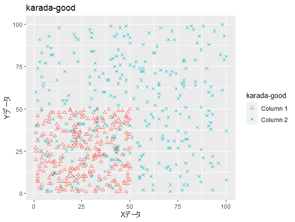
ggmatplot(x = TestData %>% select(X_Data1, X_Data2),
y = TestData %>% select(Y_Data1, Y_Data2),
plot_type = "point", color = NULL,
fill = NULL, shape = c(2, 4), linetype = NULL,
log = NULL, main = "karada-good",
xlab = "X Data", ylab = "Y Data",
legend_label = NULL, legend_title = "karada-good",
desc_stat = "mean_se")
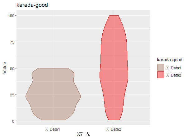
###例:violin#####
ggmatplot(x = TestData %>% select(X_Data1, X_Data2),
plot_type = "violin", color = NULL,
fill = c("#a87963", "red"), alpha = 0.4, main = "karada-good",
xlab = "X Data", ylab = "Value",
legend_label = NULL, legend_title = "karada-good",
desc_stat = "mean_se")
###In the case of ggplot2
TestData %>% select(X_Data1, X_Data2) %>%
pivot_longer(cols = X_Data1:X_Data2,
names_to = "Name", values_to = "Value") %>%
ggplot(aes(x = Name, y = Value, fill = Name)) +
geom_violin(alpha = 0.4) +
scale_fill_manual(values = c("#a87963", "red")) +
labs(title = "karada-good", x = "X Data",
y = "Value", fill = "karada-good")
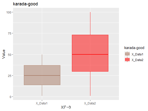
###Exsample:BoxPlot#####
ggmatplot(x = TestData %>% select(X_Data1, X_Data2),
plot_type = "boxplot", color = c("#a87963", "red"),
fill = c("#a87963", "red"), main = "karada-good",
xlab = "X Data", ylab = "Value",
legend_label = NULL, legend_title = "karada-good",
desc_stat = "mean_se")
###In the case of ggplot2
TestData %>% select(X_Data1, X_Data2) %>%
pivot_longer(cols = X_Data1:X_Data2,
names_to = "Name", values_to = "Value") %>%
ggplot(aes(x = Name, y = Value, fill = Name, col = Name)) +
geom_boxplot(alpha = 0.5) +
scale_fill_manual(values = c("#a87963", "red")) +
scale_color_manual(values = c("#a87963", "red"),
guide = "none") +
labs(title = "karada-good", x = "X Data",
y = "Value", fill = "karada-good")
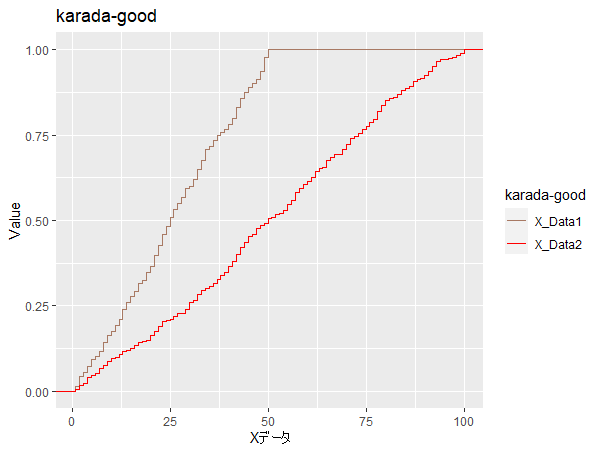
###Exsample:ecdf#####
ggmatplot(x = TestData %>% select(X_Data1, X_Data2),
plot_type = "ecdf", color = NULL,
fill = c("#a87963", "red"), main = "karada-good",
xlab = "X Data", ylab = "Value",
legend_label = NULL, legend_title = "karada-good",
desc_stat = "mean_se")
###In the case of ggplot2
TestData %>% select(X_Data1, X_Data2) %>%
pivot_longer(cols = X_Data1:X_Data2,
names_to = "Name", values_to = "Value") %>%
ggplot(aes(x = Value, col = Name)) +
stat_ecdf(geom = "step") +
scale_color_manual(values = c("#a87963", "red")) +
labs(title = "karada-good", x = "X Data",
y = "Value", col = "karada-good")Output Example
・Scatter Plot
・Exsample:violin
・Exsample:BoxPlot
・Exsample:ecdf
I hope this makes your analysis a little easier !!