各種「geom_XXXX」コマンドでプロットを装飾するのも良いですが、場合によっては「annotate」コマンドで装飾する方が便利な場合があります。紹介では四角で塗りつぶしの”rect”、範囲で塗りつぶしの”segment”、テキストを追加の”text”を紹介します。
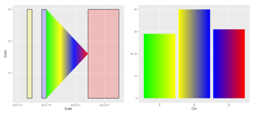
なお、”rect”や”segment”を上手に利用すると図の塗色をベタではなくグラデーションで設定することが可能です。全体またはエリア分けのグラデーションが可能です。
「ggplot2」のインストールと読み込み
「tidyverse」をインストールして「ggplot2」パッケージを利用するのが便利です。
# パッケージのインストール
install.packages("tidyverse")

# パッケージの読み込み
library("tidyverse")
データ例を作成
以下のコマンドを実行してください。
#日付データの作成に便利:lubridateパッケージがなければインストール
if(!require("lubridate", quietly = TRUE)){
install.packages("lubridate");require("lubridate")
}
set.seed(1234)
#lubridate::ymd;locale="C", tz="Asia/Tokyo"を設定するのがポイント
TestData <- tibble(Date = seq(lubridate::ymd("2021-01-01", locale = "C",
tz = "Asia/Tokyo"),
lubridate::ymd("2022-03-24", locale = "C",
tz = "Asia/Tokyo"),
by = "10 day")) %>%
mutate(Data = sample(c(1:30), length(Date), replace = TRUE),
#Dateを基準に曜日を入手:wdayコマンド
Day_Type = lubridate::wday(Date, label = TRUE,
abbr = FALSE))基本的なプロット
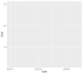
以下の図を「annotate」コマンドで装飾していきます。左から折れ線グラフ、空のプロットです。
# 折れ線グラフ
ggplot(TestData, aes(x = Date, y = Data)) +
  geom_line() -> BasePlot

# 空のプロット
ggplot(TestData, aes(x = Date, y = Data)) +
  geom_blank() -> BlankPlot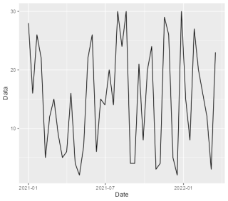
体裁の設定例
annotateコマンドに”rect”、”segment”、”text”の設定例です。
## 四角で塗りつぶし
# annotateコマンドで"rect"を設定
BasePlot +
annotate(geom = "rect",
xmin = as.POSIXct(c("2021-03-01", "2021-06-01", "2022-03-20")),
xmax = as.POSIXct(c("2021-04-01", "2021-07-01", "2022-10-01")),
ymin = c(-Inf, -Inf, -Inf) , ymax = c(Inf, Inf, Inf),
alpha = 0.2, color = "black", fill = c("yellow", "blue", "red"))
## 範囲で塗りつぶし
## 塗りつぶし範囲を計算
# X軸範囲をPOSIXct objectsで作成
day_period <- seq(lubridate::ymd("2021-07-01", locale = "C",
tz = "Asia/Tokyo"),
lubridate::ymd("2022-03-20", locale = "C",
tz = "Asia/Tokyo"),
by = "1 day")
# Y軸範囲を作成
# 「layer_scales」コマンドでRangeから最小値,最大値を取得
yaxis_range <- layer_scales(BasePlot)$y$range$range
# 終着値を平均値で取得
yaxis_mean <- mean(yaxis_range)
# y下限値を最小値から終着値までX軸範囲の長さで取得
day_ymin <- seq(min(yaxis_range), mean(yaxis_range), length = length(day_period))
# y上限値を最大値から終着値までX軸範囲の長さで取得
day_ymax <- seq(max(yaxis_range), mean(yaxis_range), length = length(day_period))
# annotateコマンドで"segment"を設定
BasePlot +
annotate(geom = "rect",
xmin = as.POSIXct(c("2021-03-01", "2021-06-01", "2022-03-20")),
xmax = as.POSIXct(c("2021-04-01", "2021-07-01", "2022-10-01")),
ymin = c(-Inf, -Inf, -Inf) , ymax = c(Inf, Inf, Inf),
alpha = 0.2, color = "black", fill = c("yellow", "blue", "red")) +
annotate(geom = "segment",
x = day_period,
xend = day_period,
y = day_ymax,
yend = day_ymin,
alpha = 0.7, color = "green")
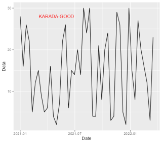
## テキストを追加
# annotateコマンドで"text"を設定
BasePlot +
annotate(geom = "text",
x = as.POSIXct("2021-05-01"),
y = 28, size = 4, color = "red",
label = "KARADA-GOOD")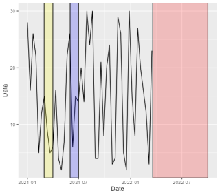
例えばこんな使い方
塗りをグラデーションにする方法とヒストグラムをグラデーションにする方法です。何かの参考になりますように。ヒストグラムをグラデーションにする方法は理解しやすいように手順をなるべく省略せずに記述しています。
# 塗りをグラデーション
# 塗り範囲を計算
colfunc <- colorRampPalette(c("green", "yellow", "blue", "red"))
BlankPlot +
annotate("rect",
xmin = as.POSIXct(c("2021-03-01", "2021-06-01", "2022-03-20")),
xmax = as.POSIXct(c("2021-04-01", "2021-07-01", "2022-10-01")),
ymin = c(2, 2, 2) , ymax = c(30, 30, 30),
#ymin = c(-Inf, -Inf, -Inf) , ymax = c(Inf, Inf, Inf),
alpha = 0.2, color = "black", fill = c("yellow", "blue", "red")) +
annotate("segment",
x = day_period,
xend = day_period,
y = day_ymax,
yend = day_ymin,
alpha = 0.7,
color = colfunc(length(day_period)))
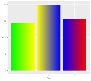
## ヒストグラムでグラデーション
# データ作成
set.seed(1234)
Chr_data <- data.frame(Chr = sample(LETTERS[c(1, 5, 8)],
size = 100,
replace = TRUE),
Group = sample(LETTERS[1:2],
size = 100,
replace = TRUE))
# 一度プロット
ggplot(Chr_data, aes(x = Chr)) +
geom_bar()
# もしくはオブジェクトに保存する
#ggplot(Chr_data, aes(x = Chr)) +
#geom_bar() -> object_gg
# データ取得:layer_dataコマンド
# iはレイヤー番号
get_data <- layer_data(plot = last_plot(), i = 1L)
# もしくはオブジェクトから読み込む
#get_data <- layer_data(plot = object_gg, i = 1L)
# 確認
get_data
#y count prop x flipped_aes PANEL group ymin ymax xmin xmax colour fill
#1 29 29 1 1 FALSE 1 1 0 29 0.55 1.45 NA grey35
#2 40 40 1 2 FALSE 1 2 0 40 1.55 2.45 NA grey35
#3 31 31 1 3 FALSE 1 3 0 31 2.55 3.45 NA grey35
#linewidth linetype alpha
#1 0.5 1 NA
#2 0.5 1 NA
#3 0.5 1 NA
# get_dataオブジェクトからデータを取得する
x_range <- c(seq(get_data$xmin[1], get_data$xmax[1], by = 0.001),
seq(get_data$xmin[2], get_data$xmax[2], by = 0.001),
seq(get_data$xmin[3], get_data$xmax[3], by = 0.001))
y_max <- rep(get_data$ymax, each = length(x_range)/3)
y_min <- rep(0, length(x_range))
# 描写エリアを空でプロット
ggplot(Chr_data, aes(x = Chr)) +
geom_blank() -> blank_bar
# 全体でグラデーションのプロット
blank_bar +
annotate("segment",
x = x_range,
xend = x_range,
y = y_max,
yend = y_min,
alpha = 0.7,
color = colfunc(length(x_range)))
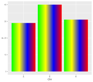
# エリア分けでグラデーションのプロット
blank_bar +
annotate("segment",
x = x_range,
xend = x_range,
y = y_max,
yend = y_min,
alpha = 0.7,
color = rep(colfunc(length(x_range)/3), 3))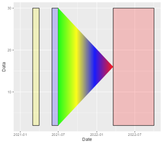
少しでも、あなたの解析に役に立ちますように!