Rで解析:データの入力形式を気にしないでggplot2が利用できます「ezplot」パッケージ
データの入力形式を気にしないでggplot2が利用できるパッケージの紹介です。収録されているコマンドはプロットに合わせてデータを整形するコマンドと、ggplot2のプロットコマンドが組み合わされた内容です。
ggplot2を利用しているパッケージですので、体裁はggplot2のコマンドを[+]で追加して編集します。
パッケージバージョンは0.0.0.9000。実行コマンドはR version 3.2.3で確認しています。
パッケージのインストール
下記、コマンドを実行してください。
#パッケージのインストール
install.packages("devtools")
devtools::install_github("gmlang/ezplot")
スポンサーリンク
実行コマンド
詳細はコメント、パッケージのヘルプを確認してください。
#パッケージの読み込み
library("ezplot")
#scalesパッケージがなければインストール
if(!require("scales", quietly = TRUE)){
install.packages("scales");require("scales")
}
#ggplot2を利用するためにtidyverseパッケージ
#tidyverseパッケージがなければインストール
if(!require("tidyverse", quietly = TRUE)){
install.packages("tidyverse");require("tidyverse")
}
###データ例の作成#####
n <- 300
TestData <- data.frame(Group = sample(paste0("Group", 1:5), n, replace = TRUE),
Data1 = rnorm(n),
Data2 = rnorm(n) + rnorm(n) + rnorm(n),
Data3 = sample(0:1, n, replace = TRUE),
Data4 = sample(LETTERS[1:26], n, replace = TRUE))
#######
#エリアプロットの作成:mk_areaplotコマンド
AreaPlot <- mk_areaplot(TestData)
#内容確認
AreaPlot
function (xvar, yvar, fillby, xlab = "", ylab = "", main = "",
legend = T)
{
p = ggplot2::ggplot(df, ggplot2::aes_string(x = xvar, y = yvar,
fill = fillby, order = fillby)) + ggplot2::geom_area(position = "stack") +
ggplot2::labs(x = xlab, y = ylab, title = main) + ggplot2::theme_bw() +
ggplot2::guides(fill = ggplot2::guide_legend(reverse = TRUE))
if (!legend)
p = p + ggplot2::guides(fill = FALSE)
p
}
<environment: 0x10b4ff828>
#プロット
AreaPlot("Data2", "Data1", fillby = "Group", legend = FALSE) +
ggplot2::scale_fill_manual(values = alpha("#4b61ba", seq(0, 1, length = 10)))
#棒グラフの作成:mk_barplotコマンド
BarPlot <- mk_barplot(TestData)
#内容確認
BarPlot
function (xvar, yvar, fillby, xorder = "alphanumeric", barpos = "stack",
xlab = "", ylab = "", main = "", legend = T, barlab = NULL,
barlab_use_pct = F, decimals = 2, barlab_at_top = F, barlab_size = 3,
dodged_lab_w = 1)
{
if (xorder == "ascend")
df[[xvar]] = reorder(df[[xvar]], df[[yvar]])
if (xorder == "descend")
df[[xvar]] = reorder(df[[xvar]], -df[[yvar]])
p = ggplot2::ggplot(df, ggplot2::aes_string(x = xvar, y = yvar,
fill = fillby, order = fillby)) + ggplot2::geom_bar(stat = "identity",
position = barpos) + ggplot2::labs(x = xlab, y = ylab,
title = main) + ggplot2::theme_bw() + ggplot2::guides(fill = ggplot2::guide_legend(reverse = TRUE))
if (!legend)
p = p + ggplot2::guides(fill = FALSE)
if (!is.null(barlab)) {
if (barlab_use_pct)
df$bar_label = format_as_pct(df[[barlab]], digits = decimals +
2)
else df$bar_label = df[[barlab]]
if (barlab_at_top)
barlab_pos = paste(yvar, "pos_top", sep = "_")
else barlab_pos = paste(yvar, "pos_mid", sep = "_")
if (barpos != "dodge")
p = p + ggplot2::geom_text(data = df, ggplot2::aes_string(label = "bar_label",
y = barlab_pos), size = barlab_size)
else p = p + ggplot2::geom_text(data = df, ggplot2::aes_string(label = "bar_label",
y = barlab_pos, ymax = paste0("max(", barlab, ")")),
size = barlab_size, position = ggplot2::position_dodge(width = dodged_lab_w))
}
p
}
<environment: 0x10b5347c8>
#プロット
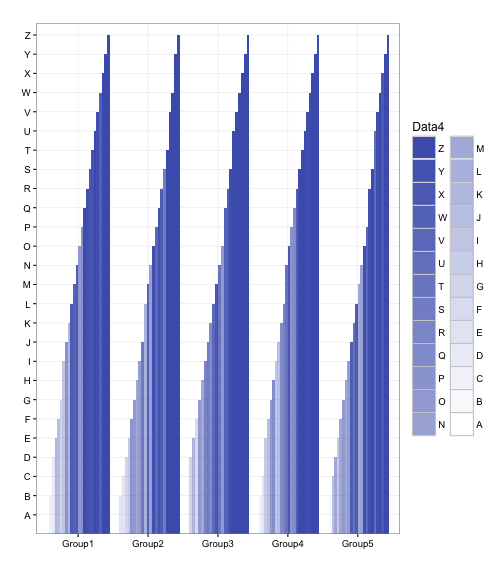
BarPlot("Group", "Data4", fillby = "Data4", legend = TRUE, barpos = "dodge") +
ggplot2::scale_fill_manual(values = alpha("#4b61ba", seq(0, 1, length = 26)))
#箱ひげ図の作成:mk_boxplotコマンド
BoxPlot <- mk_boxplot(TestData)
#内容確認
BoxPlot
function (xvar, yvar, xlab = "", ylab = "", main = "", legend = T,
add_label = T, lab_at_top = T, vpos = 0)
{
xvar_type = class(df[[xvar]])
if (xvar_type %in% c("character", "factor"))
p = ggplot2::ggplot(df, ggplot2::aes_string(x = xvar,
y = yvar, fill = xvar)) + ggplot2::geom_boxplot() +
ggplot2::stat_summary(fun.y = mean, geom = "point",
shape = 5, size = 2)
else p = ggplot2::ggplot(df, ggplot2::aes_string(x = xvar,
y = yvar, group = xvar)) + ggplot2::geom_boxplot(color = cb_color("blue"))
if (add_label) {
if (lab_at_top)
p = p + ggplot2::stat_summary(fun.data = function(x) c(y = max(x) +
vpos, label = length(x)), geom = "text", size = 5)
else p = p + ggplot2::stat_summary(fun.data = function(x) c(y = min(x) +
vpos, label = length(x)), geom = "text", size = 5)
}
p = p + ggplot2::theme_bw() + ggplot2::labs(x = xlab, y = ylab,
title = main)
if (!legend)
p = p + ggplot2::guides(fill = FALSE)
p
}
<environment: 0x10c614800>
#プロット
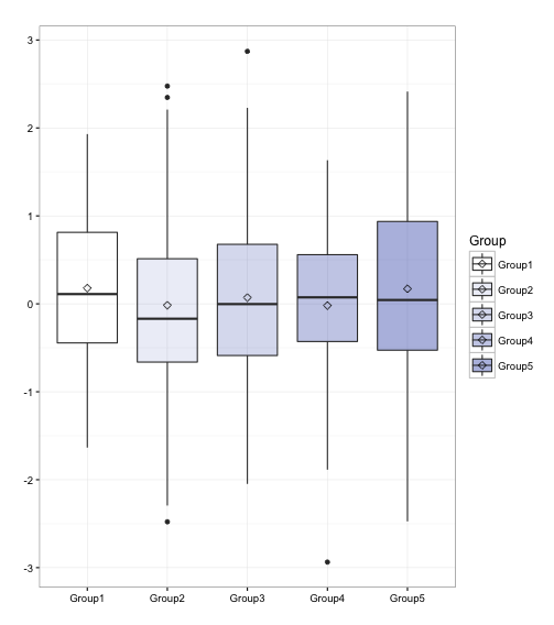
BoxPlot("Group", "Data1", legend = TRUE, lab_at_top = FALSE, add_label = FALSE) +
ggplot2::scale_fill_manual(values = alpha("#4b61ba", seq(0, 1, length = 10)))
#ヒストグラムまたは密度グラフの作成:mk_distplotコマンド
DistPlot <- mk_distplot(TestData)
#内容確認
DistPlot
function (xvar, fillby = "", xlab = "", type = "histogram", binw = NULL,
main = "", add_vline_mean = F, add_vline_median = F)
{
p = ggplot2::ggplot(df, ggplot2::aes_string(x = xvar)) +
ggplot2::labs(x = xlab, title = main) + ggplot2::theme_bw()
pexpr = draw(type)
p = eval(pexpr)
if (fillby == "") {
if (add_vline_mean) {
avg = mean(df[[xvar]], na.rm = T)
p = p + ggplot2::geom_vline(ggplot2::aes_string(xintercept = avg),
color = cb_color("reddish_purple"), size = 1,
linetype = "dashed")
}
if (add_vline_median) {
med = median(df[[xvar]], na.rm = T)
p = p + ggplot2::geom_vline(ggplot2::aes_string(xintercept = med),
color = cb_color("bluish_green"), size = 1, linetype = "dashed")
}
}
else {
lst = split(df[, c(xvar, fillby)], df[[fillby]])
if (add_vline_mean) {
avg = sapply(lst, function(elt) mean(elt[[xvar]],
na.rm = T))
means = data.frame(level = names(avg), avg)
p = p + ggplot2::geom_vline(data = means, ggplot2::aes(xintercept = avg,
color = level), linetype = "dashed", size = 1)
}
if (add_vline_median) {
med = sapply(lst, function(elt) median(elt[[xvar]],
na.rm = T))
medians = data.frame(level = names(med), med)
p = p + ggplot2::geom_vline(data = medians, ggplot2::aes(xintercept = med,
color = level), linetype = "dashed", size = 1)
}
}
p
}
<environment: 0x102bcb840>
#プロット
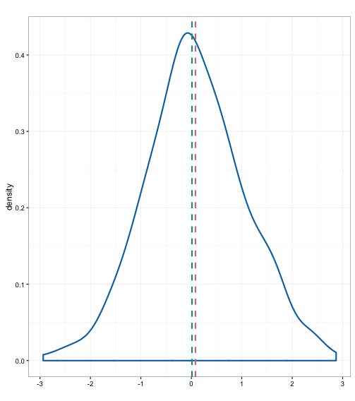
#typeオプション:"density" or "histogram"
DistPlot("Data1", type = "density", add_vline_mean = TRUE, add_vline_median = TRUE) +
ggplot2::scale_fill_manual(values = alpha("#4b61ba", seq(0, 1, length = 10)))
#ヒートマップの作成:mk_heatmapコマンド
HeatMapPlot <- mk_heatmap(TestData)
#内容確認
HeatMapPlot
function (xvar, yvar, fillby, xlab = "", ylab = "", main = "",
base_size = 12, use_theme_gray = T, legend = T)
{
p = ggplot2::ggplot(df, ggplot2::aes_string(x = xvar, y = yvar))
if (use_theme_gray)
p = p + ggplot2::theme_gray(base_size = base_size)
else p = p + ggplot2::theme_minimal(base_size = base_size)
p = p + ggplot2::geom_tile(ggplot2::aes_string(fill = fillby),
color = "white") + ggplot2::scale_fill_gradient(low = "white",
high = "steelblue") + ggplot2::labs(x = xlab, y = ylab,
title = main) + ggplot2::scale_x_discrete(expand = c(0,
0)) + ggplot2::scale_y_discrete(expand = c(0, 0)) + ggplot2::theme(axis.ticks = ggplot2::element_blank())
if (!legend)
p = p + ggplot2::guides(fill = FALSE)
p
}
<environment: 0x110d732d8>
#プロット
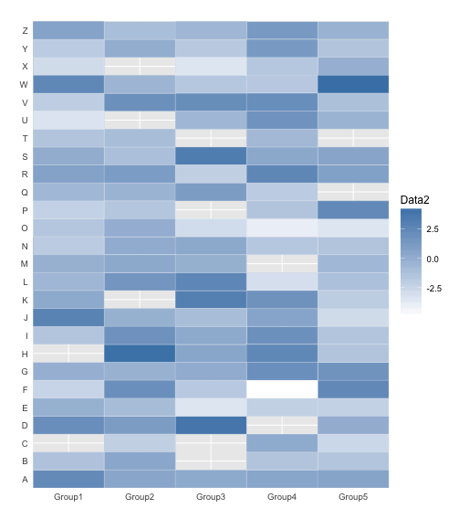
HeatMapPlot("Group", "Data4", fillby = "Data2") +
ggplot2::scale_color_manual(values = alpha("#4b61ba", seq(0, 1, length = 10)))
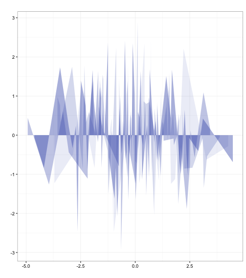
#インターバルプロットの作成:mk_intervalplotコマンド
IntVarPlot <- mk_intervalplot(TestData)
#内容確認
IntVarPlot
function (xvar, yvar, fillby = "", ymin_var, ymax_var, xlab = "",
ylab = "", main = "", size = 1, legend = T)
{
if (fillby == "")
p = ggplot2::ggplot(df, ggplot2::aes_string(x = xvar,
y = yvar, ymin = ymin_var, ymax = ymax_var)) + ggplot2::geom_pointrange(color = cb_color("blue"),
size = size)
else p = ggplot2::ggplot(df, ggplot2::aes_string(x = xvar,
y = yvar, ymin = ymin_var, ymax = ymax_var, color = fillby)) +
ggplot2::geom_pointrange(size = size)
p = p + ggplot2::labs(x = xlab, y = ylab, title = main) +
ggplot2::theme_bw()
if (!legend)
p = p + ggplot2::guides(color = FALSE)
p
}
<environment: 0x11a5429f8>
#プロット
IntVarPlot("Data1", "Data1", fillby = "Group", ymin_var = min(TestData[, 3]), ymax_var = max(TestData[, 3])) +
ggplot2::scale_color_manual(values = alpha("#4b61ba", seq(0, 1, length = 10)))
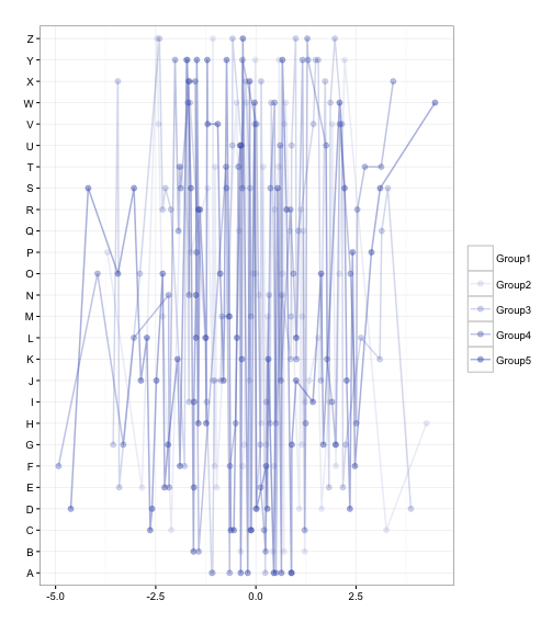
#ラインプロットの作成:mk_lineplotコマンド
LinePlot <- mk_lineplot(TestData)
#内容確認
LinePlot
function (xvar, yvar, fillby = "", xlab = "", ylab = "", main = "",
linew = 0.7, pt_size = 2)
{
if (fillby == "") {
col = cb_color("blue")
p = ggplot2::ggplot(df, ggplot2::aes_string(x = xvar,
y = yvar)) + ggplot2::geom_line(ggplot2::aes(group = 1),
color = col, size = linew) + ggplot2::geom_point(color = col,
size = pt_size)
}
else {
p = ggplot2::ggplot(df, ggplot2::aes_string(x = xvar,
y = yvar, group = fillby, color = fillby)) + ggplot2::geom_line(size = linew) +
ggplot2::geom_point(size = pt_size)
}
p = p + ggplot2::labs(x = xlab, y = ylab, title = main) +
ggplot2::theme_bw() + ggplot2::theme(legend.title = ggplot2::element_blank())
p
}
<environment: 0x114b9ad90>
#プロット
LinePlot("Data2", "Data4", fillby = "Group") +
ggplot2::scale_color_manual(values = alpha("#4b61ba", seq(0, 1, length = 10)))
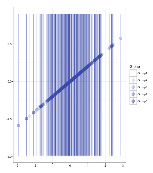
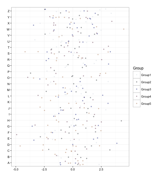
#散布図の作成:mk_scatterplotコマンド
ScatterPlot <- mk_scatterplot(TestData)
#内容確認
ScatterPlot
function (xvar, yvar, fillby = "", xlab = "", ylab = "", main = "",
add_line = F, linew = 1, pt_alpha = 0.5, pt_size = 1)
{
if (fillby == "")
p = ggplot2::ggplot(df, ggplot2::aes_string(x = xvar,
y = yvar)) + ggplot2::geom_jitter(color = cb_color("blue"),
alpha = pt_alpha, size = pt_size)
else p = ggplot2::ggplot(df, ggplot2::aes_string(x = xvar,
y = yvar, color = fillby)) + ggplot2::geom_jitter(alpha = pt_alpha,
size = pt_size)
if (add_line)
p = p + ggplot2::geom_smooth(method = lm, se = F, size = linew)
p = p + ggplot2::labs(x = xlab, y = ylab, title = main) +
ggplot2::theme_bw()
p
}
<environment: 0x10c6a5438>
#プロット
x <- seq(0, 1, length = 10)
ScatterPlot("Data2", "Data4", fillby = "Group") +
ggplot2::scale_color_manual(values = seq_gradient_pal(c("#e1e6ea", "#505457", "#4b61ba", "#a87963",
"#d9bb9c", "#756c6d", "#807765", "#ad8a80"))(x))出力例
・mk_areaplotコマンド
・mk_barplotコマンド
・mk_boxplotコマンド
・mk_distplotコマンド
・mk_heatmapコマンド
・mk_intervalplotコマンド
・mk_lineplotコマンド
・mk_scatterplotコマンド
少しでも、あなたのウェブや実験の解析が楽になりますように!!

スポンサーリンク