「ggplot2」パッケージで複数プロットする時に軸範囲を自動で調整するパッケージの紹介です。単純に並べるだけではなく、周辺のプロットを追加でも調整してくれます。軸のずれに困っている方にピッタリなパッケージです。
パッケージバージョンは0.2.3。実行コマンドはwindows 11のR version 4.3.3で確認しています。
パッケージのインストール
下記コマンドを実行してください。
# パッケージのインストール
install.packages("aplot")
実行コマンド
詳細はコマンド、パッケージのヘルプを確認してください。
# パッケージの読み込み
library("aplot")
###データ例の作成#####
# tidyverseパッケージがなければインストール
if(!require("tidyverse", quietly = TRUE)){
install.packages("tidyverse");require("tidyverse")
}
set.seed(1234)
n <- 100
TestData <- tibble(Group = sample(paste0("Group", 1:4), n,
replace = TRUE),
ID = sample(LETTERS[1:5], n, replace = TRUE),
X_num_Data = sample(c(1:30), n, replace = TRUE),
Y_num_Data = sample(c(51:100), n, replace = TRUE))
########
# プロット例の作成
## BoxPlotの例
ExBoxPlot <- ggplot(TestData, aes(x = X_num_Data,
y = Group,
fill = Group)) +
geom_boxplot(show.legend = FALSE)
## 散布図の例
ExPointPlot <- ggplot(subset(TestData, Group != "Group4"),
aes(x = X_num_Data,
y = Group,
col = Group)) +
geom_point(show.legend = FALSE)
## 密度曲線の例
ExDensity <- ggplot(TestData, aes(x = X_num_Data,
fill = "green")) +
geom_density(show.legend = FALSE)
## ヒートマップの例
ExTile <- ggplot(TestData, aes(x = X_num_Data,
y = Group,
fill = Y_num_Data)) +
geom_tile() +
scale_fill_gradient(low = "#6f74a4", high = "red")
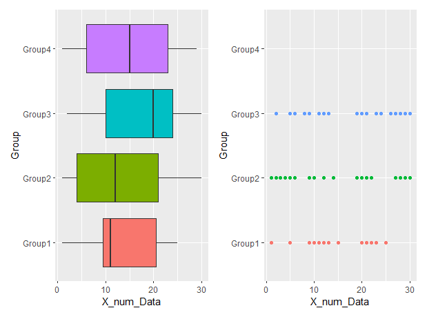
# 普通にプロット:y軸がずれる
ExBoxPlot + ExPointPlot
########
# 基準となるプロットでx/y軸を調整してプロット:xlim2/ylim2コマンド
# 調整したい軸に合わせてxlim2/ylim2コマンドを使い分ける
# 基準となるプロットにコマンドを適応します
# ExBoxPlotにylim2コマンドを適応
TestNewPoint <- ExPointPlot + ylim2(ExBoxPlot)
# 調整してプロット
ExBoxPlot + TestNewPoint
##
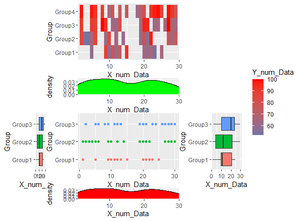
# 周辺にプロット:insert_top/insert_bottom/insert_left/insert_rightコマンド
# 基本となるプロットに「%>%」でつなげる
ExPointPlot %>%
# 塗色を変更
insert_top(ExDensity +
scale_fill_manual(values = "green"),
height = 0.3) %>%
# 塗色を変更
insert_bottom(ExDensity +
scale_fill_manual(values = "red"),
height = 0.2) %>%
insert_left(ExBoxPlot, width = 0.1) %>%
# 重ねてプロットも可能です
insert_top(ExTile, height = 1) %>%
insert_right(ExBoxPlot, width = 0.3)出力例
・基準となるプロットでx/y軸を調整してプロット:xlim2/ylim2コマンド
・周辺にプロット:insert_top/insert_bottom/insert_left/insert_rightコマンド
少しでも、あなたの解析が楽になりますように!!