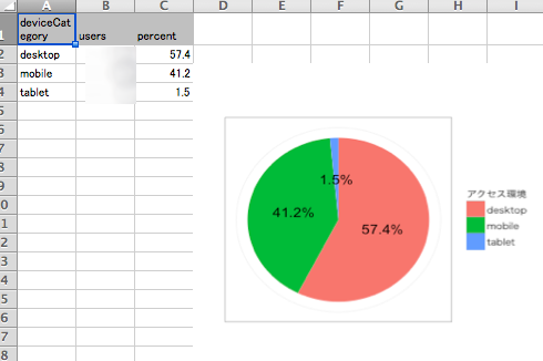
RGoogleAnalyticsパッケージで「訪問者のアクセス環境(デスクトップ,モバイル,タブレット)を取得」するコマンドを紹介します。なお、データを取得するサイトのidとトークンファイルは取得・保存している前提でコマンドを紹介します。
サイトのidとトークンファイルの取得と保存方法は「RでGoogle Analyticsの目次」から「RGoogleAnalyticsパッケージ基本的な利用方法」を確認してください。
また、解析環境が整っていない場合は「解析の準備」の項目を確認してください。初心者でも実行できるようにまとめています。
解析コマンドなどのまとめはこちらから:RでGoogle Analyticsの目次
セッション数(訪問回数)の取得コマンドの紹介
dimensionsに「ga:deviceCategory」を指定します。
実行することで円グラフとデータがエクセルで出力されます。
library("RGoogleAnalytics")
library("XLConnect")
library("tcltk")
library("ggplot2")
TableID <- "ga:データを取得するサイトのidを入力"
#取得パラメータの設定
query.list <- Init(start.date = "2014-08-01",
end.date = "2014-08-31",
dimensions = "ga:deviceCategory",
metrics = "ga:users",
max.results = 10000,
table.id = TableID)
#取得パラメーターを処理
query <- QueryBuilder(query.list)
#データの取得
DeviceCategoryData <- GetReportData(query, oauth_token)
#ユーザー数で並び替え
DeviceCategoryData <- DeviceCategoryData[order(DeviceCategoryData[, 2], decreasing = TRUE), ]
#パーセントのデータを追加
DeviceCategoryData <- cbind(DeviceCategoryData,
percent = round(DeviceCategoryData[, 2] / sum(DeviceCategoryData[, 2], na.rm = TRUE) * 100, 1))
#円グラフを作成
PiePlot <- ggplot(DeviceCategoryData, aes(x = "",
y = DeviceCategoryData[, 2],
fill = DeviceCategoryData[, 1]))
PiePlot <- PiePlot +
geom_bar(width = 1, stat = "identity", show_guide = TRUE) +
geom_text(aes(y = cumsum(DeviceCategoryData[, 2]) - 0.5 * DeviceCategoryData[, 2],
label = paste(DeviceCategoryData[, 3], "%", sep = ""))) +
coord_polar(theta = "y") +
labs(x = "", y = "") +
theme_bw(base_family = ifelse(.Platform[1] == "windows", "", "HiraKakuProN-W3")) +
scale_y_continuous(breaks = NULL) +
scale_x_discrete(breaks = NULL) +
guides(fill = guide_legend(title = "アクセス環境")) +
theme(axis.ticks = element_blank(),
axis.text.x = element_text(size = 8,
angle = 60,
hjust = 1.1,
colour = "grey50"))
#グラフのプロット
#PiePlot
###以下、グラフが貼り付けられたエクセルファイルの出力#####
#保存フォルダの選択
SaveDir <- paste(as.character(tkchooseDirectory(title = "保存ディレクトリを選択"), sep = "", collapse =""))
#ワークブックの作成
wb <- loadWorkbook("アクセスデータ.xlsx", create = TRUE)
#シートの作成
createSheet(wb, name = "アクセスデータ")
#データの書き込み
writeWorksheet(wb, DeviceCategoryData, sheet = "アクセスデータ", startRow = 1, startCol = 1)
#一時フォルダに切り替え
setwd(tempdir())
#グラフファイルの作成
png(filename = "PiePlot.png", width = 350, height = 350)
#出力
print(PiePlot)
dev.off()
#グラフの書き込み
createName(wb, name = "PiePlot", formula = paste("アクセスデータ", idx2cref(c(3, 4)), sep = "!"))
addImage(wb, filename = "PiePlot.png", name = "PiePlot", originalSize = TRUE)
#ファイルの保存
setwd(SaveDir)
saveWorkbook(wb)
########書き出されるエクセル
一部のデータを隠しています。
解析コマンドなどのまとめはこちらから:RでGoogle Analyticsの目次
少しでも、あなたのウェブや実験の解析が楽になりますように!!