「ggplot2」パッケージで箱ひげ図を作成する方法の紹介です。箱ひげ図はBoxplotとも呼ばれ、データ分布を確認するのに大変便利な方法です。基本的な使い方の他にドットプロットを追加するコマンドを紹介します。
「ggplot2」のインストールと読み込み
「tidyverse」をインストールして「ggplot2」パッケージを利用するのが簡単です。
# パッケージのインストール
install.packages("tidyverse")

# パッケージの読み込み
library("tidyverse")
データ例を作成
以下のコマンドを実行してください。
# 例
set.seed(1234)
Box_data <- data.frame(x = sample(LETTERS[c(1, 5, 8)],
                                  size = 100, replace = TRUE),
                       y = sample(1:100, size = 100,
                                  replace = TRUE),
                       Group = sample(LETTERS[2:3],
                                      size = 100,
                                      replace = TRUE))
基本的なプロット
「ggplot」コマンドに「geom_boxplot」コマンドを追加することで作図が可能です。
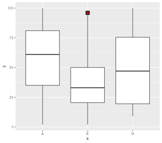
# 設定なしでプロット
ggplot(Box_data, aes(x = x, y = y)) +
  geom_boxplot()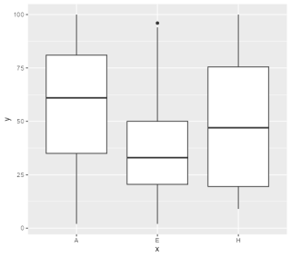
体裁の設定例
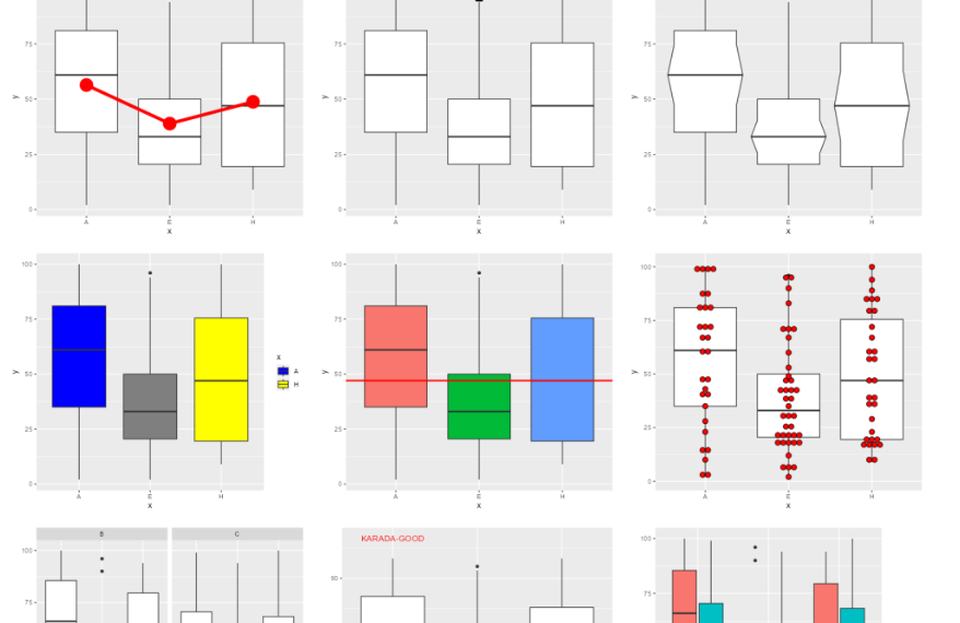
外れ値プロットの書式設定、ノッチの設定、塗色、平均値をプロットし線でつなげる、ドッドプロットを追加するなどの例です。
# 外れ値の書式設定:outlier.XXXXオプション
ggplot(Box_data, aes(x = x, y = y)) +
geom_boxplot(
# シンボル線色;初期値:NULL
outlier.color = "black",
# シンボル塗色;初期値:NULL
outlier.fill = "red",
# シンボル種類;初期値:19
outlier.shape = 22,
# シンボルサイズ;初期値:1.5
outlier.size = 3,
# シンボル線サイズ;初期値:0.5
outlier.stroke = 1.5,
# シンボル塗透明度;初期値:NULL
outlier.alpha = 1)
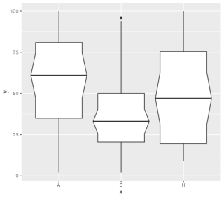
# ノッチを設定する:notchオプション,notchwidthオプション
ggplot(Box_data, aes(x = x, y = y)) +
geom_boxplot(
# ノッチ設定;初期値:FALSE
notch = TRUE,
# ノッチサイズ;初期値:0.5
# 1> notchwidth >0で絞り
# 1< notchwidthで膨張
notchwidth = 1.2)
## 塗色の設定:fillオプション
# xで塗色を分ける
# 凡例の表示設定:show.legendオプション
ggplot(Box_data, aes(x = x, y = y, fill = x)) +
geom_boxplot(show.legend = FALSE)
# groupで塗色を分ける
ggplot(Box_data, aes(x = x, y = y, fill = Group)) +
geom_boxplot()
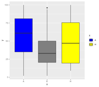
# 好みの色はscale_fill_manualコマンドを使用する
ggplot(Box_data, aes(x = x, y = y, fill = x))+
geom_boxplot() +
scale_fill_manual(values = c("A" = "blue", "H" = "yellow"))
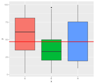
## Y軸の値で参考線を追加する
# geom_hlineコマンドを追加する
ggplot(Box_data, aes(x = x, y = y, fill = x)) +
geom_boxplot(show.legend = FALSE) +
geom_hline(color = "red", alpha = 1,
linewidth = 1,
yintercept = mean(Box_data$y),
show.legend = NA)
## 平均値にシンボルをプロットし線でつなげる
# stat_summaryコマンドを使うのが簡単です
ggplot(Box_data, aes(x = x, y = y)) +
geom_boxplot() +
# 平均値にシンボルをプロット
stat_summary(fun.y = "mean", geom = 'point',
color = "red", shape = 16, size = 8) +
# 平均値を線でつなげる
stat_summary(aes(group = 1),
fun.y = "mean", geom = 'line',
color = "red", size = 2)
## プロットを横方向にする
# coord_flipコマンドを使用します
ggplot(Box_data, aes(x = x, y = y)) +
geom_boxplot() +
# 平均値にシンボルをプロット
stat_summary(fun.y = "mean", geom = 'point',
color = "red", shape = 16, size = 8) +
# 平均値を線でつなげる
stat_summary(aes(group = 1),
fun.y = "mean", geom = 'line',
color = "red", size = 2) +
# 横方向にする
coord_flip()
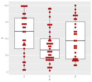
## ドットプロットを追加する
# geom_dotplot()コマンドを使用します
ggplot(Box_data, aes(x = x, y = y)) +
geom_boxplot() +
# 平均値にシンボルをプロット
geom_dotplot(binaxis = "y", stackdir = "center",
binwidth = 2.5, fill = "red")
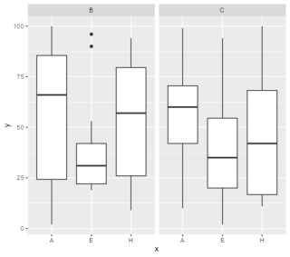
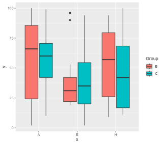
## グループに分けてプロット
# fillにグループを設定する
ggplot(Box_data, aes(x = x, y = y, fill = Group)) +
geom_boxplot()
# facet_wrapコマンドを使用する
ggplot(Box_data, aes(x = x, y = y)) +
geom_boxplot() +
facet_wrap(~Group)
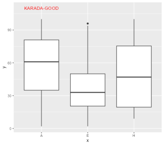
## テキストを追加する
# coord_flipコマンドを使用します
ggplot(Box_data, aes(x = x, y = y)) +
geom_boxplot() +
annotate("text", x = 1, y = 110,
label = "KARADA-GOOD", color = "red")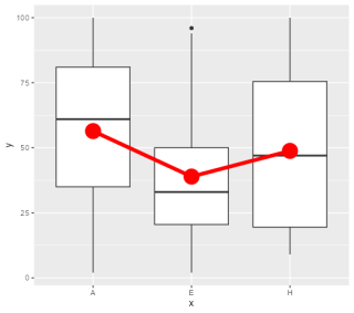
少しでも、あなたの解析に役に立ちますように!