棒の長さで数量の大小を表す、棒グラフの作成コマンド「geom_col」の紹介です。数量は最大値、最小値、平均値、中央値などがあります。ですので、場合によっては元データから計算する必要がありますので注意が必要です。
また、エラーバーとして標準誤差(standard error)を使用することがあります。「ggplot2」パッケージには平均、平均+標準誤差、平均-標準誤差を算出する「mean_se」コマンドが収録されているので利用してはいかがでしょうか。
「ggplot2」のインストールと読み込み
「tidyverse」をインストールして「ggplot2」パッケージを利用するのが便利です。
# パッケージのインストール
install.packages("tidyverse")

# パッケージの読み込み
library("tidyverse")
対象データ
下記のような、データが対象データです。「dplyr::group_by」コマンドでグループ化、「dplyr::summarise_all」コマンドで平均値、標準偏差を求めています。
## 対象データ
# 一変量_X or Y:No
# 二変量_X and Y:Yes
# 文字:Yes
# 数字:Yes
# 例
set.seed(1234)
Col_data <- data.frame(x = sample(LETTERS[c(1, 5, 8)],
size = 100, replace = TRUE),
y = sample(c(1, 3, 6), size = 100,
replace = TRUE),
Group = sample(LETTERS[2:3],
size = 100,
replace = TRUE)) %>%
group_by(Group, x) %>%
summarise_all(list(mean = mean, sd = sd,
# 平均と標準誤差算出に便利な「mean_se」コマンド
se = ggplot2::mean_se))
# 以下「mean_se」コマンドと同じ
#summarise_all(list(mean = mean, sd = sd,
# 標準誤差を計算
# se = function(.) sd(.)/sqrt(length(.)))) %>%
# 平均±標準誤差を計算
# mutate(ymin = mean - se,
# ymax = mean + se)基本的なプロット
ggplot(Col_data, aes(x = x, y = mean)) +
  geom_col()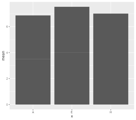
体裁の設定例
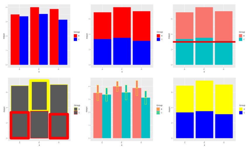
枠線色、塗色、積み上げ・グループ毎に横並びなどの表現方法の設定例です。
## 枠色の設定:colorオプション
# 各項目のみの塗分けはGroupオプションを使用しない
ggplot(Col_data, aes(x = x, y = mean,
color = Group,
Group = Group)) +
geom_col()
# 好みの色はscale_color_manualコマンドを使用する
ggplot(Col_data, aes(x = x, y = mean,
color = Group,
Group = Group)) +
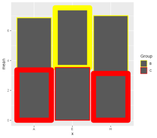
geom_col(linewidth = rep(c(1, 6), time = 3)) +
scale_color_manual(values = c("C" = "red", "B" = "yellow"))
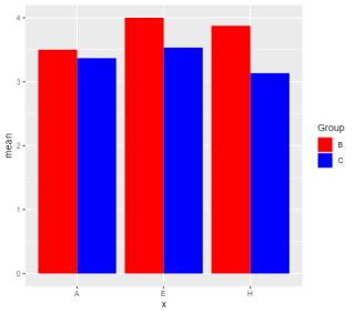
## 塗色の設定:fillオプション
# 各項目のみの塗分けはGroupオプションを使用しない
ggplot(Col_data, aes(x = x, y = mean,
fill = Group,
Group = Group))+
geom_col()
# 好みの色はscale_fill_manualコマンドを使用する
ggplot(Col_data, aes(x = x, y = mean,
fill = Group,
Group = Group))+
geom_col() +
scale_fill_manual(values = c("C" = "blue", "B" = "yellow"))
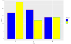
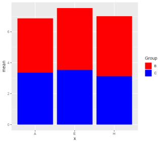
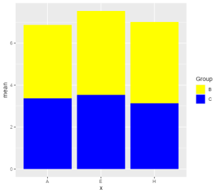
## 表現方法:positionオプション
# "dodge","dodge2","stack"
ggplot(Col_data, aes(x = x, y = mean, fill = Group)) +
geom_col(position = position_stack(reverse = TRUE)) +
scale_fill_manual(values = c("C" = "blue", "B" = "red"))
ggplot(Col_data, aes(x = x, y = mean, fill = Group)) +
geom_col(position = "dodge") +
scale_fill_manual(values = c("C" = "blue", "B" = "red"))
ggplot(Col_data, aes(x = x, y = mean, fill = Group)) +
geom_col(position = "dodge2") +
scale_fill_manual(values = c("C" = "blue", "B" = "red"))
ggplot(Col_data, aes(x = x, y = mean, fill = Group)) +
geom_col(position = "stack") +
scale_fill_manual(values = c("C" = "blue", "B" = "red"))
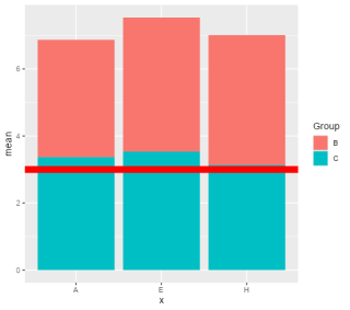
## Y軸の値で参考線を追加する
# geom_hlineコマンドを追加する
ggplot(Col_data, aes(x = x, y = mean, fill = Group)) +
geom_col() +
geom_hline(color = "red", linewidth = mean(Col_data$mean),
yintercept = 3,
show.legend = NA) エラーバーを付けるいくつかの方法
## エラーバーを付けるいくつかの方法
# グループ分類時のポイントはposition_XXXXXコマンドを利用する
# geom_pointrangeコマンド
ggplot(Col_data, aes(x = x, y = mean, fill = Group)) +
geom_col(position = "dodge2") +
geom_pointrange(aes(ymin = mean - sd,
ymax = mean + sd),
position = position_dodge2(width = 0.9),
colour = "red")
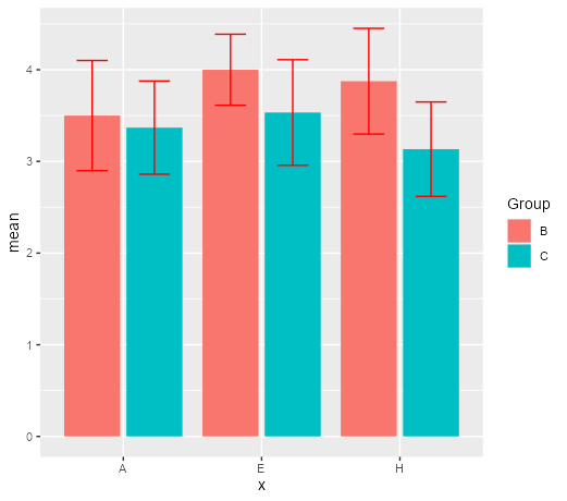
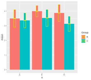
# geom_errorbarコマンド
ggplot(Col_data, aes(x = x, y = mean, fill = Group)) +
geom_col(position = "dodge2") +
geom_errorbar(aes(ymin = se$ymin,
ymax = se$ymax),
position = position_dodge2(width = 0.9,
padding = 0.5),
colour = "red")
# geom_crossbarコマンド
ggplot(Col_data, aes(x = x, y = mean, fill = Group)) +
geom_col(position = position_dodge(width = 0.9)) +
geom_crossbar(aes(ymin = se$ymin,
ymax = se$ymax),
position = position_dodge2(padding = 1.2),
fatten = 2.5, colour = "yellow")
# geom_linerangeコマンド
ggplot(Col_data, aes(x = x, y = mean, fill = Group)) +
geom_col(position = position_dodge(width = 0.9)) +
geom_linerange(aes(ymin = mean - sd,
ymax = mean + sd),
position = position_dodge2(width = 0.9),
colour = "red")作図例
・表現方法:positionオプション:geom_col(position = “dodge2”)

・エラーバーを付けるいくつかの方法:geom_errorbarコマンド
・その他、コマンド実行で作成できる棒グラフ
少しでも、あなたの解析に役に立ちますように!