 からだにいいもの
 Analyze in R: Heatmap your calendar! The “openair” package
The “calendarPlot” command included in this package can easily heat map your calendar.
It may be interesting to plot readily available temperature and precipitation data on a calendar.
Package version is 2.14. Checked with R version 4.2.2.
<おすすめのRに関する書籍です>
Rグラフィックスクックブック 第2版 ―ggplot2によるグラフ作成のレシピ集 | Winston Chang, 石井弓美子, 河内崇
ggplot2でのグラフ作成をレシピ形式でまとめた一冊。この図をどう描くか、という引き方ができる。
Install Package
Run the following command.
#Install Package
install.packages("openair")
スポンサーリンク
Examples
See the command and package help for details.
#Loading the library
library("openair")

###Creating Data#####
#Install the lubridate package if it is not already present
if(!require("lubridate", quietly = TRUE)){
  install.packages("lubridate");require("lubridate")
}
#Install the tidyverse package if it is not already present
if(!require("tidyverse", quietly = TRUE)){
  install.packages("tidyverse");require("tidyverse")
}

set.seed(1234)
n <- 30
TestData <- tibble(date = seq(lubridate::ymd("2022-12-01", locale = "C",
                                             tz = "Asia/Tokyo"),
                              by = "1 day", length.out = n),
                   Data = sample(1:30, n, replace = TRUE))
########

#Convert date to Date class
TestData[, 1] <- as.Date(TestData[, 1], tz = "Japan")
#Plot
calendarPlot(TestData, pollutant = "Data",
             annotate = "date",
             day = "weekend",
             cols = c("#4b61ba", "#a87963"),
             main = "からだにいいもの")
Output Example
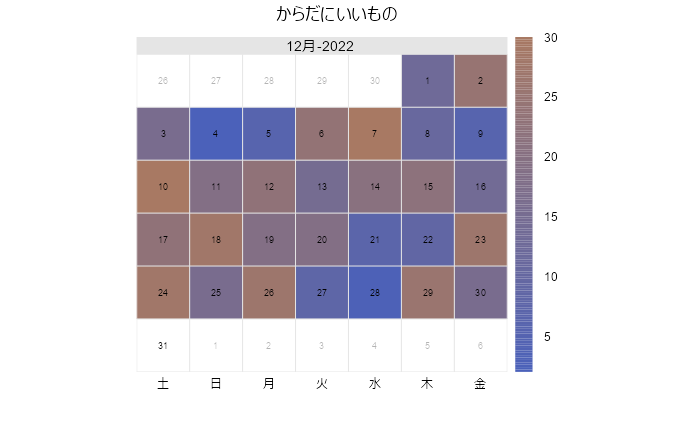
I hope this makes your analysis a little easier !!

スポンサーリンク