 からだにいいもの
 Rで解析:ggplot2の周囲にグラフの追加が簡単です!!「ggside」パッケージ
ggplot2の周囲にグラフの追加が簡単なパッケージの紹介です。非常に使い方が簡単です。追加可能なグラフのコマンドは
「geom_*freqpoly」、「geom_*sidebar」、「geom_*sideboxplot」、「geom_*sidedensity」、「geom_*sidehistogram」、「geom_*sideline」、「geom_*sidepoint」、「geom_*sidetile」、「geom_*sideviolin」
などです。なお、*には「xまたはy」が入ります。また、グラフを「facet_grid」コマンドで分割すると各周辺のグラフも分割されてしまいます。しかし、本パッケージに収録されている「ggside」コマンドを利用するとグラフの分割を調整することが可能です。大変便利な機能だと思います。
パッケージバージョンは0.2.1。実行コマンドはwindows 11のR version 4.2.1で確認しています。
<おすすめのRに関する書籍です>

Rによるデータサイエンス(第2版):データ解析の基礎から最新手法まで | 金明哲
主成分分析やクラスター分析から、サポートベクターマシン・ニューラルネットワーク・生存分析まで、幅広い手法をRで一望できる。
パッケージのインストール
下記、コマンドを実行してください。
#パッケージのインストール
install.packages("ggside")
スポンサーリンク
実行コマンド
詳細はコメント、パッケージのヘルプを確認してください。
#パッケージの読み込み
library("ggside")

###データ例の作成#####
#tidyverseパッケージがなければインストール
if(!require("tidyverse", quietly = TRUE)){
  install.packages("tidyverse");require("tidyverse")
}
set.seed(1234)
n <- 100
TestData <- tibble(Group = sample(paste0("Group", 1:5), n, replace = TRUE),
                   Char_Data = sample(LETTERS, n, replace = TRUE),
                   X_Data = sample(c(1:50), n, replace = TRUE),
                   Y_Data = sample(c(51:100), n, replace = TRUE)) %>%
  arrange(Group, Char_Data)
########

###HeatMapにデータを追加する#####
#データの準備
HeatData <- TestData %>%
  group_by(Group, Char_Data) %>%
  summarise(X_Data_Mean = mean(X_Data), .groups = "drop") %>%
  group_by(Char_Data) %>%
  mutate(Char_Mean = mean(X_Data_Mean), .keep = "all") %>%

#基本プロットの作成:ggplot2::geom_tileコマンド
ggplot(HeatData, aes(x = Group, y = Char_Data)) +
  geom_tile(aes(fill = X_Data_Mean)) +
  scale_fill_viridis_b() -> HeatPlot
#確認
HeatPlot

###HeatPlotオブジェクトにグラフを追加###
HeatPlot +
  #x軸側上部にBoxPlotを追加:geom_xsideboxplotコマンド
  #塗色:xfillオプション;fillではない
  geom_xsideboxplot(aes(x = Group, y = X_Data_Mean,
                        xfill = Group), show.legend = FALSE) +

  #BoxPlotのy軸を調整:scale_xsidey_continuousコマンド
  scale_xsidey_continuous(minor_breaks = NULL, limits = c(0,NA)) +

  #y軸側右側にHeatMapを追加:geom_ysidetileコマンド
  #塗色:yfillオプション;fillではない
  geom_ysidetile(aes(x = "mean", yfill = Char_Mean)) +

  #y軸側のHeatMapの色を設定:scale_yfill_gradientコマンド
  #その他色の設定コマンドは?"scale_xcolour"で確認してください
  scale_yfill_gradient(low ="#FFFFFF", high = "#0000FF") +

  #テーマで体裁を調整
  #その他体裁コマンドは?"ggside-theme"で確認してください
  theme(
    #パネルサイズを調整:ggside.panel.scaleコマンド
    #例ではx軸のBoxPlot
    #末尾の".x"を取り除くと両軸,".y"でy軸HeatMapサイズ
    ggside.panel.scale.x = 0.3,

    #各パネル枠線色:ggside.panel.borderコマンド
    ggside.panel.border = element_rect(fill = NA,
                                       colour = "red", size = 1),

    #各パネルのメモリ線:ggside.panel.gridコマンド;その他に
    #ggside.panel.grid.major,ggside.panel.grid.minor,
    #ggside.panel.grid.major.x,ggside.panel.grid.major.y,
    #ggside.panel.grid.minor.x, ggside.panel.grid.minor.y
    ggside.panel.grid = element_line(colour = "black", size = .1,
                                     linetype = "dotted"),

    #各パネル背景色:ggside.panel.backgroundコマンド
    ggside.panel.background = element_blank(),

    #以下ggplot2の基本コマンド
    panel.background = element_rect(fill = "grey20"),
    panel.grid.major = element_line(colour = NA)
    )
########

###PointPlotに密度分布とBoxPlotを追加#####
ggplot(TestData, aes(X_Data, Y_Data, fill = Group)) +
  geom_point(aes(color = Group)) +
  geom_xsidedensity(alpha = 0.5, position = "stack") +
  geom_ysideboxplot(aes(x = Group), orientation = "x") +
  scale_ysidex_discrete(guide = guide_axis(angle = 30)) +
  theme(ggside.panel.scale = 0.5,
        ggside.panel.border = element_rect(fill = NA,
                                           colour = "red",
                                           size = 0.5,
                                           linetype = "dotted"),
        ggside.panel.background = element_blank()) -> PointTest
#確認
PointTest

###上記グラフを「facet_grid」コマンドを適応し「ggside」コマンドでx側のグラフを集約#####
PointTest +
  facet_grid(.~Group) +
  #各パネルの位置,集約などを設定:ggsideコマンド
  #各パネルの集約:collapseオプション
  #"all"でx,y軸
  ggside(collapse = "y")
出力例
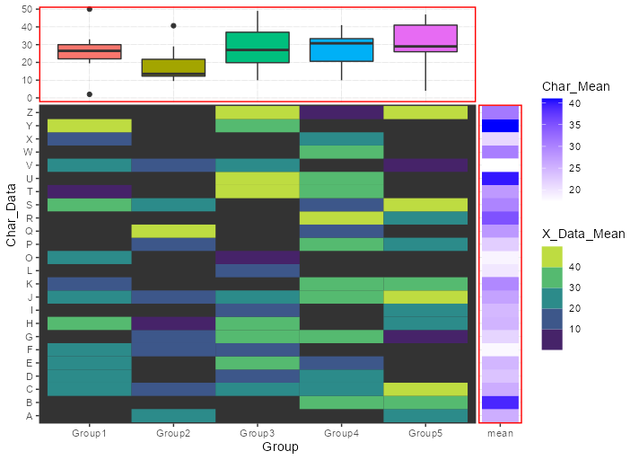
・HeatPlotオブジェクトにグラフを追加
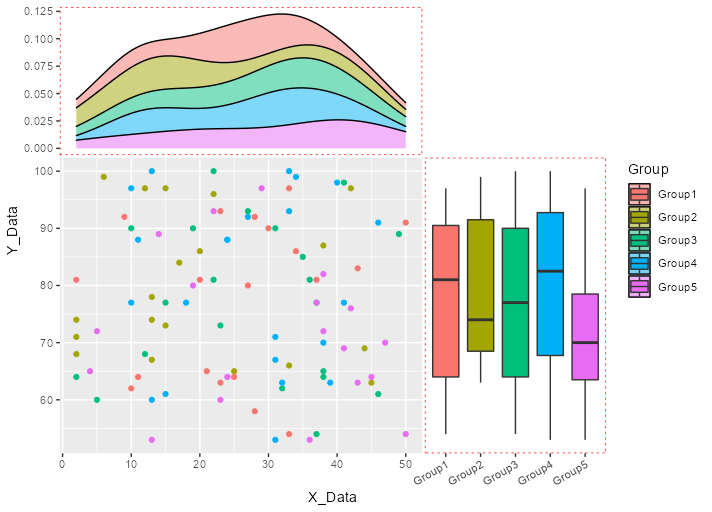
・PointPlotに密度分布とBoxPlotを追加
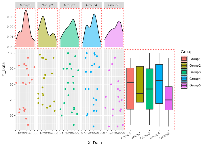
・上記グラフを「facet_grid」コマンドを適応し「ggside」コマンドでx側のグラフを集約
少しでも、あなたの解析が楽になりますように!!


スポンサーリンク