 からだにいいもの
 Rで解析:グラフに表や図を挿入する「ggpp」パッケージ
散布図や箱ひげ図に、集計表や拡大図を追加すると、図の内容が伝わりやすくなる場合があります。しかし、ggplot2 だけで挿入図を思いどおりの位置へ配置するには手間がかかります。「ggpp」パッケージは、表やプロット、図形をグラフ内へ座標を指定して挿入できるパッケージです。データ座標で位置を決めるコマンドに加え、描画領域を 0 から 1 で表す npc 座標に対応したコマンドが収録されています。また、元の位置と移動後の位置を線分や矢印で結ぶラベル配置や、ドッジと組み合わせた位置調整も可能です。本パッケージの利用で、注釈や補足情報を含んだ図を、意図した体裁で作成できるのではないかと考えます。
パッケージバージョンは0.6.1。Windows 11 x64 (build 26200)のR version 4.6.1で確認しています。
<おすすめのRに関する書籍です>
![Rで楽しむベイズ統計入門[しくみから理解するベイズ推定の基礎] Data Science Library](https://m.media-amazon.com/images/I/519e2geAM2L._SL500_.jpg)
 www.amazon.co.jp
パッケージのインストール
下記コマンドを実行してください。
# パッケージのインストール
install.packages("ggpp")

# パッケージの読み込み
library("ggpp")

# コマンド例の実行で必要なパッケージを読み込み
# install.packages("tidyverse")
library("tidyverse")記事で使用するデータの作成
以降のコマンド例は、すべて下記のデータを使用します。
# 図全体の体裁を白背景に設定
theme_set(theme_bw())

# 野菜15品目の栄養価を模した架空のデータを作成
yasai <- data.frame(
  # 品目名
  name = c("にんじん", "だいこん", "ごぼう", "れんこん", "たまねぎ",
           "ほうれんそう", "キャベツ", "こまつな", "はくさい", "しゅんぎく",
           "トマト", "かぼちゃ", "ピーマン", "なす", "きゅうり"),
  # 分類(並び順を固定するため因子として作成)
  type = factor(rep(c("根菜", "葉菜", "果菜"), each = 5),
                levels = c("根菜", "葉菜", "果菜")),
  # 食物繊維量(g/100 g)
  fiber = c(2.8, 1.4, 5.7, 2.0, 1.5,
            2.8, 1.8, 1.9, 1.3, 3.2,
            1.0, 3.5, 2.3, 2.2, 1.1),
  # エネルギー(kcal/100 g)
  energy = c(35, 15, 58, 66, 33,
             20, 21, 13, 13, 20,
             20, 78, 20, 18, 13)
)

# 以降の作図で土台として使う散布図を作成
p <- ggplot(yasai, aes(x = fiber, y = energy)) +
  geom_point(size = 3) +
  labs(x = "食物繊維量(g/100 g)", y = "エネルギー(kcal/100 g)")

# 出荷量の前年からの増減を模した架空のデータを作成
shukka <- data.frame(
  # 増減量(t)で、マイナスは前年割れを表す
  diff = c(12, 5, -8, 20, -3),
  # 地域区分
  area = c("道央", "道央", "道南", "道北", "道南"),
  # 品目名
  item = c("だいこん", "にんじん", "かぼちゃ", "たまねぎ", "ブロッコリー")
)
コマンド例
詳細はコメント、パッケージのヘルプを確認してください。
図の任意の位置に文字・表・図形を注釈として追加する:annotateコマンド
| オプション | 意味 | 初期値 |
|---|---|---|
| geom | 注釈に使うジオメトリ名を文字列で指定する | なし |
| x | 注釈を置く横方向の位置で、位置を指定する引数から少なくとも1つの指定が必要 | NULL |
| y | 注釈を置く縦方向の位置 | NULL |
| xmin | 矩形などの左端となる位置 | NULL |
| xmax | 矩形などの右端となる位置 | NULL |
| ymin | 矩形などの下端となる位置 | NULL |
| ymax | 矩形などの上端となる位置 | NULL |
| xend | 線分の終点となる横方向の位置 | NULL |
| yend | 線分の終点となる縦方向の位置 | NULL |
| npcx | 描画領域の幅を0〜1で表したときの横方向の位置 | NULL |
| npcy | 描画領域の高さを0〜1で表したときの縦方向の位置 | NULL |
| label | 文字列、データフレーム、ggplot オブジェクト、または grob を指定する | NULL |
| … | layer() に渡すその他の名前付き引数で、colourやsizeなどを固定値で指定できる | なし |
| na.rm | FALSE で欠損値を警告付きで除去し、TRUE で警告なしに除去する | FALSE |
# 散布図の空きスペースに文字の注釈を追加
p + annotate("text", x = 4.2, y = 72, size = 8,
             label = "からだにいいもの", colour = "red")

# 2か所に背景付きのラベルを追加
p + annotate("label", x = c(1.4, 5.2), y = c(70, 20),
             size = 5, label = c("繊維少なめ", "繊維多め"))

# 分類ごとの品目数をまとめた表を注釈として追加
p + annotate("table", x = 5.7, y = 78, size = 4, colour = "red",
             label = data.frame(分類 = c("根菜", "葉菜", "果菜"),
                                品目数 = c(5, 5, 5)))

# 全体を縮小した図を図中へ挿入
p + annotate("plot", x = 5.0, y = 70,
             label = p + theme_bw(9))

# 低エネルギーかつ低繊維の範囲を矩形で塗り分け
p + annotate("rect", xmin = 1.0, xmax = 2.5, ymin = 10, ymax = 25, alpha = 0.2)

# 2点の間を線分で結ぶ
p + annotate("segment", x = 2.0, xend = 5.0, y = 20, yend = 60, colour = "blue")

# エネルギーの中央値と範囲をポイントレンジで示す
p + annotate("pointrange", x = 2.3, y = 20, ymin = 13, ymax = 78,
             colour = "red", size = 1.2)

# 以下は npc 座標(描画領域を 0〜1 で表す座標)で位置を指定
# npc 座標を数値で指定して左下と右上にラベルを配置
p + annotate("label_npc", npcx = c(0.05, 0.95), npcy = c(0.05, 0.95),
             label = c("左下", "右上"))

# npc 座標を数値で指定して文字を配置
p + annotate("text_npc", npcx = 0.9, npcy = 0.9, label = "架空のデータ")

# npc 座標を文字列で指定して文字を配置
p + annotate("text_npc", npcx = "right", npcy = "bottom", label = "架空のデータ")

# npc 座標を指定して表を配置
p + annotate("table_npc", npcx = 0.05, npcy = 0.95,
             label = data.frame(分類 = c("根菜", "葉菜", "果菜"),
                                品目数 = c(5, 5, 5)))

# npc 座標を指定して図中へ図を挿入
p + annotate("plot_npc", npcx = 1, npcy = 1,
             label = p + theme_bw(9))

# 左下と右上の2か所へ、表示サイズを指定して図を挿入
p + annotate("plot_npc", npcx = c(0, 1), npcy = c(0, 1),
             label = list(p + theme_bw(9), p + theme_grey(9)),
             vp.width = 0.3, vp.height = 0.4)
棒グラフのラベルを振り分けて重なりを防ぐ:position_dodgenudgeコマンド
| オプション | 意味 | 初期値 |
|---|---|---|
| width | ドッジ(横ずらし)の幅で、個々の要素の幅と変えたいときに指定する | 1 |
| preserve | 全要素の合計幅を保持するか、単一要素の幅を保持するかを指定する | c(“total”, “single”) |
| reverse | TRUE で既定の積み重ね順序を逆にする | FALSE |
| x | 水平方向に移動させる量 | 0 |
| y | 垂直方向に移動させる量 | 0 |
| direction | “none”、”split”、”split.x”、”split.y”、”center” のいずれかを指定する | c(“none”, “split”, “split.x”, “split.y”, “center”) |
| kept.origin | “dodged”、”original”、”none” のいずれかを指定する | c(“dodged”, “original”, “none”) |
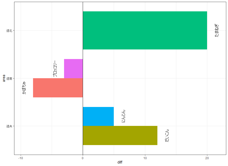
# 横棒グラフのラベルを 0 を境に左右へ振り分けて配置
ggplot(data = shukka, aes(diff, area, group = item)) +
  geom_col(aes(fill = item), width = 0.8,
           position = position_dodge()) +
  geom_vline(xintercept = 0) +
  geom_text(aes(label = item),
            position = position_dodgenudge(x = 1.5,
                                           direction = "split",
                                           width = 0.8),
            angle = 90, size = 4) +
  theme(legend.position = "none")

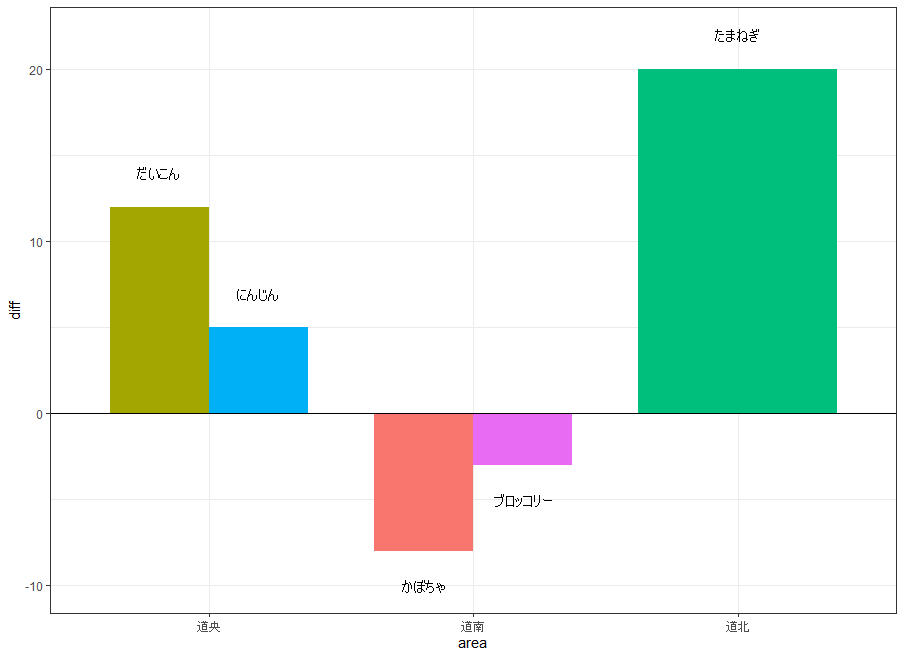
# 縦棒グラフのラベルを 0 を境に上下へ振り分けて配置
ggplot(data = shukka, aes(area, diff, group = item)) +
  geom_col(aes(fill = item), width = 0.75,
           position = position_dodge(width = 0.75)) +
  geom_hline(yintercept = 0) +
  geom_text(aes(label = item),
            position = position_dodgenudge(y = 2,
                                           direction = "split",
                                           width = 0.75),
            size = 4) +
  theme(legend.position = "none")
・横棒グラフのラベルを 0 を境に左右へ振り分けて配置
・縦棒グラフのラベルを 0 を境に上下へ振り分けて配置
データ座標を指定して図形を重ねる:geom_grobコマンド
| オプション | 意味 | 初期値 |
|---|---|---|
| mapping | レイヤー単位でプロットの既定を上書きするときに設定するaes()での指定 | NULL |
| data | レイヤー固有のデータセットを指定する | NULL |
| stat | このレイヤーに適用する統計変換を文字列で指定する | “identity” |
| position | 位置補正を文字列または関数の結果で指定する | “identity” |
| … | layer() に渡すその他の引数で、colourやsizeなどを固定値で指定できる | なし |
| nudge_x | ラベルの開始位置を水平方向にずらす量(単位は軸のデータ単位と同じ) | 0 |
| nudge_y | ラベルの開始位置を垂直方向にずらす量(単位は軸のデータ単位と同じ) | 0 |
| default.colour | aes()のcolourで色が指定されない要素に使う色 | NULL |
| default.color | aes()のcolorで色が指定されない要素に使う色 | default.colour |
| colour.target | 色を適用する対象を指定する文字列ベクトル(all/text/box/segment/none) | “segment” |
| color.target | 色を適用する対象を指定する文字列ベクトル(all/text/box/segment/none) | colour.target |
| default.alpha | aes()のalphaで透過度が指定されない要素に使う透過度(0〜1) | 1 |
| alpha.target | 透過度を適用する対象を指定する文字列ベクトル(all/text/segment/box/box.line/box.fill/none) | “segment” |
| add.segments | 元の位置とずらした位置の間に線や矢印を表示するかを指定する論理値 | TRUE |
| box.padding | 各セグメントの両端を短縮する長さ(mm) | 0.25 |
| point.padding | 各セグメントの両端を短縮する長さ(mm) | 1e-06 |
| segment.linewidth | セグメントまたは矢印の幅(mm)を指定する | 0.5 |
| min.segment.length | この長さより短いセグメントは描画しない(mm) | 0 |
| arrow | grid::arrow() で作成する矢じりの指定 | NULL |
| na.rm | FALSE で欠損値を警告付きで除去し、TRUE で警告なしに除去する | FALSE |
| show.legend | このレイヤーを凡例に含めるかを指定する論理値 | FALSE |
| inherit.aes | FALSE で全体のaes()の指定を継承せず上書きする | FALSE |
# 図中へ挿入する図形(grob)と配置座標を格納したデータフレームを作成
zukei <- tibble(
  # 図形を置く食物繊維量の位置
  x = c(1.4, 5.2),
  # 図形を置くエネルギーの位置
  y = c(70, 25),
  # 黄色の円と緑色の四角を作成
  grob = list(grid::circleGrob(r = 0.3,
                               gp = grid::gpar(fill = "#FFD24D", col = NA)),
              grid::rectGrob(width = 0.6, height = 0.6,
                             gp = grid::gpar(fill = "#8CC63F", col = NA)))
)

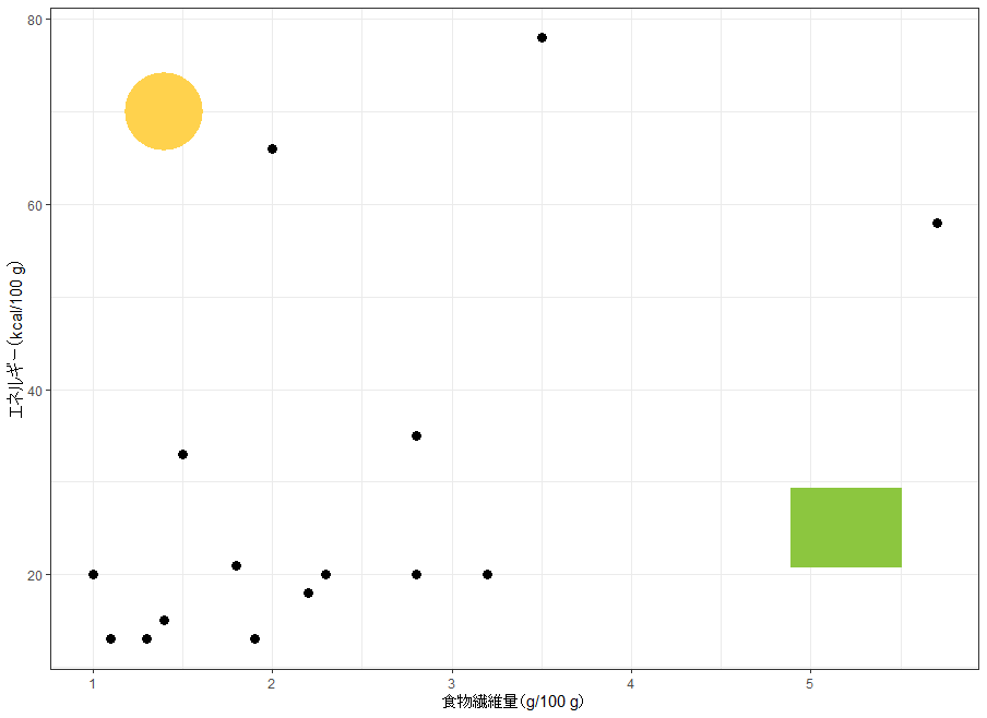
# 位置をずらさない場合は移動線がプロットされない
p + geom_grob(data = zukei,
              aes(x, y, label = grob))

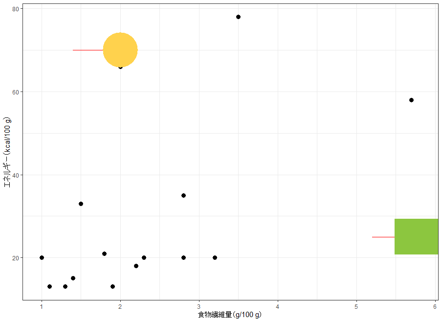
# 位置を右へずらすと、元の位置との間に移動線がプロットされる
p + geom_grob(data = zukei,
              aes(x, y, label = grob),
              nudge_x = 0.6,
              colour = "red",
              hjust = 0.5,
              vjust = 0.5)

# 移動線へ色を適用しない(colour.target = "none")
p + geom_grob(data = zukei,
              aes(x, y, label = grob),
              nudge_x = 0.6,
              colour = "red",
              colour.target = "none",
              hjust = 0.5,
              vjust = 0.5)

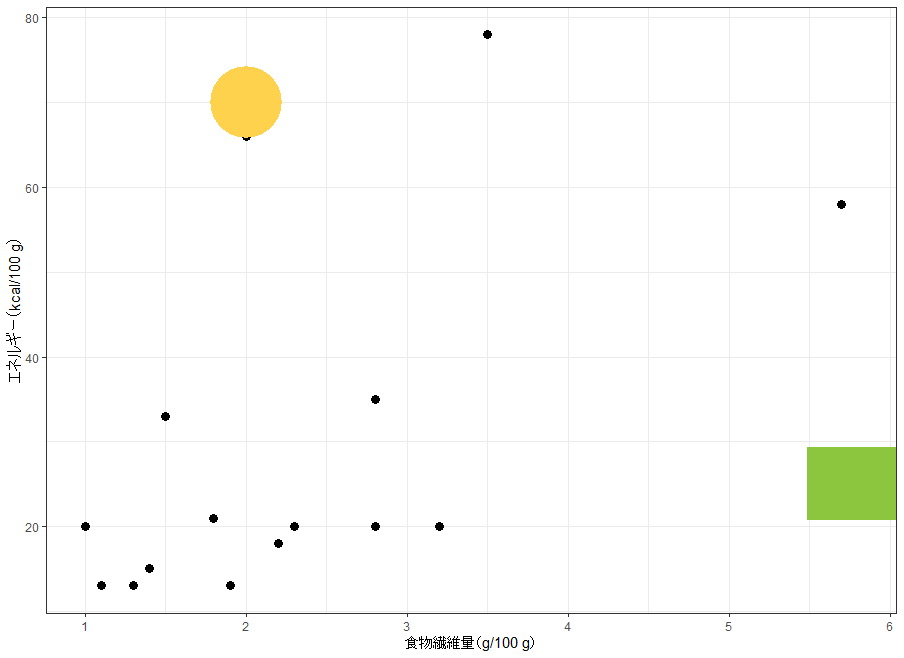
# 位置をずらしても移動線をプロットしない(add.segments = FALSE)
p + geom_grob(data = zukei,
              aes(x, y, label = grob),
              add.segments = FALSE,
              nudge_x = 0.6,
              hjust = 0.5,
              vjust = 0.5)
・位置をずらさない場合は移動線がプロットされない
・位置を右へずらすと、元の位置との間に移動線がプロットされる
・移動線へ色を適用しない(colour.target = “none”)
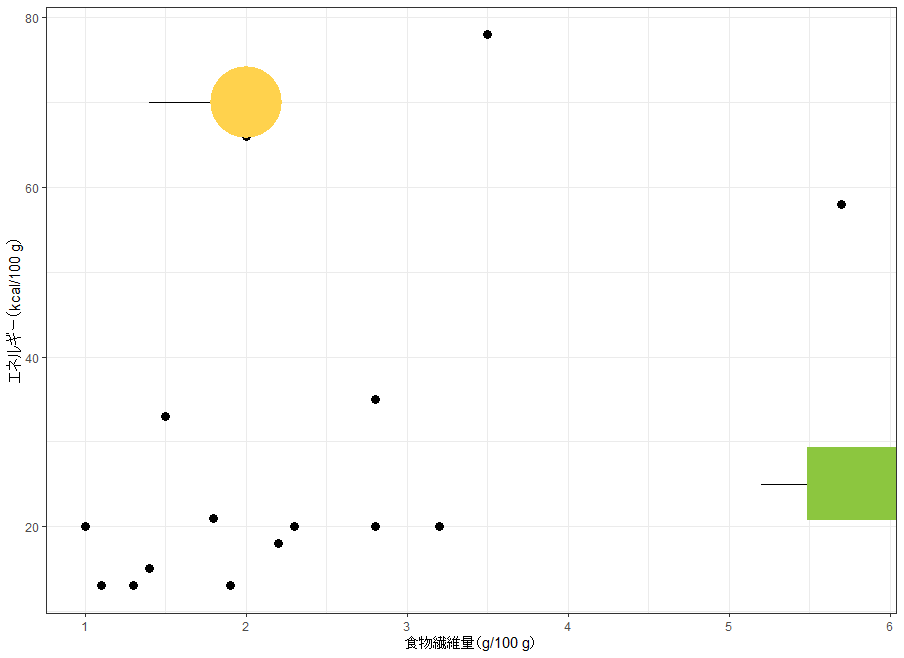
・位置をずらしても移動線をプロットしない(add.segments = FALSE)
<おすすめのRに関する書籍です>
 www.amazon.co.jp
主図の一部を拡大した図を挿入する:geom_plotコマンド
| オプション | 意味 | 初期値 |
|---|---|---|
| mapping | レイヤー単位でプロットの既定を上書きするときに設定するaes()での指定 | NULL |
| data | レイヤー固有のデータセットを指定する | NULL |
| stat | このレイヤーに適用する統計変換を文字列で指定する | “identity” |
| position | 位置補正を文字列または関数の結果で指定する | “identity” |
| … | layer() に渡すその他の引数で、colourやsizeなどを固定値で指定できる | なし |
| nudge_x | ラベルの開始位置を水平方向にずらす量(単位は軸のデータ単位と同じ) | 0 |
| nudge_y | ラベルの開始位置を垂直方向にずらす量(単位は軸のデータ単位と同じ) | 0 |
| default.colour | aes()のcolourで色が指定されない要素に使う色 | NULL |
| default.color | aes()のcolorで色が指定されない要素に使う色 | default.colour |
| colour.target | 色を適用する対象を指定する文字列ベクトル(all/text/box/segment) | “box” |
| color.target | 色を適用する対象を指定する文字列ベクトル(all/text/box/segment) | colour.target |
| default.alpha | aes()のalphaで透過度が指定されない要素に使う透過度(0〜1) | 1 |
| alpha.target | 透過度を適用する対象を指定する文字列ベクトル(all/text/segment/box/box.line/box.fill) | “all” |
| add.segments | 元の位置とずらした位置の間に線や矢印を表示するかを指定する論理値 | TRUE |
| box.padding | 各セグメントの両端を短縮する長さ(mm) | 0.25 |
| point.padding | 各セグメントの両端を短縮する長さ(mm) | 1e-06 |
| segment.linewidth | セグメントまたは矢印の幅(mm)を指定する | 0.5 |
| min.segment.length | この長さより短いセグメントは描画しない(mm) | 0 |
| arrow | grid::arrow() で作成する矢じりの指定 | NULL |
| na.rm | FALSE で欠損値を警告付きで除去し、TRUE で警告なしに除去する | FALSE |
| show.legend | このレイヤーを凡例に含めるかを指定する論理値 | FALSE |
| inherit.aes | FALSE で全体のaes()の指定を継承せず上書きする | FALSE |
# 点が密集する低エネルギー帯を切り出した拡大図を作成
p.zoom <- p +
  coord_cartesian(xlim = c(1.0, 2.5), ylim = c(10, 25)) +
  labs(x = NULL, y = NULL) +
  theme_bw(9)

# 拡大図と npc 座標での配置位置を格納したデータフレームを作成
zoom.npc <- tibble(x = 0.95, y = 0.95, plot = list(p.zoom))

# npc 座標を使って拡大図を右上へ配置
p +
  geom_plot_npc(data = zoom.npc,
                aes(npcx = x, npcy = y, label = plot))

# 拡大図の表示サイズをaes()の中で指定
p +
  geom_plot_npc(data = zoom.npc,
                aes(npcx = x, npcy = y, label = plot,
                    vp.width = 1/2, vp.height = 1/4))

# 拡大図の表示サイズを引数で指定
p +
  geom_plot_npc(data = zoom.npc,
                aes(npcx = x, npcy = y, label = plot),
                vp.width = 1/4, vp.height = 1/4)

# 拡大図とデータ座標での配置位置を格納したデータフレームを作成
zoom.data <- tibble(x = 1.8, y = 18, plot = list(p.zoom))

# データ座標で配置し、拡大元の範囲へ矢印付きセグメントで結ぶ
p +
  geom_plot(data = zoom.data,
            aes(x = x, y = y, label = plot),
            nudge_x = 2.5, nudge_y = 45,
            hjust = 0.5, vjust = 0.5,
            arrow = arrow(length = unit(0.5, "lines")),
            colour = "red",
            vp.width = 1/4, vp.height = 1/4) +
  expand_limits(x = 7, y = 95)
集計結果の表を図中へ挿入する:geom_tableコマンド
| オプション | 意味 | 初期値 |
|---|---|---|
| mapping | レイヤー単位でプロットの既定を上書きするときに設定するaes()での指定 | NULL |
| data | レイヤー固有のデータセットを指定する | NULL |
| stat | このレイヤーに適用する統計変換を文字列で指定する | “identity” |
| position | 位置補正を文字列または関数の結果で指定する | “identity” |
| … | layer() に渡すその他の引数で、colourやsizeなどを固定値で指定できる | なし |
| nudge_x | ラベルの開始位置を水平方向にずらす量(単位は軸のデータ単位と同じ) | 0 |
| nudge_y | ラベルの開始位置を垂直方向にずらす量(単位は軸のデータ単位と同じ) | 0 |
| default.colour | aes()のcolourで色が指定されない要素に使う色(NA ならテーブルテーマの色を変更しない) | NA |
| default.color | aes()のcolorで色が指定されない要素に使う色(NA ならテーブルテーマの色を変更しない) | default.colour |
| colour.target | 色を適用する対象を指定する文字列ベクトル(all/table/table.text/table.rules/segment/none) | “table.text” |
| color.target | 色を適用する対象を指定する文字列ベクトル(all/table/table.text/table.rules/segment/none) | colour.target |
| default.alpha | aes()のalphaで透過度が指定されない要素に使う透過度(NA なら色定義のアルファ値を変更しない) | 1 |
| alpha.target | 透過度を適用する対象を指定する文字列ベクトル(all/table/table.text/table.rules/table.canvas/segment/none) | “all” |
| fontsize.scaling | テーブル文字のsizeに指定した値へ掛けるスケーリング係数 | 0.825 |
| add.segments | 元の位置とずらした位置の間に線や矢印を表示するかを指定する論理値 | TRUE |
| box.padding | 各セグメントの両端を短縮する長さ(mm) | 0.25 |
| point.padding | 各セグメントの両端を短縮する長さ(mm) | 1e-06 |
| segment.linewidth | セグメントまたは矢印の幅(mm)を指定する | 0.5 |
| min.segment.length | この長さより短いセグメントは描画しない(mm) | 0 |
| arrow | grid::arrow() で作成する矢じりの指定 | NULL |
| table.theme | gridExtra のテーブルテーマ(ttheme)またはその生成関数を指定する | NULL |
| table.rownames | 行名の表示有無を切り替える論理値 | FALSE |
| table.colnames | 列名の表示有無を切り替える論理値 | TRUE |
| table.hjust | テーブル本体と列見出しの水平方向の配置を指定する | 0.5 |
| parse | TRUE でラベルを式として解釈し表示する | FALSE |
| na.rm | FALSE で欠損値を警告付きで除去し、TRUE で警告なしに除去する | FALSE |
| show.legend | このレイヤーを凡例に含めるかを指定する論理値 | FALSE |
| inherit.aes | FALSE で全体のaes()の指定を継承せず上書きする | FALSE |
# 分類ごとの平均値を集計し、表示用の桁数に整えて格納
shukei <- yasai |>
  group_by(type) |>
  summarize(fiber = mean(fiber), energy = mean(energy)) |>
  ungroup() |>
  mutate(fiber = sprintf("%.1f", fiber),
         energy = sprintf("%.0f", energy))

# 表として表示する列名を日本語へ変更
names(shukei) <- c("分類", "繊維", "熱量")

# 集計表と配置座標を格納したデータフレームを作成
tbl.df <- tibble(x = 5.7, y = 78, tb = list(shukei))

# 既定の設定で散布図に集計表を重ねる
ggplot(yasai, aes(fiber, energy, colour = type)) +
  geom_point(size = 3) +
  geom_table(data = tbl.df,
             aes(x = x, y = y, label = tb))

# 表の色・塗り・フォント・サイズ・角度を定数で指定
ggplot(yasai, aes(fiber, energy, colour = type)) +
  geom_point(size = 3) +
  geom_table(data = tbl.df,
             aes(x = x, y = y, label = tb),
             colour = "red",
             fill = "#FFCCCC",
             family = "serif", size = 4,
             angle = 90, vjust = 0)

# 縞模様のテーブルテーマを引数で渡す
ggplot(yasai, aes(fiber, energy, colour = type)) +
  geom_point(size = 3) +
  geom_table(data = tbl.df,
             aes(x = x, y = y, label = tb),
             table.theme = ttheme_gtstripes)

# 表全体へ透過度を適用
ggplot(yasai, aes(fiber, energy, colour = type)) +
  geom_point(size = 3) +
  geom_table(data = tbl.df,
             aes(x = x, y = y, label = tb),
             alpha = 0.5)

# 表の背景(table.canvas)だけへ透過度を適用
ggplot(yasai, aes(fiber, energy, colour = type)) +
  geom_point(size = 3) +
  geom_table(data = tbl.df,
             aes(x = x, y = y, label = tb),
             alpha = 0.5, alpha.target = "table.canvas")

# 集計表を1行ずつに分け、分類ごとの重心座標とあわせて格納
tbl.df2 <- tibble(
  # 図の右側に縦に並べるときの x 座標
  x = 5.7,
  # 図の右側に縦に並べるときの y 座標
  y = c(78, 62, 46),
  # 各分類のおおよその重心(食物繊維量)
  x1 = c(2.7, 2.2, 2.0),
  # 各分類のおおよその重心(エネルギー)
  y1 = c(41, 17, 30),
  # 主図と色を対応させるための分類
  type = factor(c("根菜", "葉菜", "果菜"),
                levels = c("根菜", "葉菜", "果菜")),
  # 1行ずつ切り出した集計表
  tb = list(shukei[1, ], shukei[2, ], shukei[3, ])
)

# 主図の色分けを引き継いで、分類ごとの表を配置
ggplot(yasai, aes(fiber, energy, colour = type)) +
  geom_point(size = 3) +
  geom_table(data = tbl.df2,
             inherit.aes = TRUE,
             mapping = aes(x = x, y = y, label = tb))

# 表の罫線(table.rules)へ色を適用
ggplot(yasai, aes(fiber, energy, colour = type)) +
  geom_point(size = 3) +
  geom_table(data = tbl.df2,
             inherit.aes = TRUE,
             colour.target = "table.rules",
             mapping = aes(x = x, y = y, label = tb))

# 重心から表をずらし、矢印付きセグメントで結ぶ
ggplot(yasai, aes(fiber, energy, colour = type)) +
  geom_point(size = 3, show.legend = FALSE) +
  geom_table(data = tbl.df2,
             inherit.aes = TRUE,
             mapping = aes(x = x1, y = y1, label = tb),
             nudge_x = 1.2, nudge_y = 18,
             vjust = 0.5, hjust = 0.5,
             arrow = arrow(length = unit(0.5, "lines"))) +
  expand_limits(x = 7, y = 95)

# 罫線とセグメントの両方へ色を適用
ggplot(yasai, aes(fiber, energy, colour = type)) +
  geom_point(size = 3, show.legend = FALSE) +
  geom_table(data = tbl.df2,
             inherit.aes = TRUE,
             mapping = aes(x = x1, y = y1, label = tb),
             nudge_x = 1.2, nudge_y = 18,
             vjust = 0.5, hjust = 0.5,
             arrow = arrow(length = unit(0.5, "lines")),
             colour.target = c("table.rules", "segment")) +
  expand_limits(x = 7, y = 95)

# データ座標ではなく npc 座標で配置するためのデータフレームを作成
tbl.npc <- tibble(x = 0.95, y = 0.95, tb = list(shukei))

# npc 座標を使って集計表を右上へ配置
ggplot(yasai, aes(fiber, energy, colour = type)) +
  geom_point(size = 3) +
  geom_table_npc(data = tbl.npc,
                 aes(npcx = x, npcy = y, label = tb))
描画領域を 0〜1 で表す座標にラベルを配置する:geom_label_npcコマンド
| オプション | 意味 | 初期値 |
|---|---|---|
| mapping | レイヤー単位でプロットの既定を上書きするときに設定するaes()での指定 | NULL |
| data | レイヤー固有のデータセットを指定する | NULL |
| stat | このレイヤーに適用する統計変換を文字列で指定する | “identity” |
| position | 位置補正を文字列または関数の結果で指定する | “identity” |
| … | layer() に渡すその他の引数で、colourやsizeなどを固定値で指定できる | なし |
| parse | TRUE でラベルを式として解釈し表示する | FALSE |
| nudge_x | ラベルを水平方向にずらす量 | 0 |
| nudge_y | ラベルを垂直方向にずらす量 | 0 |
| label.padding | ラベル周囲の余白の大きさ | grid::unit(0.25, “lines”) |
| label.r | 角の丸みの半径 | grid::unit(0.15, “lines”) |
| label.size | ラベル枠線の太さ(mm) | 0.25 |
| size.unit | sizeに指定した値を解釈する単位(mm/pt/cm/in/pc) | “mm” |
| na.rm | FALSE で欠損値を警告付きで除去し、TRUE で警告なしに除去する | FALSE |
| show.legend | このレイヤーを凡例に含めるかを指定する論理値 | FALSE |
| inherit.aes | FALSE で全体のaes()の指定を継承せず上書きする | FALSE |
# npc 座標の指定方法を比較するためのデータフレームを作成
npc.df <- data.frame(
  # 数値で指定する x 位置(0〜1)
  x = c(0, 0, 1, 1, 0.5),
  # 文字列で指定する x 位置
  x.chr = c("left", "left", "right", "right", "center"),
  # 数値で指定する y 位置(0〜1)
  y = c(0, 1, 0, 1, 0.5),
  # 文字列で指定する y 位置
  y.chr = c("bottom", "top", "bottom", "top", "middle"),
  # 各位置に表示する文字列
  text = c("左下", "左上", "右下", "右上", "中央")
)

# npc 座標を数値で指定して文字を配置
ggplot(npc.df) +
  geom_text_npc(aes(npcx = x, npcy = y, label = text))

# npc 座標を文字列で指定して文字を配置
ggplot(npc.df) +
  geom_text_npc(aes(npcx = x.chr, npcy = y.chr, label = text))

# 文字を 90 度回転して配置
ggplot(npc.df) +
  geom_text_npc(aes(npcx = x.chr, npcy = y.chr, label = text),
                angle = 90)

# 散布図の四隅と中央へ文字を重ねる
p +
  geom_text_npc(data = npc.df,
                aes(npcx = x, npcy = y, label = text))

# 表示範囲を広げてから文字を重ねる
p +
  geom_text_npc(data = npc.df,
                aes(npcx = x, npcy = y, label = text)) +
  expand_limits(x = 7, y = 95)

# 背景付きのラベルを npc 座標へ配置
p +
  geom_label_npc(data = npc.df,
                 aes(npcx = x, npcy = y, label = text))

# 文字列で指定した npc 座標へラベルを配置し 90 度回転
p +
  geom_label_npc(data = npc.df,
                 aes(npcx = x.chr, npcy = y.chr, label = text),
                 angle = 90)
<おすすめのRに関する書籍です>
 www.amazon.co.jp
2つの水準を結ぶ比較バーとラベルを描画する:geom_label_pairwiseコマンド
| オプション | 意味 | 初期値 |
|---|---|---|
| mapping | aes()での指定(inherit.aes = FALSE では全体の指定と結合しない) | NULL |
| data | 指定したデータフレームでプロットの既定を上書きする | NULL |
| stat | このレイヤーに適用する統計変換を文字列で指定する | “identity” |
| position | 位置補正を文字列または関数の結果で指定する | “identity” |
| … | layer() に渡すその他の引数で、colourやsizeなどの固定値や統計変換への引数も指定できる | なし |
| orientation | レイヤーの向きを指定する(NA では自動判定し、失敗時は “x” か “y” を明示する) | NA |
| parse | TRUE でラベルを式として解釈し表示する | FALSE |
| nudge_x | 各テキストラベルの開始位置を水平方向にずらす量(単位は軸のデータ単位と同じ) | 0 |
| nudge_y | 各テキストラベルの開始位置を垂直方向にずらす量(単位は軸のデータ単位と同じ) | 0 |
| default.colour | aes()のcolourで色が指定されない要素に使う色 | NULL |
| default.color | aes()のcolorで色が指定されない要素に使う色 | default.colour |
| colour.target | 色を適用する対象を指定する文字列ベクトル(all/text/segment/box/box.line/box.fill/none) | “all” |
| color.target | 色を適用する対象を指定する文字列ベクトル(all/text/segment/box/box.line/box.fill/none) | colour.target |
| default.alpha | aes()のalphaで透過度が指定されない要素に使う透過度(0〜1) | NA |
| alpha.target | 透過度を適用する対象を指定する文字列ベクトル(all/text/segment/box/box.line/box.fill/none) | “segment” |
| label.padding | ラベル周囲の余白の大きさ | grid::unit(0.25, “lines”) |
| label.r | 角の丸みの半径 | grid::unit(0.15, “lines”) |
| segment.linewidth | セグメントまたは矢印の幅(mm)を指定する | 0.5 |
| arrow | grid::arrow() で作成する矢じりの指定 | NULL |
| size.unit | sizeに指定した値を解釈する単位(mm/pt/cm/in/pc) | “mm” |
| na.rm | FALSE で欠損値を警告付きで除去し、TRUE で警告なしに除去する | FALSE |
| show.legend | このレイヤーを凡例に含めるかを指定する論理値 | FALSE |
| inherit.aes | FALSE で全体のaes()の指定を継承せず上書きする | FALSE |
# 分類ごとのエネルギーの箱ひげ図を作成
p.box <- ggplot(yasai, aes(x = type, y = energy)) +
  geom_boxplot(width = 0.4) +
  labs(x = "分類", y = "エネルギー(kcal/100 g)") +
  expand_limits(y = 110)

# 比較する組み合わせと表示例のP値(架空の値)を格納
pair.df <- data.frame(
  # 比較する左側の水準番号
  A = 1:2,
  # 比較する右側の水準番号
  B = 2:3,
  # 比較バーを描く高さ
  bar = c(88, 100),
  # 表示するP値
  p.value = c(0.012, 0.048)
)

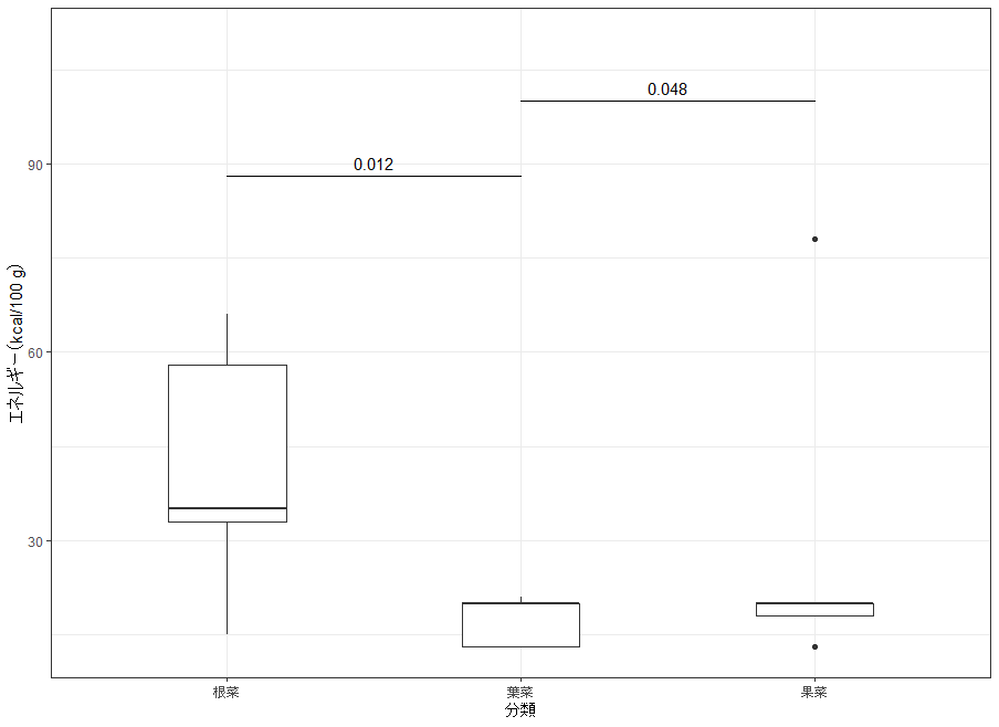
# 水準1-2、水準2-3の間に比較バーとP値を追加
p.box +
  geom_text_pairwise(data = pair.df,
                     aes(xmin = A, xmax = B, y = bar, label = p.value),
                     parse = TRUE)

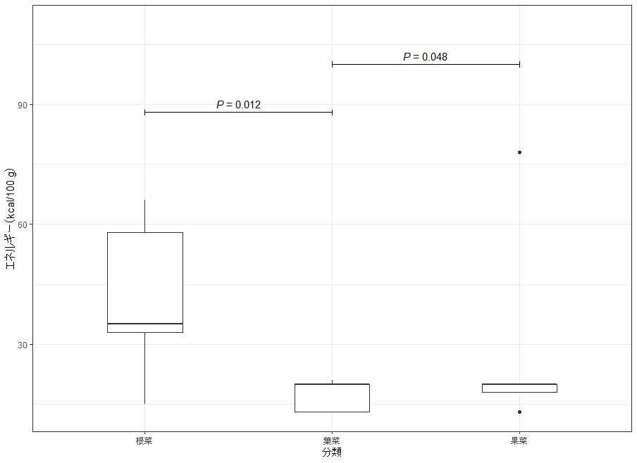
# P値を数式として表示し、バーの両端に縦線を付ける
p.box +
  geom_text_pairwise(data = pair.df,
                     aes(xmin = A, xmax = B, y = bar,
                         label = sprintf("italic(P)~`=`~%.3f", p.value)),
                     arrow = grid::arrow(angle = 90,
                                         length = unit(1, "mm"),
                                         ends = "both"),
                     parse = TRUE)

# 文字とバーの両方を赤色にする
p.box +
  geom_text_pairwise(data = pair.df,
                     aes(xmin = A, xmax = B, y = bar,
                         label = sprintf("italic(P)~`=`~%.3f", p.value)),
                     colour = "red",
                     arrow = grid::arrow(angle = 90,
                                         length = unit(1, "mm"),
                                         ends = "both"),
                     parse = TRUE)

# 背景付きラベルでP値を表示
p.box +
  geom_label_pairwise(data = pair.df,
                      aes(xmin = A, xmax = B, y = bar,
                          label = sprintf("italic(P)~`=`~%.3f", p.value)),
                      colour = "red", size = 3,
                      arrow = grid::arrow(angle = 30,
                                          length = unit(1.5, "mm"),
                                          ends = "both"),
                      parse = TRUE)

# バーだけを赤色にする(colour.target = "segment")
p.box +
  geom_text_pairwise(data = pair.df,
                     aes(xmin = A, xmax = B, y = bar,
                         label = sprintf("italic(P)~`=`~%.3f", p.value)),
                     colour = "red", colour.target = "segment",
                     arrow = grid::arrow(angle = 90,
                                         length = unit(1, "mm"),
                                         ends = "both"),
                     parse = TRUE)

# 文字だけを赤色にする(colour.target = "text")
p.box +
  geom_text_pairwise(data = pair.df,
                     aes(xmin = A, xmax = B, y = bar,
                         label = sprintf("italic(P)~`=`~%.3f", p.value)),
                     colour = "red", colour.target = "text",
                     arrow = grid::arrow(angle = 90,
                                         length = unit(1, "mm"),
                                         ends = "both"),
                     parse = TRUE)

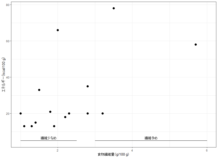
# 連続値の範囲に説明を付けるためのデータを作成
range.df <- data.frame(
  # 範囲の下限
  A = c(1.0, 3.0),
  # 範囲の上限
  B = c(2.5, 6.0),
  # 範囲バーを描く高さ
  bar = 5,
  # 範囲に付ける説明
  text = c("繊維少なめ", "繊維多め")
)

# 食物繊維量の2つの範囲に説明ラベルを配置
p +
  geom_text_pairwise(data = range.df,
                     aes(xmin = A, xmax = B, y = bar, label = text))

# ラベルを 90 度回転して配置
p +
  geom_text_pairwise(data = range.df,
                     aes(xmin = A, xmax = B, y = bar, label = text),
                     angle = 90, hjust = -0.1)

# 背景付きラベルを 90 度回転して配置
p +
  geom_label_pairwise(data = range.df,
                      aes(xmin = A, xmax = B, y = bar, label = text),
                      angle = 90, hjust = -0.1)

# 背景付きラベルをそのまま配置
p +
  geom_label_pairwise(data = range.df,
                      aes(xmin = A, xmax = B, y = bar, label = text))

# 範囲バーの両端に矢じりを付けて配置
p +
  geom_text_pairwise(data = range.df,
                     aes(xmin = A, xmax = B, y = bar, label = text),
                     arrow = grid::arrow(ends = "both",
                                         length = unit(2, "mm")))

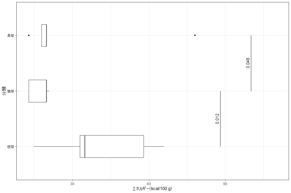
# 縦軸を分類にした箱ひげ図を作成
p.box.y <- ggplot(yasai, aes(x = energy, y = type)) +
  geom_boxplot(width = 0.4) +
  labs(x = "エネルギー(kcal/100 g)", y = "分類") +
  expand_limits(x = 110)

# 横向きの箱ひげ図に比較バーとP値を重ねる
p.box.y +
  geom_text_pairwise(data = pair.df,
                     aes(ymin = A, ymax = B, x = bar, label = p.value))

# 横向きの箱ひげ図に背景付きラベルを重ねる
p.box.y +
  geom_label_pairwise(data = pair.df,
                      aes(ymin = A, ymax = B, x = bar, label = p.value))
コマンド例から一部抜粋し紹介。
・水準1-2、水準2-3の間に比較バーとP値を追加
・P値を数式として表示し、バーの両端に縦線を付ける
・食物繊維量の2つの範囲に説明ラベルを配置
・横向きの箱ひげ図に比較バーとP値を重ねる
ずらしたラベルを線分や矢印で元の位置と結ぶ:geom_label_sコマンド
| オプション | 意味 | 初期値 |
|---|---|---|
| mapping | aes()での指定(inherit.aes = TRUE では全体の指定と結合する) | NULL |
| data | 指定したデータフレームでプロットの既定を上書きする | NULL |
| stat | このレイヤーに適用する統計変換を文字列で指定する | “identity” |
| position | 位置補正を文字列または関数の結果で指定する | “identity” |
| … | layer() に渡すその他の引数で、colourやsizeなどの固定値や統計変換への引数も指定できる | なし |
| parse | TRUE でラベルを式として解釈し表示する | FALSE |
| nudge_x | 各テキストラベルの開始位置を水平方向にずらす量(単位は軸のデータ単位と同じ) | 0 |
| nudge_y | 各テキストラベルの開始位置を垂直方向にずらす量(単位は軸のデータ単位と同じ) | 0 |
| default.colour | aes()のcolourで色が指定されない要素に使う色 | NULL |
| default.color | aes()のcolorで色が指定されない要素に使う色 | default.colour |
| colour.target | 色を適用する対象を指定する文字列ベクトル(all/text/segment/box/box.line/box.fill/none) | c(“text”, “box”) |
| color.target | 色を適用する対象を指定する文字列ベクトル(all/text/segment/box/box.line/box.fill/none) | colour.target |
| default.alpha | aes()のalphaで透過度が指定されない要素に使う透過度(0〜1) | NA |
| alpha.target | 透過度を適用する対象を指定する文字列ベクトル(all/text/segment/box/box.line/box.fill/none) | “all” |
| label.padding | ラベル周囲の余白の大きさ | grid::unit(0.25, “lines”) |
| label.r | 角の丸みの半径 | grid::unit(0.15, “lines”) |
| segment.linewidth | セグメントまたは矢印の幅(mm)を指定する | 0.5 |
| add.segments | 元の位置とずらした位置の間に線や矢印を表示するかを指定する論理値 | TRUE |
| box.padding | 各セグメントの両端を短縮する長さ(mm) | 1e-06 |
| point.padding | 各セグメントの両端を短縮する長さ(mm) | 1e-06 |
| min.segment.length | この長さより短いセグメントは描画しない(mm) | 0 |
| arrow | grid::arrow() で作成する矢じりの指定 | NULL |
| size.unit | sizeに指定した値を解釈する単位(mm/pt/cm/in/pc) | “mm” |
| na.rm | FALSE で欠損値を警告付きで除去し、TRUE で警告なしに除去する | FALSE |
| show.legend | このレイヤーを凡例に含めるかを指定する論理値 | NA |
| inherit.aes | FALSE で全体のaes()の指定を継承せず上書きする | TRUE |
# 品目名をラベルに割り当てた散布図を作成
p.name <- ggplot(yasai, aes(fiber, energy, label = name)) +
  geom_point(size = 2) +
  labs(x = "食物繊維量(g/100 g)", y = "エネルギー(kcal/100 g)")

# 位置をずらさずに品目名を表示
ggplot(yasai, aes(fiber, energy, label = name)) +
  geom_text_s() +
  expand_limits(x = c(0.5, 6.5))

# 品目名を右へずらして表示
p.name +
  geom_text_s(nudge_x = 0.2) +
  expand_limits(x = 6.5)

# 品目名を左へずらして表示
p.name +
  geom_text_s(nudge_x = -0.2) +
  expand_limits(x = 0.3)

# ずらした品目名を矢印で結び、点の周囲に余白を設ける
p.name +
  geom_text_s(nudge_x = 0.2,
              arrow = arrow(length = grid::unit(1.5, "mm")),
              point.padding = 0.4) +
  expand_limits(x = 6.5)

# 品目名を右上へ少しずらして表示
p.name +
  geom_text_s(nudge_y = 3, nudge_x = 0.12) +
  expand_limits(x = 6.5)

# 品目名を上へずらして 90 度回転
p.name +
  geom_text_s(nudge_y = 5, angle = 90) +
  expand_limits(y = 110)

# セグメントだけを赤色にして矢印で結ぶ
p.name +
  geom_text_s(angle = 90, nudge_y = 5,
              arrow = arrow(length = grid::unit(1.5, "mm")),
              colour.target = "segment", colour = "red") +
  expand_limits(y = 110)

# 分類で色分けし、セグメントだけを半透明にする
p.name +
  geom_text_s(aes(colour = type),
              angle = 90, nudge_y = 5,
              arrow = arrow(length = grid::unit(1.5, "mm")),
              alpha.target = "segment", alpha = 0.3) +
  expand_limits(y = 110)

# 背景付きラベルを右へずらして表示
p.name +
  geom_label_s(nudge_x = 0.2) +
  expand_limits(x = 6.5)

# ラベルの枠線を点線にし、線幅を細くする
p.name +
  geom_label_s(nudge_x = 0.2, linetype = "dotted", linewidth = 0.3) +
  expand_limits(x = 6.5)

# 分類で色分けし、枠(box)へ色を適用して角を直角にする
p.name +
  geom_label_s(aes(colour = type),
               nudge_x = 0.2,
               colour.target = "box",
               linewidth = 0.5,
               label.r = unit(0, "lines")) +
  expand_limits(x = 6.5)

# ラベルの枠線を消す(linewidth = 0)
p.name +
  geom_label_s(nudge_x = 0.2, linewidth = 0) +
  expand_limits(x = 6.5)

# セグメントの線幅を 0 にして結ぶ線を隠す
p.name +
  geom_label_s(nudge_x = 0.1, segment.linewidth = 0) +
  expand_limits(x = 6.5)

# 食物繊維量 1.0 を基準に、ラベルを外側へ配置
p.name +
  geom_label_s(hjust = "outward_1", nudge_x = 0.2) +
  expand_limits(x = 6.5)

# 食物繊維量 3.0 を基準に、ラベルを内側へ配置
p.name +
  geom_label_s(hjust = "inward_3", nudge_y = 4) +
  expand_limits(y = 95)

# 背景付きラベルを上へずらして 90 度回転
p.name +
  geom_label_s(nudge_y = 5, angle = 90) +
  expand_limits(y = 110)

# 分類で色分けし、閉じた形状の矢じりを付ける
p.name +
  geom_text_s(aes(colour = type),
              angle = 90,
              nudge_y = 5,
              arrow = arrow(angle = 20,
                            length = grid::unit(1.5, "mm"),
                            ends = "first",
                            type = "closed")) +
  scale_colour_discrete(l = 40) +
  expand_limits(y = 110)

# 枠と文字(box・text)へ色を適用し、矢印で結ぶ
p.name +
  geom_label_s(aes(colour = type),
               colour.target = c("box", "text"),
               nudge_x = 0.4,
               arrow = arrow(angle = 20,
                             length = grid::unit(1/3, "lines"))) +
  scale_colour_discrete(l = 40) +
  expand_limits(x = 7)

# 枠とセグメント(box・segment)へ色を適用し、矢印で結ぶ
p.name +
  geom_label_s(aes(colour = type),
               nudge_x = 0.4,
               colour.target = c("box", "segment"),
               linewidth = 0.5,
               arrow = arrow(angle = 20,
                             length = grid::unit(1/3, "lines"))) +
  scale_colour_discrete(l = 40) +
  expand_limits(x = 7)

# 枠(box)だけを半透明にして矢印で結ぶ
p.name +
  geom_label_s(aes(colour = type, fill = type),
               nudge_x = 0.4,
               alpha.target = "box",
               alpha = 0.1,
               linewidth = 0.5,
               arrow = arrow(angle = 20,
                             length = grid::unit(1/3, "lines"))) +
  scale_colour_discrete(l = 40) +
  expand_limits(x = 7)

# エネルギーの大きさで文字サイズを変え、左へずらす
p.name +
  geom_text_s(aes(size = energy), nudge_x = -0.15) +
  scale_radius(range = c(3, 6)) +
  expand_limits(x = c(0.3, 6.5))
<おすすめのRに関する書籍です>
 www.amazon.co.jp
この記事が誰かの役に立ちますように。