 からだにいいもの
 Analysis in R:The “mschart” package, which outputs editable graphs in Word and PowerPoint
This package can output charts that can be edited in Word and PowerPoint. You can create bar, line, scatter and area charts.
Package version is 0.3.1. Checked with R version 4.1.2. Checked with Office 365.
<おすすめのRに関する書籍です>

統計ソフト「R」超入門〈最新版〉 統計学とデータ処理の基礎が一度に身につく! (ブルーバックス)
新書サイズで、統計学の基礎とRの操作を一度に押さえられる。最初の一冊として手に取りやすい。
Install Package
Run the following command.
#Install Package
install.packages("mschart")
スポンサーリンク
Example
See the command and package help for details.
#Loading the library
library("mschart")

###Creating Data#####
n <- 30
TestData <- data.frame("ID" = rep(c("KA", "RA", "DA"), each = 3, length = n),
                          "Group" = rep_len(c("Group1", "Group2", "Group3"), n),
                          "Point" = rep(1:10, length = n),
                          "Value" = rnorm(n))
########

#Four types of graphs that can be created: ms_XXXX command
#The created graph is displayed with the print command, preview = TRUE
#Group split: group option: no split with NULL
#Bar chart: ms_barchart command
TestBar <- ms_barchart(data = TestData, x = "ID", y = "Value", group = "Group")
print(TestBar, preview = TRUE)
#NoGTestBar <- ms_barchart(data = TestData, x = "ID", y = "Value", group = NULL)
#print(NoGTestBar, preview = TRUE)

#Line chart: ms_linechart command
TestLine <- ms_linechart(data = TestData, x = "Point", y = "Value", group = "Group")
print(TestLine, preview = TRUE)

#Scatter plot: ms_scatterchart command
TestScatter <- ms_scatterchart(data = TestData, x = "Point", y = "Value", group = "Group")
print(TestScatter, preview = TRUE)

#Area graph: ms_areachart command
TestAreachart <- ms_areachart(data = TestData, x = "Point", y = "Value", group = "Group")
print(TestAreachart, preview = TRUE)

#Set graph type: chart_settings command
#SetType: Grouping option; stacked: Stacked, percentStacked: 100% Stacked,
#Clustered :Clustered; Bar and scatter plots, standard: Standard can be specified.
#Overlap: Overlap command; -100 to 100 can be specified
SetTestBar1 <- chart_settings(TestBar, grouping = "stacked", overlap = 50)
print(SetTestBar1, preview = TRUE)

#Formatting of X and Y axes: chart_ax_x,chart_ax_y command
#Both of these command options are the same
#Specify label position: crosses option; min, max, autoZero
#Specify the position of tick marks and auxiliary tick marks:
#major_tick_mark and minor_tick_mark options; cross,in,none,out
#Label rotation: rotation option; -360 to 360 can be specified
#Numeric formatting: num_fmt option
SetTestBar2 <- chart_ax_x(SetTestBar1, crosses = "min", minor_tick_mark = "cross",
                             rotation = -45)
SetTestBar3 <- chart_ax_y(SetTestBar2, crosses = "min", minor_tick_mark = "cross",
                             num_fmt = "0.0", rotation = -45)
print(SetTestBar3, preview = TRUE)

#Set titles for graphs, X and Y axes: chart_labels command
SetTestBar3$theme$main_title$font.family <- "Arial"
SetTestBar3$theme$axis_title_x$font.family <- "Arial"
SetTestBar3$theme$axis_title_y$font.family <- "Arial"
SetTestBar4 <- chart_labels(SetTestBar3, title = "Title",
                               xlab = "x title", ylab = "y title")
print(SetTestBar4, preview = TRUE)

#Specify fill color: chart_data_fill command
#Set colors: value option
SetTestBar5 <- chart_data_fill(SetTestBar4,
                                  values = c(Group1 = "#FDE4C0",
                                             Group2 = "#FFF7F3",
                                             Group3 = "red"))
print(SetTestBar5, preview = TRUE)

#Specify border colors: chart_data_stroke command
#Options are common to chart_data_fill command
SetTestBar6 <- chart_data_stroke(SetTestBar5, values = "yellow")
print(SetTestBar6, preview = TRUE)

#Example: Embedding and saving charts in a Word or PowerPoint file
#install.packages("officer")
library("officer")

#Word:body_add_chart command
doc <- read_docx()
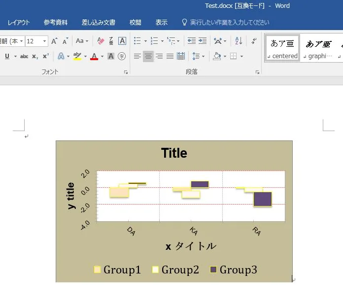
doc <- body_add_chart(doc, chart = SetTestBar6, style = "centered")
print(doc, target = "Test.docx")

#PowerPoint:ph_with_chartcommand
doc <- read_pptx()
doc <- add_slide(doc, layout = "Title and Content", master = "Office Theme")
doc <- ph_with_chart(doc, chart = SetTestBar6)
print(doc, target = "Test.pptx")
Output Example
・ms_XXXX command
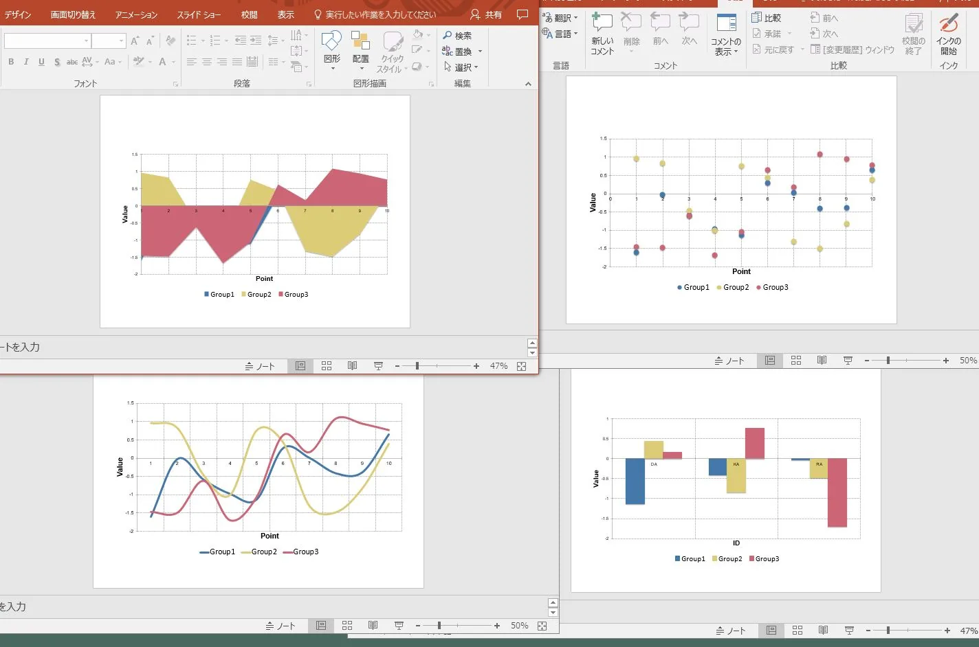
・Adaptation of the whole formatting command to the ms_barchart command
『SetTestBar6』
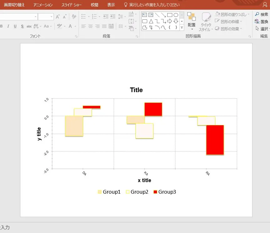
・Exsample: Editing after output to Word
I hope this makes your analysis a little easier !!


スポンサーリンク