 からだにいいもの
 Analysis in R: Create Heat Maps Easily! The “heatmap3” package
Heatmap is a way to visually display the size of numbers and objects by color.
Note that the ggplot2 extension package can also plot heatmaps. Click here to read the full article.
Package version is 1.1.9. R version 4.2.2 is confirmed.
<おすすめのRに関する書籍です>

多変量解析の基礎 II 主成分分析(改訂版): 理論とRによる演習
主成分分析に絞って理論を丁寧に追い、Rの演習で確認する構成。数式の意味を腹落ちさせたい人向け。
 www.amazon.co.jp
Install Package
Run the following command.
#Install Package
install.packages("heatmap3")
スポンサーリンク
Execute command
Here are three examples. When using Rstudio, if the plot area is too small, the message “Figure margins too large” may appear and the heat map may not be displayed. In this case, please increase the plot area sufficiently and re-run the command.
#Loading the library
library("heatmap3")

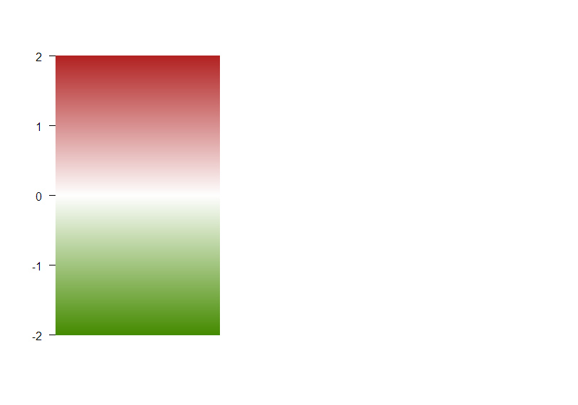
#Example 1 Displaying data in color bars
temp <- c(-3, 2, 1, 2, 1.2, -1.2)
col <- colByValue(temp, col = colorRampPalette(c('chartreuse4', 'white', 'firebrick'))(1024),
                  range = c(-2,2))

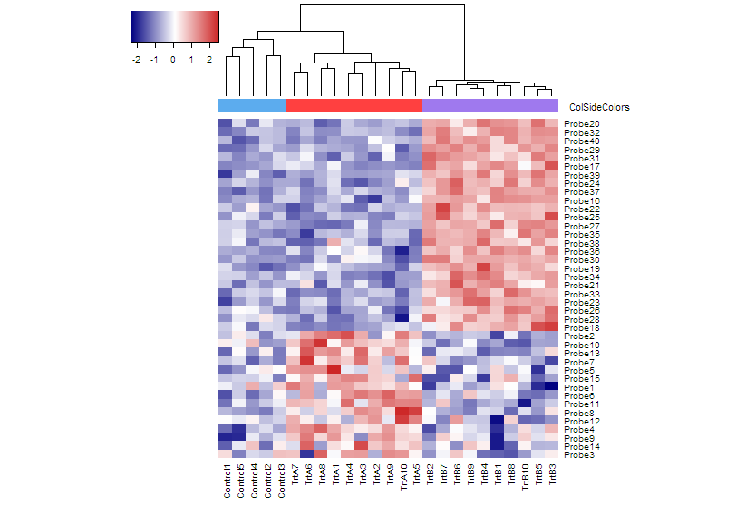
#Example 2 Group color at the top of the heatmap
set.seed(123456789)
###Creating Data Examples#####
rnormData <- matrix(rnorm(1000), 40, 25)
rnormData[1:15, seq(6, 25, 2)] = rnormData[1:15, seq(6, 25, 2)] + 2
rnormData[16:40, seq(7, 25, 2)] = rnormData[16:40, seq(7, 25, 2)] + 4
########

###Set row and column names for created data#####
#colnames
colnames(rnormData) <- c(paste("Control", 1:5, sep = ""),
                         paste(c("TrtA", "TrtB"),
                               rep(1:10,each = 2), sep = ""))
#rownames
rownames(rnormData) <- paste("Probe", 1:40, sep = "")
########

#Specify the group colors to be displayed at the top of the heatmap. You can change the color here.
ColSideColors <- c(rep("steelblue2", 5), rep(c("brown1", "mediumpurple2"), 10))

#Plot heatmap
heatmap3(rnormData, ColSideColors = ColSideColors, showRowDendro = FALSE)

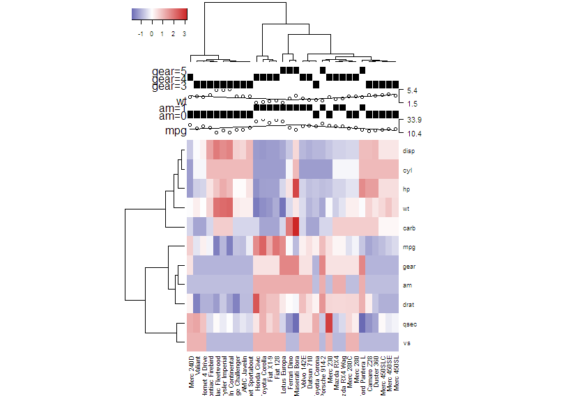
#Example 3 Using the "showAnn" function to display data details at the top of the heatmap
###Creating Data Examples#####
annData <- data.frame(mtcars[,c("mpg","am","wt","gear")])
annData[,2] <- as.factor(annData[,2])
annData[,4] <- as.factor(annData[,4])
########

#Plot heatmap
heatmap3(t(mtcars), ColSideAnn = annData,
         ColSideFun = function(x){showAnn(x)},
         ColSideWidth = 1.2, balanceColor = TRUE)
Output Examples
Example 1
Example 2
Example 3
I hope this makes your analysis a little easier !!

スポンサーリンク