 からだにいいもの
 Analysis in R: Add significance bars to ggplot2 plots! The “ggsignifr” package
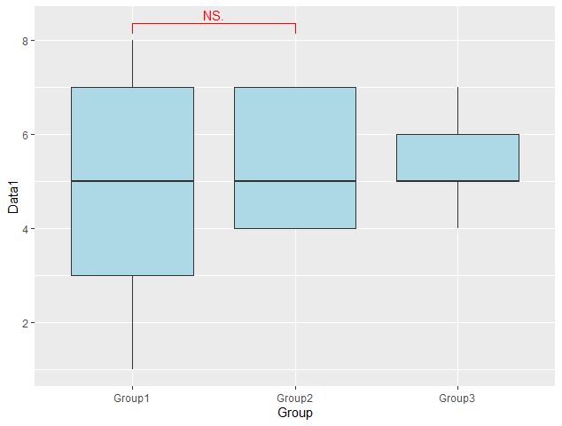
Introduces a package that adds a significant difference symbol to the plots of the “ggplot2” package. See the example output.
Package version is 0.6.3. Checked with R version 4.2.2.
<おすすめのRに関する書籍です>

Rによるベイジアン動的線形モデル (統計ライブラリー)
動的線形モデル(状態空間モデル)をベイズの枠組みで扱う専門書。理論と実装を往復しながら読み進める。
 www.amazon.co.jp
Install Package
Run the following command.
#Install Package
install.packages("ggsignif")
スポンサーリンク
Example
See the command and package help for details.
#Loading the library
library("ggsignif")

#Install the tidyverse package if it is not already present
if(!require("tidyverse", quietly = TRUE)){
  install.packages("tidyverse");require("tidyverse")
}

###Creating Data#####
TestData <- data.frame("Group" = c(rep("Group1", 50), sample(paste0("Group", 2:3), 50, replace = TRUE)),
                       "Data1" = c(sample(c(1:8), 10, replace = TRUE),
                                   sample(2:8, 40, replace = TRUE),
                                   sample(4:7, 50, replace = TRUE)))
########

###Creating Plot Examples#####
#Box Plot
BoxPlot <- ggplot(TestData, aes(x = Group, y = Data1)) +
  geom_boxplot(fill = "lightblue")
#Histogram
HistPlot <- ggplot(TestData, aes(x = Group, y = Data1, group = Group)) +
  geom_histogram(aes(fill = Group), stat = "identity")
########

#Significant difference display on plot: geom_signif command
#Specify variables: comparisons option; specify by list
#Specify bivariate test methods: test option;
#t.test, wilcox.test, etc. can be specified
#Calculate with missing values removed: na.rm option
#Display test results with asterisks:
#map_signif_level option;"***"=0.001,"**"=0.01,"*"=0.05

###Plot#####
BoxPlot +
  geom_signif(comparisons = list(c("Group1", "Group2")),
              test = "t.test", na.rm = FALSE,
              map_signif_level = TRUE, col = "red")

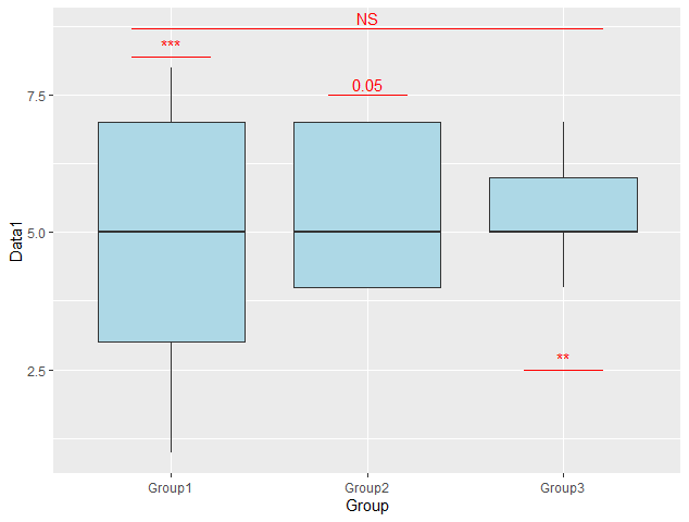
#Manual Significant Difference Display added
#stat option:"identity"
###Display position is specified by data.frame;x,xend,y,yend,annotation####
PlotPoint <- data.frame(x = c(0.8, 1.8, 2.8, 0.8),
                        y = c(8.2, 7.5, 2.5, 8.7),
                        xend = c(1.2, 2.2, 3.2, 3.2),
                        yend = c(8.2, 7.5, 2.5, 8.7),
                        annotation = c("***", "0.05", "**", "NS"))
###Plot#####
BoxPlot +
  geom_signif(data = PlotPoint,
              aes(x = x, xend = xend,
                  y = y, yend = yend,
                  annotation = annotation),
              stat = "identity", col = "red")
Output Example
・Significant difference display on plot: geom_signif command
・Manual Significant Difference Display added
I hope this makes your analysis a little easier !!

スポンサーリンク