 からだにいいもの
 Analysis in R: Helps you create the ideal heatmap. The “ComplexHeatmap” package
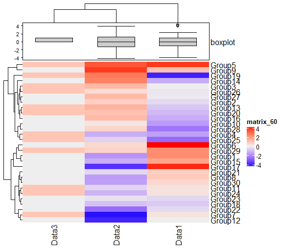
This package allows you to fine-tune the appearance of your heatmaps. For example, you can easily add a graph showing the distribution of data to a heatmap or display heatmaps side by side.
Many functions are included in the “ComplexHeatmap” package. Since I cannot show you all of them, these are examples of some commands. I think they are sufficient for basic use. Please check the Github page below for more information.
・jokergoo/ComplexHeatmap
https://github.com/jokergoo/ComplexHeatmap
Package version is 2.10.0. Checked with R version 4.2.2.
<おすすめのRに関する書籍です>
Install Package
Run the following command.
#Install Package
if (!require("BiocManager", quietly = TRUE)){
  install.packages("BiocManager")
}
BiocManager::install("ComplexHeatmap", force = TRUE)Example
See the command and package help for details.
#Loading the library
library("ComplexHeatmap")

###Creating Data#####
n <- 30
TestData1 <- as.matrix(data.frame(row.names = sample(paste0("Group", 1:n), n, replace = FALSE),
                                  Data1 = rnorm(n) + rnorm(n) + rnorm(n),
                                  Data2 = rnorm(n) + rnorm(n) + rnorm(n),
                                  Data3 = sample(0:1, n, replace = TRUE)))
TestData2 <- as.matrix(data.frame(Data1 = sample(c(LETTERS[15:24], NA), n, replace = TRUE),
                                  Data2 = sample(LETTERS[15:24], n, replace = TRUE),
                                  Data3 = sample(c(LETTERS[15:24], NA), n, replace = TRUE)))
#######

###Plot Heatmap: Heatmap command#####
Heatmap(TestData1)
########

###Specify cell color: col option#####
#Use the "scales" package
if (!require("scales", quietly = TRUE)){
  install.packages("scales");require("scales")
}
x <- seq(0, 1, length = 10)
ColPal <- seq_gradient_pal(c("#e1e6ea", "#505457", "#4b61ba", "#a87963",
                                "#d9bb9c", "#756c6d"))(x)
#Example: For a continuous variable heatmap
Heatmap(TestData1, col = ColPal)

#Example: For a heatmap of category variables
#Specify the color of missing values: na_col option
#Create a labeled character array with the base::structure command
CateColPal <- structure(ColPal, names = LETTERS[15:24])
Heatmap(TestData2, col = CateColPal, na_col = "yellow")
########

###Set column and row titles#####
#Column side: column_title option
Heatmap(TestData1, col = ColPal, column_title = "Column TITLE")
#Row side: row_title option
Heatmap(TestData1, col = ColPal, row_title = "Row TITLE")
########

###Position of column and row titles#####
#Column side: column_title_side option;"top","bottom"
Heatmap(TestData1, col = ColPal, column_title = "Column TITLE",
        column_title_side = "bottom")
#Row side: row_title_side option;"left","right"
Heatmap(TestData1, col = ColPal, row_title = "Column TITLE",
        row_title_side = "right")
########

###Rotate column and row titles#####
#Column side: column_title_rot option
Heatmap(TestData1, col = ColPal, column_title = "Column TITLE",
        column_title_side = "bottom", column_title_rot = 90)
#Row side: row_title_rot option
Heatmap(TestData1, col = ColPal, row_title = "Column TITLE",
        row_title_side = "right", row_title_rot = 0)
########

###Legend title setting: name option#####
Heatmap(TestData1, col = ColPal, name = "Legend TITLE")
#####

###Specify distance and clustering#####
###Distance:clustering_distance_rows option, clustering_distance_columns optipn#####
#euclidean","maximum","manhattan","canberra","binary","minkowski",
#"pearson","spearman","kendall"
###Clustering:clustering_method_rows,clustering_method_columnオプション#####
#"ward.D","ward.D2","single","complete","average"(= UPGMA),"mcquitty"(= WPGMA),
#"median"(= WPGMC),"centroid"(= UPGMC)の指定が可能
Heatmap(TestData1, clustering_distance_rows = "pearson",
        clustering_method_rows = "single")
########

###Whether clusters are displayed or not#####
#Column side: cluster_columns option
#Row side: cluster_rows option
Heatmap(TestData1, cluster_rows = TRUE, cluster_columns = FALSE)
########

###Cluster display position#####
#Column side: row_dend_side option:"left","right"
#Row side: column_dend_side option:"top","bottom"
Heatmap(TestData1, row_dend_side = "right", column_dend_side = "bottom")
########

###Row-side cluster split and space adjustment#####
#Split: km option
#Space:gap option
#Set label color after splitting: row_names_gp option
#Format is specified by gpar command; color: col,label size:fontsize; default 14
#For continuous variables
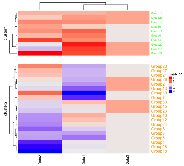
Heatmap(TestData1, km = 2, gap = unit(10, "mm"),
        row_names_gp = gpar(col = c("green", "orange"), fontsize = c(10, 14)))

#For categorical variables
#Split:split option; specify contents as string
#Total 30 data divided into 3 parts of 10 each
Heatmap(TestData2, split = rep(LETTERS[1:3], each = 10), gap = unit(5, "mm"))
########

###Sort columns, rows########
#Column side: column_order option
#Row side: row_order option
Heatmap(TestData1, cluster_rows = FALSE, cluster_columns = FALSE,
        column_order = c("Data3", "Data2", "Data1"), row_order = paste0("Group", 30:1))
########

###Set column and row labels#####
#Column side: column_names_gp option
#Row side: row_names_gp option
#Format is specified by gpar command; color: col,label size:fontsize; default 14
Heatmap(TestData1,
        column_names_gp = gpar(col = c(rep("red", 1), rep("blue", 2)), fontsize = 20),
        row_names_gp = gpar(col = c(rep("red", 20), rep("blue", 10)), fontsize = 10))
########

###Set of each cell border: rect_gp option#####
#Format is specified by gpar command; col, lty, lwd
Heatmap(TestData1, rect_gp = gpar(col = "black", lty = 1, lwd = 3))
########

###Plot heatmap with different width: width option#####
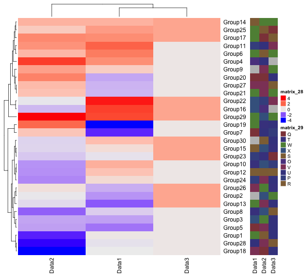
Width1 <- Heatmap(TestData1, width = 2)
Width2 <- Heatmap(TestData2, width = unit(2, "cm"))
Width1 + Width2
#####

###Plot heatmaps side by side: draw command#####
#Stores the result of the heatmap command to the argument
HeatMap1 <- Heatmap(TestData1)
HeatMap2 <- Heatmap(TestData2)
#Plot
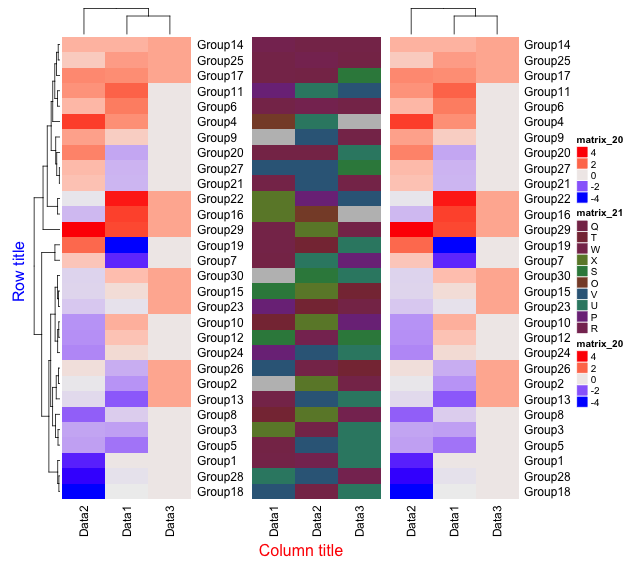
draw(HeatMap1 + HeatMap2)
########

###Customize the appearance when using the Draw command#####
#Each option is common to the Heatmap command
draw(HeatMap1 + HeatMap2, row_title = "Row title", row_title_gp = gpar(col = "blue"),
     column_title = "Column title", column_title_side = "bottom",
     column_title_gp = gpar(col = "red"))
########

###Annotate#####
#HeatmapAnnotation commna
#A simple example
AnotationDF <- data.frame(type = c(rep("a", 2), rep("b", 2)))

#Create annotation data
Anotation <- HeatmapAnnotation(df = AnotationDF)

#Plot
draw(Anotation, 1:4)

#Graphs and texts can be added to annotations with the commands: #anno_points(),anno_barplot(),anno_boxplot(),anno_histogram(),
#anno_density(),anno_text()

#Create annotation data with additional graphs
#Create data for upper display
TopAnotation <- HeatmapAnnotation(boxplot = anno_boxplot(as.matrix(TestData1)))
#描写
Heatmap(TestData1, top_annotation = TopAnotation)
Output Example
Some from the examples.
・km option
・width option
・draw command
・HeatmapAnnotation command
I hope this makes your analysis a little easier !!