 からだにいいもの
 Analysis in R:I can see the relationship between indicators! The “corragram” package
Methods to show the relationship between indicators include scatter plots and correlation coefficients, and the corragram package allows you to output all of these methods together.

Install Package
It can be introduced by running the following code.
URL: https://github.com/kwstat/corrgram
 install.packages("corrgram", type = "source")

#or

 library(devtools) #If devtools is not present, run right:install.packages("devtools")
  install_github("kwstat/corrgram")
スポンサーリンク
Execute command
Here are two examples.
Note that the manual says you can choose between Pearson, Spearman, and Kendall for the correlation coefficient, but the correlation coefficient calculated in the panel.conf option is Pearson. Please note this!
#Reading data provided with the corrgram package, 74 rows and 14 columns.
data(auto)

#Example 1
#Default plot. Correlation coefficients can be selected from pearson, spearman, kendall.
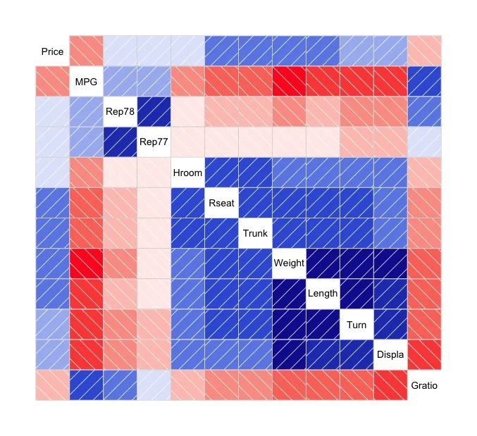
corrgram(auto[, -c(1:2)], cor.method = "kendall")

#Example 2
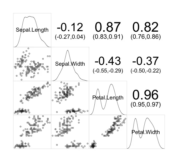
#Plot with iris data supplied with R. Densities, scatter plots, and correlation coefficients for each variable can be plotted simultaneously.
#Note that the correlation coefficients in panel.conf are output in pearson even if the method is specified in cor.method. Please be aware of this!
corrgram(iris, lower.panel = panel.pts, upper.panel = panel.conf,
         diag.panel = panel.density, cor.method = "spearman")
Output Examples
Example 1
Example 2
少しでも、ウェブや実験の解析が楽になりますように!!

スポンサーリンク