 からだにいいもの
 Analysis in R: Intuitive understanding of trends! Creating Violin Plots with ggplot2
There are a number of charts that show trends in access, including bar charts, line charts, and, once you get used to them, the convenient box-and-whisker chart. But while these charts are very useful for analysis, they are difficult to get used to for showing trends. So we will show you how to create a fiddle chart in ggplot2 that is easy to see and easy to understand access trends.
<おすすめのRに関する書籍です>

Preparation for Analysis
- Install R Click here for reference article.
- Install the “ggplot2”.
*If you do not have ggplot2 installed, please run install.packages(“ggplot2”) with R first.
Execute command
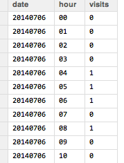
The format of the Excel data to be covered is as follows. From left to right: date, time zone, number of sessions (VISITS). The time zone is set between 00 and 23.
Run the following command.
###Loading the library#####
library("XLConnect")
library("tcltk")
library("ggplot2")
########

###Data loading#####
sheetSelect <- 1 #Enter the sheet number to be read
selectABook <- paste(as.character(tkgetOpenFile(title = "Select xlsx file",filetypes = '{"xlsx file" {".xlsx"}}',initialfile = "*.xlsx")), sep = "", collapse =" ")
MasterAnaData <- loadWorkbook(selectABook)
AnaData <- readWorksheet(MasterAnaData, sheet = sheetSelect)

UniqueDate <- unique(AnaData[, 1]) #Date unification
ViolinVisitsData <- NULL #To store visit data for plotting
ViolinPlotData <- NULL #To save data for plotting

###Data Processing#####
for (n in seq(UniqueDate)){
  #Extract data by date
  SubAnaData <- subset(AnaData, AnaData[, 1] == UniqueDate[n])

  #The time series of the data is not always 24 hours, so use "for" just in case.
  for (i in seq(nrow(SubAnaData))){

    hourVisits <- SubAnaData[i, 3] #Get visits by time

    if(identical(all.equal(hourVisits, 0), TRUE))
    {

      #Do not process when the "visit" is 0.

    }else{

      ViolinVisitsData <- rep(type.convert(SubAnaData[i, 2]), hourVisits)
      ViolinPlotData <- rbind(ViolinPlotData, cbind(UniqueDate[n], as.numeric(ViolinVisitsData)))
    }}

}

ViolinPlotData <- as.data.frame(ViolinPlotData)
ViolinPlotData[, 2] <- type.convert(as.character(ViolinPlotData[, 2]))

#Plot preparation and fill color can be set with FILL.
p <- ggplot(ViolinPlotData, aes(factor(ViolinPlotData[, 1]), ViolinPlotData[, 2], fill = factor(ViolinPlotData[, 1])))

#vaiolinplot setting
p <- p + geom_violin(scale = "count")
#If you want to adjust the figure and Y axis to time, delete the last + coord_flip().
p <- p +
  coord_cartesian(ylim = -0.5:24.5) +
  labs( x = " ", y = " ") +
  #scale_y_continuous(0:23) +
  theme(axis.text.x = element_text(colour="black", size = 13),
        plot.background = element_rect(fill = NA, colour = NA), #生成り色"#fbfaf5"
        panel.background = element_rect(linetype = "solid", colour = "black", fill = NA), #絹鼠"#dddcd6"
        panel.grid.major = element_line(color = NA),
        panel.grid.minor = element_line(color = NA),
        axis.title.x = element_text(size = 13),
        axis.title.y = element_text(size = 13,angle = 90),
        axis.text.y = element_text(colour="black", size = 11)) +
  coord_flip()

print(p)
Output Examples
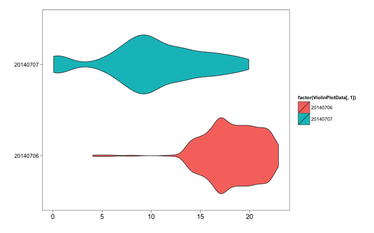
The time series of the data is not all These are some of the number of sessions (VISITS) on the same day and the next day that were introduced by Hatena Bookmark. Although the numbers cannot be read from the figure, the trend is clear at a glance. I think it will be sufficient as a study material by adding the necessary number of sessions and interpretation.ays 24 hours, so use “for” just in case.
I hope this makes your analysis a little easier !!