 からだにいいもの
 Analysis in R: ggplot2 made easy! The “ggpubr” package
Although ggplot2 is a useful package for plotting data, sometimes the procedures for doing so can be cumbersome. However, this package can solve such problems.
The following is a list of commands that are likely to be used frequently from the commands included in the package. For other commands, see the package help. Duplicate command options are omitted.
Package version is 0.4.0. Checked with R version 4.2.2.
<おすすめのRに関する書籍です>

超入門! Rでできるビジュアル統計学 学会・論文発表に役立つデータ可視化マニュアル
学会発表や論文の図表づくりに寄せた実践書。伝わるグラフをRで作るための手順をまとめている。
 www.amazon.co.jp
Install Package
Run the following command.
#Install Package
install.packages("ggpubr")
スポンサーリンク
Examples
See the command and package help for details.
#Loading the library
library("ggpubr")

###Creating Data Examples#####
n <- 100
TestData <- data.frame("Group" = factor(rep(c("Group1", "Group2", "Group3", "Group4"), each = 25)),
                          "Data" = c(rnorm(25, 10), rnorm(25, 15), rnorm(25, 20), rnorm(25, 25)))
########

#Create density plot:ggdensity command
#Data:data option
#x-axis data:x option
#y-axis data:y option;"..density..","..count.."
#Line color:color option;Default is "black"
#Fill color:fill option;Default is NA
#Color pallet:palette option;"ggsci package":"npg","aaas",
#"lancet","jco","ucscgb","uchicago","simpsons","rickandmorty"
#Line type:linetype option;"twodash","longdash","dotdash","dotted",
#"dashed","solid","blank"
#Fill color transparency:alpha option;Default is 0.5
#Adding information to the plot:add option;"none","mean","median"
#Line type for add option:add.params option;Use list class
#Add lag plot:rug option;Default is FALSE
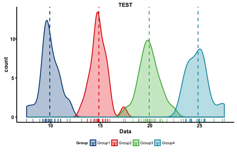
ggdensity(data = TestData, x = "Data", y = "..count..",
          color = "Group", fill = "Group", palette = "lancet",
          linetype = "solid", alpha = 0.3, add = "mean",
          add.params = list(linetype = "dashed"), rug = TRUE, main = "TEST")

#Create Box plot:ggboxplot command
#Make a notched box plot:notch option;TRUE/FALSE
#Adding information to the plot:add option;"none","dotplot","jitter",
##"mean","mean_se","mean_sd","mean_ci","mean_range",
##"median","median_iqr","median_mad","median_range"
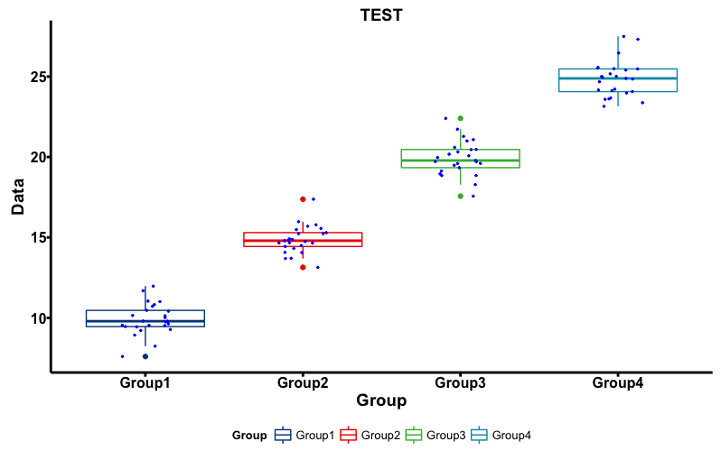
ggboxplot(data = TestData, x = "Group", y = "Data",
          color = "Group", size = 0.5, width = 1,
          notch = FALSE, palette = "lancet",
          add = "jitter", add.params = list(color = "blue", size = 0.5),
          main = "TEST")

#Create pie chart:ggpie command
#Location of data labels:lab.pos option;in/out
#Data Label Format:lab.font option:set a c(size, style, color)
#Ignored when lab.pos option is out
#Examples
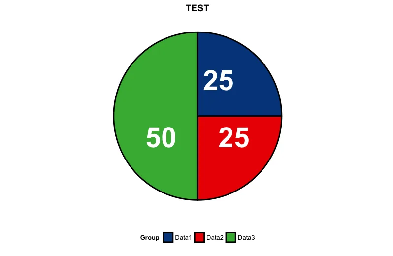
PieData <- data.frame(Group = c("Data1", "Data2", "Data3"),
                         Value = c(25, 25, 50))
ggpie(data = PieData, x = "Value", label = "Value", lab.pos = "in",
      lab.font = c(15, "bold", "white"), color = "black",
      fill = "Group", palette = "lancet", size = 1, main = "TEST")

#Create Violon plot:ggviolin command
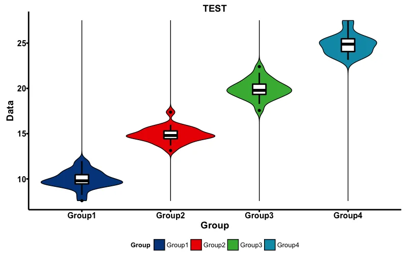
ggviolin(data = TestData, x = "Group", y = "Data",
         fill = "Group", size = 0.5, width = 1,
         palette = "lancet", add = "boxplot",
         add.params = list(fill = "white"), main = "TEST")
Output Examples
・ggdensity command
・ggboxplot command
・ggpie command
・ggviolin command
I hope this makes your analysis a little easier !!

スポンサーリンク